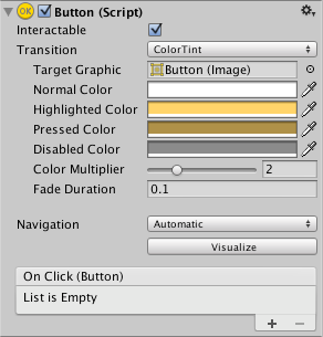
Button
The Button control responds to a click from the user and is used to initiate or confirm an action. Familiar examples include the Submit and Cancel buttons used on web forms.


Properties
| Property: | Function: |
|---|---|
| InteractableA UI component property that detemines whether the component can accept input. More info See in Glossary |
Will this component will accept input? See Interactable. |
| TransitionThe blend from one state to another in a state machine, such as transitioning a character from a walk to a jog animation. Transitions define how long the blend between states should take, and the conditions that activate the blend. More info See in Glossary |
Properties that determine the way the control responds visually to user actions. See Transition Options. |
| Navigation | Properties that determine the sequence of controls. See Navigation Options. |
Events
| Property: | Function: |
|---|---|
| On Click | A UnityEvent that is invoked when when a user clicks the button and releases it. |
Details
The button is designed to initiate an action when the user clicks and releases it. If the mouse is moved off the button control before the click is released, the action does not take place.
The button has a single event called On Click that responds when the user completes a click. Typical use cases include:
- Confirming a decision (eg, starting gameplay or saving a game)
- Moving to a sub-menu in a GUI
- Cancelling an action in progress (eg, downloading a new scene)
Did you find this page useful? Please give it a rating: