Styling text
Basic text styling
Text properties are regular USS style properties. You can set text style properties on any element, regardless of whether it’s a text element (inheriting from TextElement C# type) or not. Unlike most USS style properties, text style properties propagate to child elements. For example:
<ui:UXML xmlns:ui="UnityEngine.UIElements" xmlns:uie="UnityEditor.UIElements">
    <ui:VisualElement style="-unity-font-style: bold-and-italic; font-size: 39px;">
        <ui:Label text="Label" />
    </ui:VisualElement>
</ui:UXML>
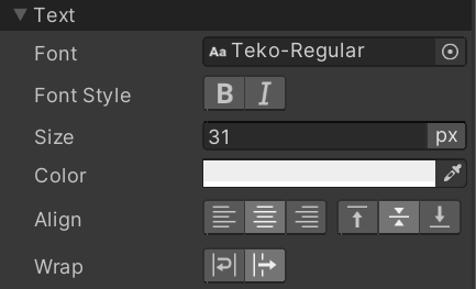
In the example above, the Label text will be bold, italic, and have a font size of 39px. The image below displays the available text style properties in the InspectorA Unity window that displays information about the currently selected GameObject, asset or project settings, allowing you to inspect and edit the values. More info
See in Glossary:

Style text directly in the Canvas
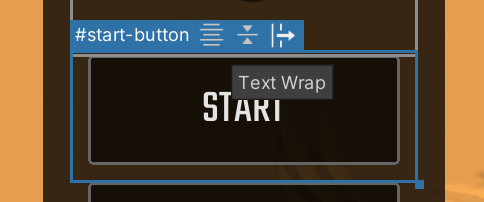
The following text styles are exposed as toggles in the Canvas on selected elements:
- Horizontal Text Align
- Vertical Text Align
- Text Wrap
These toggles appear in the header of the selected element, if the selected element is a text element (inherits from TextElement). For example, Label and Button:

Advanced text styling
You can install the TextMeshPro package, which Unity installs by default. The package features include:
- The use of rich text tags in
Labeltext attributes. - The use of the more advanced
Font Assetin style properties, which allows setting text highlights and shadows.