- Unity User Manual 2023.2
- User interface (UI)
- UI 工具包
- Structure UI
- UXML 元素参考
- UXML element CurveField
UXML element CurveField
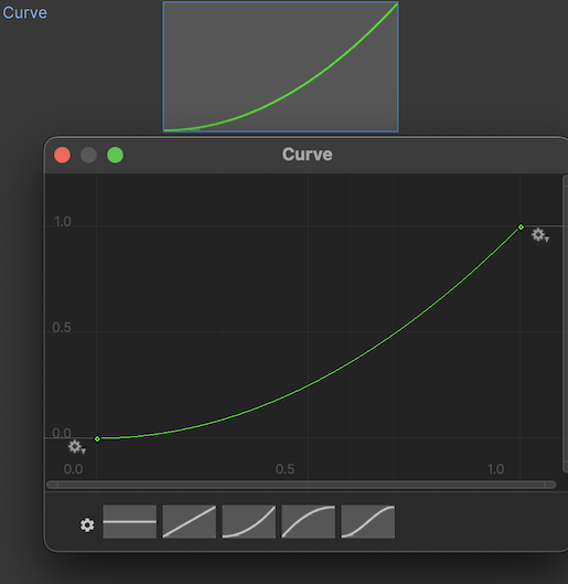
A CurveField is an Editor-only control that lets users select a curve from a curve editor. You can use a CurveField to display a curve to visualize its properties or create and adjust curves for animatable properties in an Animation Clip, providing precise control over how these properties change over time.

Note: To align an element with other fields in an Inspector window, simply apply the .unity-base-field__aligned USS class to it. For more information, refer to BaseField.
Create a CurveField
You can create a CurveField with UI Builder, UXML, or C#. The following C# example creates a CurveField with a default curve:
using UnityEditor.UIElements;
...
// Create a CurveField
var curveField = new CurveField();
// Set the curve
curveField.value = new AnimationCurve(new Keyframe(0, 0), new Keyframe(1, 1), new Keyframe(2, 2), new Keyframe(3, 3));
// Set the width and height of the curve editor
curveField.style.width = 300;
curveField.style.height = 400;
示例
The following UXML example creates a CurveField:
[!code-xml[(External/Resources/editor_resources/Assets/Editor Default Resources/UIPackageResources/Snippets/UXML/CurveFieldSnippet.uxml)]
The following C# example illustrates some of the customizable functionalities of the CurveField:
[!code-cs[(Modules/UIElementsSamplesEditor/Snippets/CurveFieldSnippet.cs#sample)]
To try this example live in Unity, go to Window > UI Toolkit > Samples.
C# base class and namespace
C# class: CurveField
Namespace: UnityEditor.UIElements
Base class: BaseField_1
Inherited UXML attributes
This element inherits the following attributes from its base class:
| 名称 | 类型 | 描述 |
|---|---|---|
binding-path |
string |
Path of the target property to be bound. |
focusable |
boolean |
True if the element can be focused. |
label |
string |
The string representing the label that will appear beside the field. |
tabindex |
int |
An integer used to sort focusables in the focus ring. Must be greater than or equal to zero. |
This element also inherits the following attributes from VisualElement:
| 名称 | 类型 | 描述 |
|---|---|---|
content-container |
string |
Child elements are added to it, usually this is the same as the element itself. |
data-source |
Object |
Assigns a data source to this VisualElement which overrides any inherited data source. This data source is inherited by all children. |
data-source-path |
string |
Path from the data source to the value. |
name |
string |
The name of this VisualElement. Use this property to write USS selectors that target a specific element. The standard practice is to give an element a unique name. |
picking-mode |
UIElements.PickingMode |
Determines if this element can be pick during mouseEvents or IPanel.Pick queries. |
style |
string |
Reference to the style object of this element. Contains data computed from USS files or inline styles written to this object in C#. |
tooltip |
string |
Text to display inside an information box after the user hovers the element for a small amount of time. This is only supported in the Editor UI. |
usage-hints |
UIElements.UsageHints |
A combination of hint values that specify high-level intended usage patterns for the VisualElement. This property can only be set when the VisualElement is not yet part of a Panel. Once part of a Panel, this property becomes effectively read-only, and attempts to change it will throw an exception. The specification of proper UsageHints drives the system to make better decisions on how to process or accelerate certain operations based on the anticipated usage pattern. Note that those hints do not affect behavioral or visual results, but only affect the overall performance of the panel and the elements within. It’s advised to always consider specifying the proper UsageHints, but keep in mind that some UsageHints might be internally ignored under certain conditions (e.g. due to hardware limitations on the target platform). |
view-data-key |
string |
Used for view data persistence, such as tree expanded states, scroll position, or zoom level. This key is used to save and load the view data from the view data store. If you don’t set this key, the persistence is disabled for the associated VisualElement. For more information, refer to View data persistence. |
USS classes
The following table lists all the C# public property names and their related USS selector.
| C# property | USS selector | 描述 |
|---|---|---|
ussClassName |
.unity-curve-field |
USS class name of elements of this type. |
labelUssClassName |
.unity-curve-field__label |
USS class name of labels in elements of this type. |
inputUssClassName |
.unity-curve-field__input |
USS class name of input elements in elements of this type. |
contentUssClassName |
.unity-curve-field__content |
USS class name of content elements in elements of this type. |
borderUssClassName |
.unity-curve-field__border |
USS class name of border elements in elements of this type. |
ussClassName |
.unity-base-field |
USS class name of elements of this type. |
labelUssClassName |
.unity-base-field__label |
USS class name of labels in elements of this type. |
inputUssClassName |
.unity-base-field__input |
USS class name of input elements in elements of this type. |
noLabelVariantUssClassName |
.unity-base-field--no-label |
USS class name of elements of this type, when there is no label. |
labelDraggerVariantUssClassName |
.unity-base-field__label--with-dragger |
USS class name of labels in elements of this type, when there is a dragger attached on them. |
mixedValueLabelUssClassName |
.unity-base-field__label--mixed-value |
USS class name of elements that show mixed values |
alignedFieldUssClassName |
.unity-base-field__aligned |
USS class name of elements that are aligned in a inspector element |
disabledUssClassName |
.unity-disabled |
USS class name of local disabled elements. |
You can also use the Matching Selectors section in the Inspector or the UI Toolkit Debugger to see which USS selectors affect the components of the VisualElement at every level of its hierarchy.