USS サポートプロパティ
ここでは、サポートされている USS プロパティとその値について説明します。
USS データ型
USS データ型は、USS プロパティが受け入れる値とキーワードを定義します。
| プロパティ | 説明 |
|---|---|
<length> |
距離の値を表します。 |
<number> |
整数または小数部分を持つ数値を表します。 |
<integer> |
整数を表します。 |
<color> |
色を表します。#hexadecimal コード、rgb() や rgba() 関数、または blue や transparent などの色のキーワードを使って定義できます。 |
<resource> |
Resources フォルダーのアセットを表します。 |
<url> |
パスで指定されたアセットを表します。相対パスまたは絶対パスで表現できます。 |
USS 構文
UIElement のスタイルプロパティは、W3C CSS ドキュメントと同じ文法構文を使用します。
- キーワードの値はそのまま表記します。例:
auto、baseline - 基本的なデータ型は山括弧 (
<と>) の間に表記します。例:<length>、<color> - プロパティと同じ名前を持つ端末以外のものは山括弧 (
<と>) の間に表記します。例:<'width'>
プロパティ値に複数のコンポーネントがある場合は以下の通りです。
- 複数の並列の単語は、すべてが与えられた順序で発生することを意味します。
- A bar (
|) separates two or more alternatives: exactly one must occur. - A double bar (
||) separates two or more options: one or more must occur, in any order. - 2 重アンパサンド (
&&) は、2 つ以上のコンポーネントを区切ります。これらのコンポーネントは任意の順序で発生します。 - 大括弧 (
[]) はグループ化を意味します。
すべての型、キーワード、または山括弧 <> で囲まれたグループの後にモディファイアが記述される場合があります。
- アスタリスク (
*) は、前に記述された型、単語、またはグループが 0 回以上発生することを示します。 - プラス (
+) は、前に記述された型、単語、またはグループが 1 回以上発生することを示します。 - 疑問符 (
?) は、前に記述された型、単語、またはグループが必須でないことを示します。 - 中括弧 (
{A,B}) の数字は、前に記述された型、単語、またはグループが少なくともA回、最大でB回発生することを示します。
継承プロパティ
継承プロパティに値が指定されていない場合、 要素は親要素から値を取得します。例えば、継承プロパティを使用して、すべての要素のフォントを設定します。
css
:root {
    -unity-font: resource("Font/consola.ttf");
}
その結果、以下のプロパティが継承されます。
- color
- font-size
- -unity-font
- -unity-font-style
- -unity-text-align
- visibility
- whitespace
ボックスモデル
寸法
width: <length> | auto
height: <length> | auto
min-width: <length> | auto
min-height: <length> | auto
max-width: <length> | none
max-height: <length> | none
width と height は要素のサイズを指定します。width が指定されない場合、幅は要素の内容の幅にもとづいて決定されます。height が指定されない場合、高さは要素のコンテンツの高さに基づきます。
マージン
margin-left: <length> | auto;
margin-top: <length> | auto
margin-right: <length> | auto
margin-bottom: <length> | auto
簡略表記
margin: [<length> | auto]{1,4}
margin 簡易表記オプションは以下のように適用されます。
| オプション | 説明 |
|---|---|
| length が 1 つ | 4 つのマージンすべてに適用されます。 |
| length が 2 つ | 1 つ目は margin-top と margin-bottom に適用されます。2 番目は margin-left と margin-right に適用されます。 |
| length が 3 つ | 1 つ目は margin-top に適用されます。2 番目は margin-left と margin-right に適用されます。3 番目は margin-bottom に適用されます。 |
| length が 4 つ | 各長さを margin-top、margin-right、margin-bottom、margin-left の順序で適用します。 |
境界線
border-left-width: <length>
border-top-width: <length>
border-right-width: <length>
border-bottom-width: <length>
簡略表記
border-width: <length>{1,4}
border-width 簡易表記オプションは以下のように適用されます。
| オプション | 説明 |
|---|---|
| length が 1 つ | 4 つの境界線すべてに適用されます。 |
| length が 2 つ | 1 つ目は border-top-width と border-bottom-width に適用されます。2 番目は border-left-width と border-right-width に適用されます。 |
| length が 3 つ | 1 つ目は border-top-width に適用されます。2 番目は border-left-width と border-right-width に適用されます。3 番目は border-bottom-width に適用されます。 |
| length が 4 つ | 各長さを border-top-width、border-right-width、border-bottom-width、border-left-width の順序で適用します。 |
パディング
padding-left: <length>
padding-top: <length>
padding-right: <length>
padding-bottom: <length>
簡略表記
padding: <length>{1,4}
padding 省略オプションは以下のように適用されます。
| オプション | 説明 |
|---|---|
| length が 1 つ | 4 つのパディングすべてに適用されます。 |
| length が 2 つ | 1 つ目は padding-top と padding-bottom に適用されます。2 番目は padding-left と padding-right に適用されます。 |
| length が 3 つ | 1 つ目は padding-top に適用されます。2 番目は padding-left と padding-right に適用されます。3 つ目は padding-bottom に適用されます。 |
| length が 4 つ | 各長さを padding-top、padding-right、padding-bottom、padding-left の順序で適用します。 |
フレックスレイアウト
このセクションでは、ビジュアル要素を配置するためのプロパティを列挙します。UIElement には レイアウトエンジン が含まれ、レイアウトやスタイリングのプロパティに基づいてビジュアル要素を配置します。レイアウトエンジンは、HTML/CSS レイアウトシステムの 1 つである Flexbox のサブセットを実装しています。
デフォルトでは、すべてのアイテムは垂直にコンテナに配置されます。
アイテム
flex-grow: <number>
flex-shrink: <number>
flex-basis: <length> | auto
flex: none | [ <'flex-grow'> <'flex-shrink'>? || <'flex-basis'> ]
align-self: auto | flex-start | flex-end | center | stretch
コンテナ
flex-direction: row | row-reverse | column | column-reverse
flex-wrap: nowrap | wrap | wrap-reverse
align-content: flex-start | flex-end | center | stretch
align-items: flex-start | flex-end | center | stretch
justify-content: flex-start | flex-end | center | space-between | space-around
相対位置と絶対位置
位置指定
position: absolute | relative
このプロパティは、デフォルトで relative に設定されています。これは、親に基づいて要素を配置します。このプロパティが absolute に設定されている場合、要素は親のレイアウトを離れ、親の領域に基づいて値が指定されます。
位置
left: <length> | auto
top: <length> | auto
right: <length> | auto
bottom: <length> | auto
親のエッジまたは、要素の元の位置からの距離。
描画プロパティ
描画プロパティは、ビジュアル要素の背景、境界線、外観を設定します。
背景
background-color: <color>
background-image: <resource> | <url> | none
-unity-background-scale-mode: stretch-to-fill | scale-and-crop | scale-to-fit
-unity-background-image-tint-color: <color>
スライス
背景画像を割り当てるとき、それは簡略化された 9 スライス仕様に基づいて描画されます。
-unity-slice-left: <integer>
-unity-slice-top: <integer>
-unity-slice-right: <integer>
-unity-slice-bottom: <integer>
境界線
border-color: <color>
border-top-left-radius: <length>
border-top-right-radius: <length>
border-bottom-left-radius: <length>
border-bottom-right-radius: <length>
簡略表記
border-radius: <length>{1,4}
border-radius 簡易表記オプションは以下のように適用されます。
| オプション | 説明 |
|---|---|
| length が 1 つ | 4 つの border-radius プロパティすべてに適用されます。 |
| length が 2 つ | 1 つ目は border-top-left-radius と border-bottom-right-radius に適用されます。2 番目は border-bottom-left-radius と border-top-right-radius に適用されます。 |
| length が 3 つ | 1 つ目は border-top-left-radius に適用されます。2 番目は border-bottom-left-radius と border-top-right-radius に適用されます。3 番目は border-bottom-right-radius に適用されます。 |
| length が 4 つ | 各長さを border-top-left-radius、border-top-right-radius、border-bottom-right-radius、border-bottom-left-radius の順序で適用します。 |
外観
overflow: hidden | visible
-unity-overflow-clip-box: padding-box | content-box
opacity: <number>
visibility: visible | hidden
display: flex | none
display のデフォルト値は flex です。display を none に設定すると、 要素が削除されます。visibility を hidden に設定すると要素は非表示になりますが、要素はレイアウトのスペースを占有します。
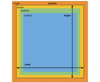
-unity-overflow-clip-box は要素 コンテンツのクリップ面の矩形を定義します。デフォルトは padding-box で、 パディングエリアの外側の矩形 (上のボックスモデルの画像の緑の矩形) です。content-box はパディングエリア (上のボックスモデルの画像の青い矩形) 内の値を表します。
テキストプロパティ
テキストプロパティは、フォント、フォントサイズ、フォントリソースの Unity 特有のプロパティ、フォントスタイル、整列、ワードラップ、クリッピングを設定します。
color: <color>
-unity-font: <resource> | <url>
font-size: <number>
-unity-font-style: normal | italic | bold | bold-and-italic
-unity-text-align: upper-left | middle-left | lower-left | upper-center | middle-center | lower-center | upper-right | middle-right | lower-right
white-space: normal | nowrap
カーソルプロパティ
cursor のデフォルトテクスチャタイプを使用して、カーソルのカスタムテクスチャをインポートします。
cursor: [ [ <resource> | <url> ] [ <integer> <integer>]? , ] [ arrow | text | resize-vertical | resize-horizontal | link | slide-arrow | resize-up-right | resize-up-left | move-arrow | rotate-arrow | scale-arrow | arrow-plus | arrow-minus | pan | orbit | zoom | fps | split-resize-up-down | split-resize-left-right ]
- 2019–05–23 修正されたページ