Unity Manual
- Unity User Manual 2021.1
- New in Unity 2021.1
- Packages
- Released packages
- 2D Animation
- 2D Pixel Perfect
- 2D PSD Importer
- 2D SpriteShape
- 2D Tilemap Extras
- Adaptive Performance
- Addressables
- Advertisement
- Alembic
- Analytics Library
- Android Logcat
- Animation Rigging
- AR Foundation
- ARCore XR Plugin
- ARKit Face Tracking
- ARKit XR Plugin
- Burst
- Cinemachine
- Code Coverage
- Editor Coroutines
- FBX Exporter
- In App Purchasing
- Input System
- iOS 14 Advertising Support
- JetBrains Rider Editor
- Magic Leap XR Plugin
- ML Agents
- Mobile Notifications
- Oculus XR Plugin
- OpenXR Plugin
- Polybrush
- Post Processing
- ProBuilder
- Profile Analyzer
- Recorder
- Remote Config
- Scriptable Build Pipeline
- Test Framework
- TextMeshPro
- Timeline
- Unity Distribution Portal
- Version Control
- Visual Scripting
- Visual Studio Code Editor
- Visual Studio Editor
- Windows XR Plugin
- XR Plugin Management
- Release Candidates
- Pre-release packages
- Core packages
- Built-in packages
- AI
- Android JNI
- Animation
- Asset Bundle
- Audio
- Cloth
- Director
- Image Conversion
- IMGUI
- JSONSerialize
- Particle System
- Physics
- Physics 2D
- Screen Capture
- Terrain
- Terrain Physics
- Tilemap
- UI
- UIElements
- Umbra
- Unity Analytics
- Unity Web Request
- Unity Web Request Asset Bundle
- Unity Web Request Audio
- Unity Web Request Texture
- Unity Web Request WWW
- Vehicles
- Video
- VR
- Wind
- XR
- Experimental packages
- Packages by keywords
- Unity's Package Manager
- Concepts
- Configuration
- Package Manager window
- List view
- Details view
- Finding packages
- Adding and removing packages
- Installing from a registry
- Installing a package from a local folder
- Installing a package from a local tarball file
- Installing from a Git URL
- Adding a registry package by name
- Removing an installed package
- Disabling a built-in package
- Importing an Asset Store package
- Switching to another package version
- Updating your Asset Store package
- Finding package documentation
- Inspecting packages
- Scripting API for packages
- Scoped Registries
- Resolution and conflict
- Project manifest
- Troubleshooting
- Creating custom packages
- Released packages
- Working in Unity
- Installing Unity
- Upgrading Unity
- API updater
- Upgrading to Unity 2021.1
- Upgrading to Unity 2020 LTS
- Upgrading to Unity 2019 LTS
- Upgrading to Unity 2018 LTS
- Legacy Upgrade Guides
- Unity's interface
- Quickstart guides
- Creating Gameplay
- Editor Features
- 2D and 3D mode settings
- Preferences
- Shortcuts Manager
- Build Settings
- Project Settings
- Visual Studio C# integration
- RenderDoc Integration
- Device Simulator
- Editor Analytics
- Check For Updates
- IME in Unity
- Version Control
- Multi-Scene editing
- Safe Mode
- Command line arguments
- Text-Based Scene Files
- Troubleshooting The Editor
- Analysis
- Asset Workflow
- Input
- 2D
- 2D game development quickstart guide
- 2D Sorting
- Sprites
- Tilemap
- Physics Reference 2D
- Graphics
- Render pipelines
- Render pipelines introduction
- Switching render pipelines
- Choosing and configuring a render pipeline and lighting solution
- Using the Built-in Render Pipeline
- Using the Universal Render Pipeline
- Using the High Definition Render Pipeline
- Scriptable Render Pipeline fundamentals
- Creating a custom render pipeline
- Cameras
- Post-processing
- Lighting
- Introduction to lighting
- Light sources
- Shadows
- The Lighting window
- Lighting Settings Asset
- The Light Explorer window
- Lightmapping
- The Progressive Lightmapper
- Lightmapping using Enlighten (deprecated)
- Lightmapping: Getting started
- Lightmap Parameters Asset
- Directional Mode
- Lightmaps and LOD
- Ambient occlusion
- Lightmaps: Technical information
- Lightmapping and the Shader Meta Pass
- Lightmap UVs
- UV overlap
- Lightmap seam stitching
- Custom fall-off
- Realtime Global Illumination using Enlighten (deprecated)
- Light Probes
- Reflection Probes
- Precomputed lighting data
- Scene View Draw Modes for lighting
- Models
- Meshes
- Textures
- Importing Textures
- Render Texture
- Custom Render Textures
- Movie Textures
- 3D textures
- Texture arrays
- Cubemaps
- Cubemap arrays
- Streaming Virtual Texturing
- Streaming Virtual Texturing requirements and compatibility
- How Streaming Virtual Texturing works
- Enabling Streaming Virtual Texturing in your project
- Using Streaming Virtual Texturing in Shader Graph
- Cache Management for Virtual Texturing
- Marking textures as "Virtual Texturing Only"
- Virtual Texturing error material
- Sparse Textures
- Loading texture and mesh data
- Shaders
- Shaders core concepts
- Built-in shaders
- Standard Shader
- Standard Particle Shaders
- Autodesk Interactive shader
- Legacy Shaders
- Using Shader Graph
- Writing shaders
- Writing shaders overview
- ShaderLab
- ShaderLab: defining a Shader object
- ShaderLab: defining a SubShader
- ShaderLab: defining a Pass
- ShaderLab: adding shader programs
- ShaderLab: commands
- ShaderLab: grouping commands with the Category block
- ShaderLab command: AlphaToMask
- ShaderLab command: Blend
- ShaderLab command: BlendOp
- ShaderLab command: ColorMask
- ShaderLab command: Conservative
- ShaderLab command: Cull
- ShaderLab command: Offset
- ShaderLab command: Stencil
- ShaderLab command: UsePass
- ShaderLab command: GrabPass
- ShaderLab command: ZClip
- ShaderLab command: ZTest
- ShaderLab command: ZWrite
- ShaderLab legacy functionality
- HLSL in Unity
- GLSL in Unity
- Example shaders
- Writing Surface Shaders
- Writing shaders for different graphics APIs
- Shader performance and profiling
- Materials
- Particle systems
- Choosing your particle system solution
- Built-in Particle System
- Using the Built-in Particle System
- Particle System vertex streams and Standard Shader support
- Particle System GPU Instancing
- Particle System C# Job System integration
- Components and Modules
- Particle System
- Particle System modules
- Particle System Main module
- Emission module
- Shape Module
- Velocity over Lifetime module
- Noise module
- Limit Velocity Over Lifetime module
- Inherit Velocity module
- Lifetime by Emitter Speed
- Force Over Lifetime module
- Color Over Lifetime module
- Color By Speed module
- Size over Lifetime module
- Size by Speed module
- Rotation Over Lifetime module
- Rotation By Speed module
- External Forces module
- Collision module
- Triggers module
- Sub Emitters module
- Texture Sheet Animation module
- Lights module
- Trails module
- Custom Data module
- Renderer module
- Particle System Force Field
- Visual Effect Graph
- Creating environments
- Sky
- Visual Effects Components
- Color
- Graphics API support
- Optimizing graphics performance
- Render pipelines
- Physics
- Scripting
- Setting Up Your Scripting Environment
- Scripting concepts
- Important Classes
- Important Classes - GameObject
- Important Classes - MonoBehaviour
- Important Classes - Object
- Important Classes - Transform
- Important Classes - Vectors
- Important Classes - Quaternion
- ScriptableObject
- Important Classes - Time and frame rate management
- Important Classes - Mathf
- Important Classes - Random
- Important Classes - Debug
- Important Classes - Gizmos & Handles
- Unity architecture
- Plug-ins
- C# Job System
- Multiplayer and Networking
- Multiplayer Overview
- Setting up a multiplayer project
- Using the Network Manager
- Using the Network Manager HUD
- The Network Manager HUD in LAN mode
- The Network Manager HUD in Matchmaker mode
- Converting a single-player game to Unity Multiplayer
- Debugging Information
- The Multiplayer High Level API
- Multiplayer Component Reference
- Multiplayer Classes Reference
- Multiplayer Encryption Plug-ins
- UnityWebRequest
- Audio
- Audio Overview
- Audio files
- Tracker Modules
- Audio Mixer
- Native Audio Plugin SDK
- Audio Profiler
- Ambisonic Audio
- Audio Reference
- Audio Clip
- Audio Listener
- Audio Source
- Audio Mixer
- Audio Filters
- Audio Effects
- Audio Low Pass Effect
- Audio High Pass Effect
- Audio Echo Effect
- Audio Flange Effect
- Audio Distortion Effect
- Audio Normalize Effect
- Audio Parametric Equalizer Effect
- Audio Pitch Shifter Effect
- Audio Chorus Effect
- Audio Compressor Effect
- Audio SFX Reverb Effect
- Audio Low Pass Simple Effect
- Audio High Pass Simple Effect
- Reverb Zones
- Microphone
- Audio Settings
- Video overview
- Animation
- Animation System Overview
- Animation Clips
- Animator Controllers
- Retargeting of Humanoid animations
- Performance and optimization
- Animation Reference
- Animation FAQ
- Playables API
- A Glossary of animation terms
- Creating user interfaces (UI)
- Comparison of UI systems in Unity
- UI Toolkit
- Unity UI
- Immediate Mode GUI (IMGUI)
- Navigation and Pathfinding
- Navigation Overview
- Navigation System in Unity
- Inner Workings of the Navigation System
- Building a NavMesh
- NavMesh building components
- Advanced NavMesh Bake Settings
- Creating a NavMesh Agent
- Creating a NavMesh Obstacle
- Creating an Off-mesh Link
- Building Off-Mesh Links Automatically
- Building Height Mesh for Accurate Character Placement
- Navigation Areas and Costs
- Loading Multiple NavMeshes using Additive Loading
- Using NavMesh Agent with Other Components
- Navigation Reference
- Navigation How-Tos
- Navigation Overview
- Unity Services
- Setting up your project for Unity services
- Unity Organizations
- Unity Ads
- Unity Analytics
- Unity Analytics Overview
- Setting Up Analytics
- Analytics Dashboard
- Analytics events
- Funnels
- Remote Settings
- Unity Analytics A/B Testing
- Monetization
- User Attributes
- Unity Analytics Raw Data Export
- Data reset
- Upgrading Unity Analytics
- COPPA Compliance
- Unity Analytics and the EU General Data Protection Regulation (GDPR)
- Unity Analytics and PIPL
- Analytics Metrics, Segments, and Terminology
- Unity Cloud Build
- Using the Unity Developer Dashboard to configure Cloud Build for Git
- Using the Unity Developer Dashboard to configure Cloud Build for Mercurial
- Using Apache Subversion (SVN) with Unity Cloud Build
- Using the Unity Developer Dashboard to configure Cloud Build for Perforce
- Using the Unity Developer Dashboard to configure Unity Cloud Build for Plastic
- Building for iOS
- Advanced options
- Using Addressables in Unity Cloud Build
- Build manifest
- Scheduled builds
- Cloud Build REST API
- Unity Cloud Content Delivery
- Unity IAP
- Setting up Unity IAP
- Cross Platform Guide
- Codeless IAP
- Defining products
- Subscription Product support
- Initialization
- Browsing Product Metadata
- Initiating Purchases
- Processing Purchases
- Handling purchase failures
- Restoring Transactions
- Purchase Receipts
- Receipt validation
- Store Extensions
- Cross-store installation issues with Android in-app purchase stores
- Store Guides
- Implementing a Store
- Unity Collaborate
- Setting up Unity Collaborate
- Adding team members to your Unity project
- Viewing history
- Enabling Cloud Build with Collaborate
- Managing Unity Editor versions
- Reverting files
- Resolving file conflicts
- Excluding Assets from publishing to Collaborate
- Publishing individual files to Collaborate
- Restoring previous versions of a project
- In-Progress edit notifications
- Managing cloud storage
- Moving your Project to another version control system
- Unity Accelerator
- Collaborate troubleshooting tips
- Unity Cloud Diagnostics
- Unity Integrations
- Multiplayer Services
- Unity Distribution Portal
- XR
- Getting started with AR development in Unity
- Getting started with VR development in Unity
- XR Plug-in Framework
- Configuring your Unity Project for XR
- Universal Render Pipeline compatibility in XR
- Unity VR project template
- Unity AR project template
- XR API reference
- Single Pass Stereo rendering (Double-Wide rendering)
- VR Audio Spatializers
- VR frame timing
- Unity XR SDK
- Open-source repositories
- Unity's Asset Store
- Asset Store packages
- Publishing to the Asset Store
- Creating your Publisher Account
- Creating a new package draft
- Deleting a package draft
- Uploading assets to your package
- Filling in the package details
- Submitting your package for approval
- Viewing the status of your Asset Store submissions
- Collecting revenue
- Providing support to your customers
- Adding tags to published packages
- Connecting your account to Google Analytics
- Promoting your Assets
- Refunding your customers
- Upgrading packages
- Deprecating your Assets
- Issuing vouchers
- Managing your publishing team
- Asset Store Publisher portal
- Platform development
- Using Unity as a Library in other applications
- Enabling deep linking
- Xcode frame debugger Unity integration
- Standalone
- macOS
- Linux
- tvOS
- WebGL
- iOS
- Integrating Unity into native iOS applications
- Getting started with iOS development
- iOS build settings
- iOS Player settings
- iOS Advanced Topics
- Troubleshooting on iOS devices
- Reporting crash bugs on iOS
- Android
- Android environment setup
- Integrating Unity into Android applications
- Unity Remote
- Android Player settings
- Android Keystore Manager
- Building apps for Android
- Single-Pass Stereo Rendering for Android
- Vulkan swapchain pre-rotation
- Building and using plug-ins for Android
- Android mobile scripting
- Troubleshooting Android development
- Reporting crash bugs under Android
- Chrome OS
- Windows
- Integrating Unity into Windows and UWP applications
- Windows General
- Universal Windows Platform
- Getting Started
- Universal Windows Platform: Deployment
- Universal Windows Platform (UWP) build settings
- Windows Device Portal Deployment
- Universal Windows Platform: Profiler
- Universal Windows Platform: Command line arguments
- Universal Windows Platform: Association launching
- AppCallbacks class
- Universal Windows Platform: WinRT API in C# scripts
- Universal Windows Platform Player Settings
- Universal Windows Platform: IL2CPP scripting back end
- FAQ
- Universal Windows Platform: Examples
- Universal Windows Platform: Code snippets
- Known issues
- Unity Search
- Legacy Topics
- Glossary
Customization
Customizing your IMGUI Controls
Although Unity’s IMGUI system is mainly intended for creating developer tools and debugging interfaces, you can still customize and style them in many ways. In Unity’s IMGUI system, you can fine-tune the appearance of your Controls with many details. Control appearances are dictated with GUIStyles. By default, when you create a Control without defining a GUIStyle, Unity’s default GUIStyle is applied. This style is internal in Unity and can be used in published games for quick prototyping, or if you choose not to stylize your Controls.
When you have a large number of different GUIStyles to work with, you can define them all within a single GUISkin. A GUISkin is no more than a collection of GUIStyles.
How Styles change the look of your GUI Controls
GUIStyles are designed to mimic Cascading Style Sheets (CSS) for web browsers. Many different CSS methodologies have been adapted, including differentiation of individual state properties for styling, and separation between the content and the appearance.
Where the Control defines the content, the Style defines the appearance. This allows you to create combinations like a functional ToggleA checkbox that allows the user to switch an option on or off. More info
See in Glossary which looks like a normal Button.
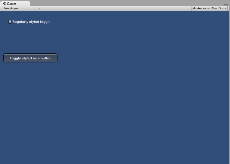
The difference between Skins and Styles
As stated earlier, GUISkins are a collection of GUIStyles. Styles define the appearance of a GUI Control. You do not have to use a Skin if you want to use a Style.
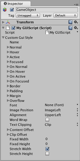
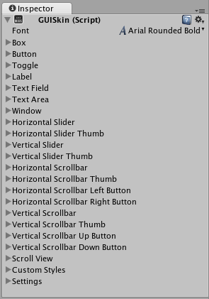 A single GUISkin shown in the Inspector - observe that it contains multiple GUIStyles
Working with Styles
All GUI Control functions have an optional last parameter: the GUIStyle to use for displaying the Control. If this is omitted, Unity’s default GUIStyle will be used. This works internally by applying the name of the control type as a string, so GUI.Button() uses the “button” style, GUI.Toggle() uses the “toggle” style, etc. You can override the default GUIStyle for a control by specifying it as the last parameter.
/* Override the default Control Style with a different style in the UnityGUI default Styles */


// JavaScript
function OnGUI () {
    // Make a label that uses the "box" GUIStyle.
    GUI.Label (Rect (0,0,200,100), "Hi - I'm a label looking like a box", "box");

    // Make a button that uses the "toggle" GUIStyle
    GUI.Button (Rect (10,140,180,20), "This is a button", "toggle");
}


// C#
using UnityEngine;
using System.Collections;

public class GUITest : MonoBehaviour {

    void OnGUI () {
        // Make a label that uses the "box" GUIStyle.
        GUI.Label (new Rect (0,0,200,100), "Hi - I'm a label looking like a box", "box");

        // Make a button that uses the "toggle" GUIStyle
        GUI.Button (new Rect (10,140,180,20), "This is a button", "toggle");
    }

}
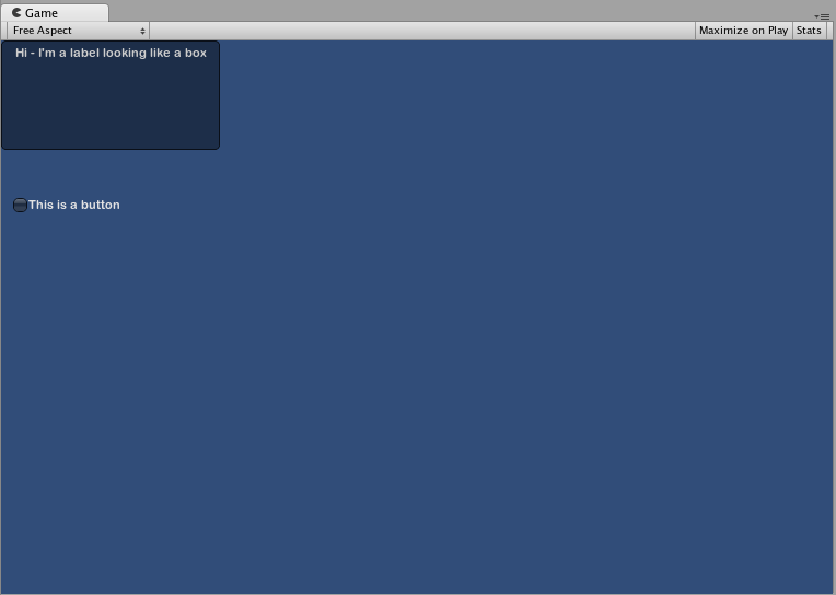
Making a public variable GUIStyle
When you declare a public GUIStyle variable, all elements of the Style will show up in the InspectorA Unity window that displays information about the currently selected GameObject, asset or project settings, allowing you to inspect and edit the values. More info
See in Glossary. You can edit all of the different values there.
/* Overriding the default Control Style with one you've defined yourself */


// JavaScript
var customButton : GUIStyle;

function OnGUI () {
    // Make a button. We pass in the GUIStyle defined above as the style to use
    GUI.Button (Rect (10,10,150,20), "I am a Custom Button", customButton);
}


// C#
using UnityEngine;
using System.Collections;

public class GUITest : MonoBehaviour {

    public GUIStyle customButton;

    void OnGUI () {
        // Make a button. We pass in the GUIStyle defined above as the style to use
        GUI.Button (new Rect (10,10,150,20), "I am a Custom Button", customButton);
    }

}
Changing the different style elements
When you have declared a GUIStyle, you can modify that style in the Inspector. There are a great number of States you can define, and apply to any type of Control.
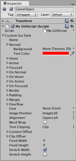
Any Control State must be assigned a Background Color before the specified Text Color will be applied.
For more information about individual GUIStyles, please read the GUIStyle Component Reference page.
Working with Skins
For more complicated GUI systems, it makes sense to keep a collection of styles in one place. This is what a GUISkin does. A GUISkin contains multiple different Styles, essentially providing a complete face-lift to all GUI Controls.
Creating a new GUISkin
To create a GUISkin, select Assets->Create->GUI Skin from the menu bar. This will create a GUI Skin in your Project Folder. Select it to see all GUIStyles defined by the Skin in the Inspector.
Applying the skin to a GUI
To use a skin you’ve created, assign it to GUI.skin in your OnGUI() function.
/* Make a property containing a reference to the skin you want to use */


// JavaScript
var mySkin : GUISkin;

function OnGUI () {
    // Assign the skin to be the one currently used.
    GUI.skin = mySkin;

    // Make a button. This will get the default "button" style from the skin assigned to mySkin.
    GUI.Button (Rect (10,10,150,20), "Skinned Button");
}


// C#
using UnityEngine;
using System.Collections;

public class GUITest : MonoBehaviour {

    public GUISkin mySkin;

    void OnGUI () {
        // Assign the skin to be the one currently used.
        GUI.skin = mySkin;

        // Make a button. This will get the default "button" style from the skin assigned to mySkin.
        GUI.Button (new Rect (10,10,150,20), "Skinned Button");
    }

}
You can switch skins as much as you like throughout a single OnGUI() call.
/* Example of switching skins in the same OnGUI() call */


// JavaScript
var mySkin : GUISkin;

var toggle = true;

function OnGUI () {
    // Assign the skin to be the one currently used.
    GUI.skin = mySkin;

    // Make a toggle. This will get the "button" style from the skin assigned to mySkin.
    toggle = GUI.Toggle (Rect (10,10,150,20), toggle, "Skinned Button", "button");

    // Assign the currently skin to be Unity's default.
    GUI.skin = null;

    // Make a button. This will get the default "button" style from the built-in skin.
    GUI.Button (Rect (10,35,150,20), "Built-in Button");
}


// C#
using UnityEngine;
using System.Collections;

public class GUITest : MonoBehaviour {

    public GUISkin mySkin;
    private bool toggle = true;

    void OnGUI () {
        // Assign the skin to be the one currently used.
        GUI.skin = mySkin;

        // Make a toggle. This will get the "button" style from the skin assigned to mySkin.
        toggle = GUI.Toggle (new Rect (10,10,150,20), toggle, "Skinned Button", "button");

        // Assign the currently skin to be Unity's default.
        GUI.skin = null;

        // Make a button. This will get the default "button" style from the built-in skin.
        GUI.Button (new Rect (10,35,150,20), "Built-in Button");
    }

}
Changing GUI Font Size
This example will show you how to dynamically change the font size through code.
First create a new project in Unity. Then make a C# script called Fontsize.cs and paste the following code in:
// C# example
using UnityEngine;

using System.Collections;

public class Fontsize : MonoBehaviour
{
    void OnGUI ()
    {
        //Set the GUIStyle style to be label
        GUIStyle style = GUI.skin.GetStyle ("label");

        //Set the style font size to increase and decrease over time
        style.fontSize = (int)(20.0f + 10.0f * Mathf.Sin (Time.time));

        //Create a label and display with the current settings
        GUI.Label (new Rect (10, 10, 200, 80), "Hello World!");
    }

}
Save the script and attach it to an empty GameObjectThe fundamental object in Unity scenes, which can represent characters, props, scenery, cameras, waypoints, and more. A GameObject’s functionality is defined by the Components attached to it. More info
See in Glossary, click play to see the font loop through increasing and decreasing in size over time. You may notice that the font does not smoothly change size, this is becauses there is not an infinite number of font sizes.
This specific example requires that the default font (Arial) is loaded and marked as dynamic. You cannot change the size of any font that is not marked as dynamic.