Unity Manual
- Unity User Manual 2023.2
- New in Unity 2023.2
- Packages and feature sets
- Released packages
- 2D Animation
- 2D Aseprite Importer
- 2D Pixel Perfect
- 2D PSD Importer
- 2D SpriteShape
- 2D Tilemap Extras
- Adaptive Performance
- Addressables
- Addressables for Android
- Ads Mediation
- Advertisement Legacy
- AI Navigation
- Alembic
- Analytics
- Android Logcat
- Animation Rigging
- Apple ARKit XR Plugin
- AR Foundation
- Authentication
- Build Automation
- Burst
- CCD Management
- Cinemachine
- Cloud Diagnostics
- Cloud Save
- Code Coverage
- Collections
- Deployment
- Device Simulator Devices
- Economy
- Editor Coroutines
- FBX Exporter
- Friends
- Google ARCore XR Plugin
- In App Purchasing
- Input System
- iOS 14 Advertising Support
- JetBrains Rider Editor
- Leaderboards
- Live Capture
- Lobby
- Localization
- Magic Leap XR Plugin
- Matchmaker
- Mathematics
- Memory Profiler
- ML Agents
- Mobile Notifications
- Multiplayer Tools
- Netcode for GameObjects
- Oculus XR Plugin
- OpenXR Plugin
- Player Accounts
- Polybrush
- Post Processing
- ProBuilder
- Profile Analyzer
- Push Notifications
- Python Scripting
- Recorder
- Relay
- Remote Config
- Scriptable Build Pipeline
- Sequences
- Splines
- Sysroot Base
- Sysroot Linux x64
- System Metrics Mali
- Terrain Tools
- Test Framework
- Timeline
- Toolchain Linux x64
- Toolchain MacOS Linux x64
- Toolchain Win Linux x64
- Tutorial Authoring Tools
- Tutorial Framework
- Unity Distribution Portal
- Unity OpenXR Meta
- Unity Profiling Core API
- Unity Transport
- User Generated Content
- User Generated Content Bridge
- User Reporting
- Version Control
- Visual Scripting
- Visual Studio Editor
- WebGL Publisher
- XR Hands
- XR Interaction Toolkit
- XR Plugin Management
- ZivaRT Player
- Release candidates
- Pre-release packages
- Core packages
- Built-in packages
- Accessibility
- AI
- Android JNI
- Animation
- Asset Bundle
- Audio
- Cloth
- Director
- Image Conversion
- IMGUI
- JSONSerialize
- NVIDIA
- Particle System
- Physics
- Physics 2D
- Screen Capture
- Terrain
- Terrain Physics
- Tilemap
- UI
- UIElements
- Umbra
- Unity Analytics
- Unity Web Request
- Unity Web Request Asset Bundle
- Unity Web Request Audio
- Unity Web Request Texture
- Unity Web Request WWW
- Vehicles
- Video
- VR
- Wind
- XR
- Experimental packages
- Packages by keywords
- Deprecated packages
- Unity's Package Manager
- How Unity works with packages
- Concepts
- Configuration
- Package Manager window
- Access the Package Manager window
- Navigation panel
- List panel
- Details panel
- Features (details panel)
- Finding packages and feature sets
- Add and remove UPM packages or feature sets
- Install a feature set from the Unity registry
- Install a UPM package from a registry
- Install a UPM package from the Asset Store
- Install a UPM package from a local folder
- Install a UPM package from a local tarball file
- Install a UPM package from a Git URL
- Install a UPM package by name
- Remove a UPM package from a project
- Switch to another version of a UPM package
- Add and remove asset packages
- Disable a built-in package
- Perform an action on multiple packages
- Finding package documentation
- Inspecting packages
- Scripting API for packages
- Scoped registries
- Resolution and conflict
- Project manifest
- Troubleshooting
- Creating custom packages
- Feature sets
- Released packages
- Install Unity
- Licenses and activation
- Upgrade Unity
- Create with Unity
- 2D or 3D projects
- Unity's interface
- The Project window
- The Scene view
- The Game view
- Device Simulator
- The Hierarchy window
- The Inspector window
- Editing properties
- The Toolbar
- The status bar
- The Background Tasks window
- Console Window
- Additional windows
- Undo
- Search in the Editor
- Customizing your workspace
- Unity shortcuts
- Quickstart guides
- Advanced best practice guides
- Create Gameplay
- Editor Features
- Analysis
- Memory in Unity
- Profiler overview
- Profiling your application
- Common Profiler markers
- The Profiler window
- Asset Loading Profiler module
- Audio Profiler module
- CPU Usage Profiler module
- File Access Profiler module
- Global Illumination Profiler module
- GPU Usage Profiler module
- Highlights Profiler Module
- Memory Profiler module
- Physics Profiler module
- Physics 2D Profiler module
- Rendering Profiler module
- UI and UI Details Profiler
- Video Profiler module
- Virtual Texturing Profiler module
- Customizing the Profiler
- Low-level native plug-in Profiler API
- Profiling tools
- Log files
- Understanding optimization in Unity
- Asset loading metrics
- Asset workflow
- Input
- 2D game development
- Introduction to 2D
- 2D game development quickstart guide
- 2D Sorting
- Work with sprites
- Tilemaps
- Essential tilemap steps and tools
- Active brush
- Create Tilemaps
- Create Tiles
- Create a Tile Palette
- Tile Palette editor tools
- Using the Select tool
- Move selected tiles with the Move tool
- Paint tiles with the Paint tool
- Use the Box Fill tool to fill an area with duplicated tiles
- Select tiles on the tilemap or Tile Palette with the Pick tool
- Remove tiles from the tilemap with the Eraser tool
- Fill an empty area with tiles with the Flood Fill tool
- Brush Picks
- Tilemap Collider 2D component reference
- Hexagonal Tilemaps
- Isometric Tilemaps
- Scriptable Tiles
- Scriptable Brushes
- Tile Palette visual elements
- Tilemap component reference
- Grid component reference
- Tilemap Renderer component reference
- Tile asset reference
- Tile Palette preferences reference
- Tile Palette editor reference
- Essential tilemap steps and tools
- Physics 2D Reference
- Graphics
- Render pipelines
- Render pipelines introduction
- Render pipeline feature comparison
- How to get, set, and configure the active render pipeline
- Choosing and configuring a render pipeline and lighting solution
- Using the Built-in Render Pipeline
- Using the Universal Render Pipeline
- Using the High Definition Render Pipeline
- Scriptable Render Pipeline fundamentals
- Creating a custom render pipeline
- Cameras
- Lighting
- Introduction to lighting
- Light sources
- Shadows
- The Lighting window
- Lighting Settings Asset
- The Light Explorer window
- Lightmapping
- Realtime Global Illumination using Enlighten
- Light Probes
- Reflection Probes
- Precomputed lighting data
- Debug Draw Modes for lighting
- Models
- Meshes
- Textures
- Importing Textures
- Texture Import Settings
- Default Import Settings reference
- Normal map Import Settings reference
- Editor GUI and Legacy GUI Import Settings reference
- Sprite (2D and UI) Import Settings reference
- Cursor Import Settings reference
- Cookie Import Settings reference
- Lightmap Import Settings reference
- Directional Lightmap Import Settings reference
- Shadowmask Import Settings reference
- Single Channel Import Settings reference
- Texture Import Settings
- Texture formats
- Mipmaps
- Render Texture
- Custom Render Textures
- Movie Textures
- 3D textures
- Texture arrays
- Cubemaps
- Cubemap arrays
- Streaming Virtual Texturing
- Streaming Virtual Texturing requirements and compatibility
- How Streaming Virtual Texturing works
- Enabling Streaming Virtual Texturing in your project
- Using Streaming Virtual Texturing in Shader Graph
- Cache Management for Virtual Texturing
- Marking textures as "Virtual Texturing Only"
- Virtual Texturing error material
- Sparse Textures
- Loading texture and mesh data
- Importing Textures
- Shaders
- Shaders core concepts
- Built-in shaders
- Standard Shader
- Standard Particle Shaders
- Autodesk Interactive shader
- Legacy Shaders
- Using Shader Graph
- Writing shaders
- Writing shaders overview
- ShaderLab
- ShaderLab: defining a Shader object
- ShaderLab: defining a SubShader
- ShaderLab: defining a Pass
- ShaderLab: adding shader programs
- ShaderLab: specifying package requirements
- ShaderLab: commands
- ShaderLab: grouping commands with the Category block
- ShaderLab command: AlphaToMask
- ShaderLab command: Blend
- ShaderLab command: BlendOp
- ShaderLab command: ColorMask
- ShaderLab command: Conservative
- ShaderLab command: Cull
- ShaderLab command: Offset
- ShaderLab command: Stencil
- ShaderLab command: UsePass
- ShaderLab command: GrabPass
- ShaderLab command: ZClip
- ShaderLab command: ZTest
- ShaderLab command: ZWrite
- ShaderLab legacy functionality
- HLSL in Unity
- GLSL in Unity
- Example shaders
- Writing Surface Shaders
- Writing shaders for different graphics APIs
- Understanding shader performance
- Materials
- Visual effects
- Post-processing and full-screen effects
- Particle systems
- Choosing your particle system solution
- Built-in Particle System
- Using the Built-in Particle System
- Particle System vertex streams and Standard Shader support
- Particle System GPU Instancing
- Particle System C# Job System integration
- Components and Modules
- Particle System
- Particle System modules
- Main module
- Emission module
- Shape module
- Velocity over Lifetime module
- Noise module
- Limit Velocity over Lifetime module
- Inherit Velocity module
- Lifetime by Emitter Speed module
- Force over Lifetime module
- Color over Lifetime module
- Color by Speed module
- Size over Lifetime module
- Size by Speed module
- Rotation over Lifetime module
- Rotation by Speed module
- External Forces module
- Collision module
- Triggers module
- Sub Emitters module
- Texture Sheet Animation module
- Lights module
- Trails module
- Custom Data module
- Renderer module
- Particle System Force Field
- Visual Effect Graph
- Decals and projectors
- Lens flares and halos
- Lines, trails, and billboards
- Sky
- Color
- Graphics API support
- Graphics performance and profiling
- Render pipelines
- World building
- Physics
- Built-in 3D Physics
- Character control
- Rigidbody physics
- Collision
- Joints
- Articulations
- Ragdoll physics
- Cloth
- Multi-scene physics
- Built-in 3D Physics
- Scripting
- Setting Up Your Scripting Environment
- Scripting concepts
- Important Classes
- Unity architecture
- Plug-ins
- Job system
- Unity Properties
- UnityWebRequest
- Multiplayer
- Audio
- Audio overview
- Audio files
- Tracker Modules
- Audio Mixer
- Native audio plug-in SDK
- Audio playlist randomization
- Audio Profiler
- Ambisonic Audio
- Audio Reference
- Audio Clip
- Audio Listener
- Audio Source
- Audio Mixer
- Audio Filters
- Audio Effects
- Audio Low Pass Effect
- Audio High Pass Effect
- Audio Echo Effect
- Audio Flange Effect
- Audio Distortion Effect
- Audio Normalize Effect
- Audio Parametric Equalizer Effect
- Audio Pitch Shifter Effect
- Audio Chorus Effect
- Audio Compressor Effect
- Audio SFX Reverb Effect
- Audio Low Pass Simple Effect
- Audio High Pass Simple Effect
- Reverb Zones
- Microphone
- Audio Settings
- Video overview
- Animation
- Animation system overview
- Rotation in animations
- Animation Clips
- Animator Controllers
- Retargeting of Humanoid animations
- Performance and optimization
- Animation Reference
- Animation FAQ
- Playables API
- A Glossary of animation terms
- Legacy Animation system
- User interface (UI)
- Comparison of UI systems in Unity
- UI Toolkit
- Get started with UI Toolkit
- UI Builder
- Structure UI
- The visual tree
- Structure UI with UXML
- Structure UI with C# scripts
- Custom controls
- Best practices for managing elements
- Encapsulate UXML documents with logic
- UXML elements reference
- UXML element BindableElement
- UXML element VisualElement
- UXML element BoundsField
- UXML element BoundsIntField
- UXML element Box
- UXML element Button
- UXML element ColorField
- UXML element CurveField
- UXML element DoubleField
- UXML element DropdownField
- UXML element EnumField
- UXML element EnumFlagsField
- UXML element FloatField
- UXML element Foldout
- UXML element GradientField
- UXML element GroupBox
- UXML element Hash128Field
- UXML element HelpBox
- UXML element IMGUIContainer
- UXML element Image
- UXML element InspectorElement
- UXML element IntegerField
- UXML element Label
- UXML element LayerField
- UXML element LayerMaskField
- UXML element LongField
- UXML element ListView
- UXML element MaskField
- UXML element MinMaxSlider
- UXML element MultiColumnListView
- UXML element MultiColumnTreeView
- UXML element ObjectField
- UXML element PopupWindow
- UXML element ProgressBar
- UXML element PropertyField
- UXML element RadioButton
- UXML element RadioButtonGroup
- UXML element RectField
- UXML element RectIntField
- UXML element RepeatButton
- UXML element RenderingLayerMaskField
- UXML element ScrollView
- UXML element Scroller
- UXML element Slider
- UXML element SliderInt
- UXML element Tab
- UXML element TabView
- UXML element TagField
- UXML element TextElement
- UXML element TextField
- UXML element TemplateContainer
- UXML element Toggle
- UXML element ToggleButtonGroup
- UXML element Toolbar
- UXML element ToolbarBreadcrumbs
- UXML element ToolbarButton
- UXML element ToolbarMenu
- UXML element ToolbarPopupSearchField
- UXML element ToolbarSearchField
- UXML element ToolbarSpacer
- UXML element ToolbarToggle
- UXML element TreeView
- UXML element TwoPaneSplitView
- UXML element UnsignedLongField
- UXML element UnsignedIntegerField
- UXML element Vector2Field
- UXML element Vector2IntField
- UXML element Vector3Field
- UXML element Vector3IntField
- UXML element Vector4Field
- Structure UI examples
- Create list and tree views
- Create a complex list view
- Create a list view runtime UI
- Wrap content inside a scroll view
- Create a tabbed menu
- Create a pop-up window
- Use Toggle to create a conditional UI
- Create a custom control with two attributes
- Create a slide toggle custom control
- Create a bindable custom control
- Create a custom style for a custom control
- Create a drag-and-drop list and tree views between windows
- Create an aspect ratio custom control
- Style UI
- UI Toolkit Debugger
- Control behavior with events
- UI Renderer
- Data binding
- Comparison of the binding systems
- Runtime data binding
- SerializedObject data binding
- Introduction to SerializedObject data binding
- Bindable elements reference
- Bindable data types and fields
- Binding system implementation details
- Binding examples
- Bind with binding path in C# script
- Bind without the binding path
- Bind with UXML and C# script
- Create a binding with the Inspector
- Bind to nested properties
- Bind to a UXML template
- Receive callbacks when a bound property changes
- Receive callbacks when any bound properties change
- Bind to a list with ListView
- Bind to a list without ListView
- Bind a custom control
- Bind a custom control to custom data type
- Support for Editor UI
- Support for runtime UI
- Work with text
- Examples
- Migration guides
- Unity UI
- Immediate Mode GUI (IMGUI)
- Unity Services
- Setting up your project for Unity services
- Unity Organizations
- Unity Ads
- Unity Analytics
- Unity Cloud Content Delivery
- Unity Build Automation (formerly Cloud Build)
- Unity IAP
- Setting up Unity IAP
- Cross Platform Guide
- Codeless IAP
- Defining products
- Subscription Product support
- Initialization
- Browsing Product Metadata
- Initiating Purchases
- Processing Purchases
- Handling purchase failures
- Restoring Transactions
- Purchase Receipts
- Receipt validation
- Store Extensions
- Cross-store installation issues with Android in-app purchase stores
- Store Guides
- Implementing a Store
- Unity Cloud Diagnostics
- Unity Integrations
- Multiplayer services
- Unity Distribution Portal
- Unity Accelerator
- XR
- Unity's Asset Store
- Asset Store packages
- Publishing to the Asset Store
- Creating your Publisher Account
- Creating a new package draft
- Deleting a package draft
- Uploading assets to your package
- Filling in the package details
- Submitting your package for approval
- Viewing the status of your Asset Store submissions
- Collecting revenue
- Providing support to your customers
- Adding tags to published packages
- Connecting your account to Google Analytics
- Promoting your Assets
- Refunding your customers
- Upgrading packages
- Deprecating your Assets
- Issuing vouchers
- Managing your publishing team
- Asset Store Publisher portal
- Verified Solutions
- Platform development
- Using Unity as a Library in other applications
- Deep linking
- Xcode frame debugger Unity integration
- Android
- Introducing Android
- Getting started with Android
- Developing for Android
- Android mobile scripting
- Input for Android devices
- Android application size restrictions
- Graphics for Android
- Testing and debugging
- Optimization for Android
- Create and use plug-ins in Android
- Integrating Unity into Android applications
- Android application entry points
- Deep linking on Android
- Device features and permissions
- Handle Android crashes
- Quit a Unity Android application
- Building and delivering for Android
- ChromeOS
- Dedicated Server
- iOS
- Introducing iOS
- Getting started with iOS
- Developing for iOS
- iOS Scripting
- Input for iOS devices
- Unity's Device Simulator for iOS
- Unity Remote
- Managed stack traces on iOS
- Optimize performance for iOS
- Native plug-ins for iOS
- Integrating Unity into native iOS applications
- Deep linking on iOS
- iOS authorizations in Unity
- Preparing your application for In-App Purchases (IAP)
- Social API
- Troubleshooting on iOS devices
- Reporting crash bugs on iOS
- Building and delivering for iOS
- Linux
- macOS
- tvOS
- Web
- Web introduction
- Web development
- Web Player settings
- Interaction with browser scripting
- Code examples: Call JavaScript and C/C++/C# functions in Unity
- Set up your JavaScript plug-in
- Call JavaScript functions from Unity C# scripts
- Call Unity C# script functions from JavaScript
- Call C/C++/C# functions from Unity C# scripts
- Compile a static library as a Unity plug-in
- Create callbacks between Unity C#, JavaScript, and C/C++/C# code
- Replace deprecated browser interaction code
- Web native plug-ins for Emscripten
- Memory in Unity Web
- Cache behavior in Web
- Web graphics
- Audio in Web
- Video playback in Web
- Texture compression in Web
- Embedded resources in Web
- Input in Web
- Configure a Web Canvas size
- Web browser access to device features
- Web networking
- Cursor locking and full-screen mode in Web
- Web performance considerations
- Debug and troubleshoot Web builds
- Build and distribute a Web application
- Windows
- Universal Windows Platform
- Introduction to Universal Windows Platform
- Get started with Universal Windows Platform
- Develop for Universal Windows Platform
- Build and deliver for Universal Windows Platform
- Unity Search
- Glossary
- User interface (UI)
- UI Toolkit
- UI Builder
- Work with elements
Work with elements
The most basic building block in UI(User Interface) Allows a user to interact with your application. Unity currently supports three UI systems. More info
See in Glossary Toolkit is a `VisualElement’. These elements are ordered into a hierarchy tree with parent-child relationships. This is called the visual treeAn object graph, made of lightweight nodes, that holds all the elements in a window or panel. It defines every UI you build with the UI Toolkit.
See in Glossary.
Add elements
You need to add elements to the hierarchy to create UI. To add an element to the hierarchy in UI Builder, drag it from the Library tab into the Hierarchy window. You can also double-click on an element in the Library to append it to the Hierarchy. By default, elements aren’t named, so they appear in the Hierarchy as their type name.
To name an element, double-click on the item in the Hierarchy, or update the Name attribute in the element’s InspectorA Unity window that displays information about the currently selected GameObject, asset or project settings, allowing you to inspect and edit the values. More info
See in Glossary window.
Unique naming in UI Toolkit isn’t enforced, so they’re only for identification within the UI. UI Builder doesn’t use element names for any internal identification or functionality.
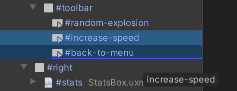
To build a hierarchy, you can drag one or more elements in the Hierarchy to reorder them or move them between parents:

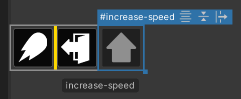
You can also drag elements into and from the Canvas, where a yellow line appears to indicate the element placement:

Manipulate elements
To copy, paste, duplicate, or delete one or more selected elements, right-click on an element and select the option in the menu. You can also use the standard short-cut keys for your operating system.
When you copy an element in the Hierarchy pane, it copies the UXML text representation of the element and its children. This means you can paste it directly into a text editor. You can also copy UXML text and paste it into the UI Builder.
All actions you do to an element are also applied to all its children. For example, deleting an element deletes all its children and duplicating an element replicates the entire sub-tree of elements under it.
Read-only elements
When you drag an element from the Library tab to the Hierarchy tab, you might notice additional child elements appearing in a dimmed state. These are read-only elements. This happens with some built-in UI controls, and some custom elements that create their internal hierarchy upon creation.
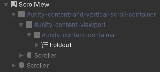
When you add child elements to a VisualElement, children elements are added to the contentContainer of this parent element. For example, the ScrollViewA UI Control which displays a large set of Controls in a viewable area that you can see by using a scrollbar. More info
See in Glossary below has one Foldout child element that’s inside the contentContainer. It also has several Scroller child elements that are in the shadow tree. The shadow tree is the hierarchy of child elements that are outside of the contentContainer of this element.

As the UI Builder can only edit what it can represent in the UXML Document, it is not possible to edit the internal hierarchy. UXML is not a direct copy of the live UI hierarchy but rather an instruction set.
Attributes in UXML
Elements have per-element attributes which can be set in UXML. You can think of them as a constructor or initialization arguments. This includes the name attribute. The base VisualElement class comes with a few standard attributes that all elements share (since all elements inherit from VisualElement), like name, tooltip, and tabindex. More advanced elements and controls have additional attributes you can set, for example, the Label adds the text attribute.
Note: You can use the Enter key to add newline characters for the text attribute.
Change attributes in the Inspector
All standard and custom attributes appear in the Attribute section at the top of the Inspector window.
You can set the value of an attribute in the attribute section. If the field appears bold with a solid line on the left of the field’s label, it means the attribute is already set and not using the default. For example, setting tooltip from empty to test and then back to empty is different from never setting it in the first place: the first case is unset while the second case is set to empty. What this attribute is set means is there’s an entry in the UXML text on this element setting this attribute to avalue
If the attribute doesn’t appear in the UXML file, it’s not set.
To unset an attribute, right-click on the field’s label and select Unset.
To unset all attributes, right-click on the field’s label and select Unset All.
Change attributes in the Canvas
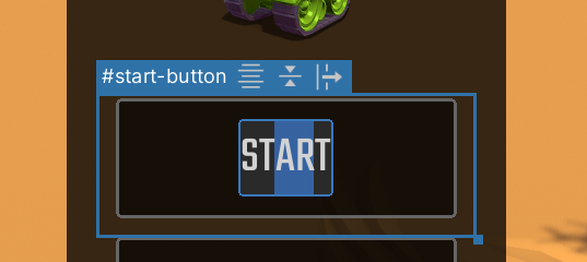
The only attribute you can change directly in the Canvas is the text attribute on text elements such as a Button or a Label. To change the text attribute in the Canvas, double-click on it in the Canvas.

To commit the change, press the Enter key. If the text attribute contains newline characters, use Shift + Enter to commit the change.
To cancel the change, press the Esc key.