USS 支持的属性
本主题列出了支持的 USS 属性及其接受的值。
USS 数据类型
USS 数据类型定义 USS 属性接受的值和关键字。
| 属性 | 描述 |
|---|---|
<length> |
表示距离值。 |
<number> |
表示整数或带小数的数字。 |
<integer> |
表示整数。 |
<color> |
表示颜色。可使用 #hexadecimal 代码、rgb() 或 rgba() 函数或颜色关键字(例如 blue 或 transparent)来定义颜色。 |
<resource> |
表示 Resources 文件夹中的资源。 |
<url> |
表示通过路径指定的资源。可将路径表示为相对路径或绝对路径。 |
USS 语法
UI 工具包样式属性使用与 W3C CSS 文档相同的语法句法:
- 关键字值按原样显示。例如:
auto、baseline。 - 基本数据类型出现在尖括号(
<和>)之间。例如:<length>、<color>。 - 与属性同名的非尾端出现在尖括号与单直引号(
<'和'>)之间。例如:<'width'>。
如果属性值包含多个组件:
- 并列的词语意味着它们全部必须按给定顺序出现。
- A bar (
|) separates two or more alternatives: exactly one must occur. - A double bar (
||) separates two or more options: one or more must occur, in any order. - 双 & 符号 (
&&) 分隔两个或多个组件:全部都必须出现,顺序任意。 - 方括号 (
[]) 表示分组。
每个类型、关键字或尖括号组的后面都可以跟修饰符:
- 星号 (
*) 表示前面的类型、词或组出现零次或多次。 - 加号 (
+) 表示前面的类型、词或组出现一次或多次。 - 问号 (
?) 表示前面的类型、词或组是可选的。 - 花括号中的一对数字 (
{A,B}) 表示前面的类型、词或组出现至少A次且最多B次。
继承的属性
如果没有为继承的属性指定任何值,该元素将从其父元素获取值。例如,使用继承的属性来设置所有元素的字体。
css
:root {
    -unity-font: resource("Font/consola.ttf");
}
继承的属性如下:
- color
- font-size
- -unity-font
- -unity-font-style
- -unity-text-align
- visibility
- whitespace
框形模型
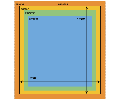
尺寸
width: <length> | auto
height: <length> | auto
min-width: <length> | auto
min-height: <length> | auto
max-width: <length> | none
max-height: <length> | none
width 和 height 指定元素的大小。如果未指定 width,则宽度基于元素内容的宽度。如果未指定 height,则高度基于元素内容的高度。
边距
margin-left: <length> | auto;
margin-top: <length> | auto
margin-right: <length> | auto
margin-bottom: <length> | auto
简便写法
margin: [<length> | auto]{1,4}
margin 简便选项的应用方式如下:
| 选项 | 描述 |
|---|---|
| 1 个长度 | 应用于所有四个边距。 |
| 2 个长度 | 第一个应用于 margin-top 和 margin-bottom。第二个应用于 margin-left 和 margin-right。 |
| 3 个长度 | 第一个应用于 margin-top。第二个应用于 margin-left 和 margin-right。第三个应用于 margin-bottom。 |
| 4 个长度 | 按此顺序应用长度:margin-top、margin-right、margin-bottom、margin-left
|
边框
border-left-width: <length>
border-top-width: <length>
border-right-width: <length>
border-bottom-width: <length>
简便写法
border-width: <length>{1,4}
border-width 简便选项的应用方式如下:
| 选项 | 描述 |
|---|---|
| 1 个长度 | 应用于所有四个边框宽度。 |
| 2 个长度 | 第一个应用于 border-top-width 和 border-bottom-width。第二个应用于 border-left-width 和 border-right-width。 |
| 3 个长度 | 第一个应用于 border-top-width。第二个应用于 border-left-width 和 border-right-width。第三个应用于 border-bottom-width。 |
| 4 个长度 | 按此顺序应用长度:border-top-width、border-right-width、border-bottom-width、border-left-width
|
填充
padding-left: <length>
padding-top: <length>
padding-right: <length>
padding-bottom: <length>
简便写法
padding: <length>{1,4}
padding 简便选项的应用方式如下:
| 选项 | 描述 |
|---|---|
| 1 个长度 | 应用于所有四个填充。 |
| 2 个长度 | 第一个应用于 padding-top 和 padding-bottom。第二个应用于 padding-left 和 padding-right。 |
| 3 个长度 | 第一个应用于 padding-top。第二个应用于 padding-left 和 padding-right。第三个应用于 padding-bottom。 |
| 4 个长度 | 按此顺序应用长度:padding-top、padding-right、padding-bottom、padding-left
|
灵活布局
此部分列出了用于定位视觉元素的属性。UI 工具包包括一个布局引擎,可根据布局和样式属性定位视觉元素。该布局引擎实现一个名为 Flexbox 的 HTML/CSS 布局系统的子集。
默认情况下,所有项都垂直放置在其容器中。
项
flex-grow: <number>
flex-shrink: <number>
flex-basis: <length> | auto
flex: none | [ <'flex-grow'> <'flex-shrink'>?|| <'flex-basis'> ]
align-self: auto | flex-start | flex-end | center | stretch
容器
flex-direction: row | row-reverse | column | column-reverse
flex-wrap: nowrap | wrap | wrap-reverse
align-content: flex-start | flex-end | center | stretch
align-items: flex-start | flex-end | center | stretch
justify-content: flex-start | flex-end | center | space-between | space-around
相对和绝对位置
定位
position: absolute | relative
默认情况下,此属性设置为 relative:根据父级来定位元素。如果此属性设置为 absolute,则元素将保留其父级布局,并根据父级边界指定值。
位置
left: <length> | auto
top: <length> | auto
right: <length> | auto
bottom: <length> | auto
相对于元素父级边缘或原始位置的距离。
绘制属性
绘制属性用于设置视觉元素的背景、边框和外观。
背景
background-color: <color>
background-image: <resource> | <url> | none
-unity-background-scale-mode: stretch-to-fill | scale-and-crop | scale-to-fit
-unity-background-image-tint-color: <color>
切片
分配背景图像时,可以根据简化的九宫格规范来绘制该图像:
-unity-slice-left: <integer>
-unity-slice-top: <integer>
-unity-slice-right: <integer>
-unity-slice-bottom: <integer>
边框
border-color: <color>
border-top-left-radius: <length>
border-top-right-radius: <length>
border-bottom-left-radius: <length>
border-bottom-right-radius: <length>
简便写法
border-radius: <length>{1,4}
border-radius 简便选项的应用方式如下:
| 选项 | 描述 |
|---|---|
| 1 个长度 | 应用于所有四个边框半径属性。 |
| 2 个长度 | 第一个应用于 border-top-left-radius 和 border-bottom-right-radius。第二个应用于 border-bottom-left-radius 和 border-top-right-radius
|
| 3 个长度 | 第一个应用于 border-top-left-radius。第二个应用于 border-bottom-left-radius 和 border-top-right-radius。第三个应用于 border-bottom-right-radius。 |
| 4 个长度 | 按此顺序应用长度:border-top-left-radius、border-top-right-radius、border-bottom-right-radius、border-bottom-left-radius
|
外观
overflow: hidden | visible
-unity-overflow-clip-box: padding-box | content-box
opacity: <number>
visibility: visible | hidden
display: flex | none
display 默认值为 flex。将 display 设置为 none 将删除此元素。将 visibility 设置为 hidden 将隐藏该元素,但是该元素仍会占用布局中的空间。
-unity-overflow-clip-box 定义元素内容的裁剪矩形。默认值为 padding-box,表示位于填充区域外部的矩形(上文的框形模型图像中的绿色矩形);content-box 表示位于填充区域内的值(上文的框形模型图像中的蓝色矩形)。
文本属性
文本属性用于设置颜色、字体、字体大小以及 Unity 特有属性(字体资源、字形、对齐、自动换行和剪切)。
color: <color>
-unity-font: <resource> | <url>
font-size: <number>
-unity-font-style: normal | italic | bold | bold-and-italic
-unity-text-align: upper-left | middle-left | lower-left | upper-center | middle-center | lower-center | upper-right | middle-right | lower-right
white-space: normal | nowrap
光标属性
使用 cursor 默认纹理类型可为光标导入自定义纹理。
cursor: [ [ <resource> | <url> ] [ <integer> <integer>]?, ] [ arrow | text | resize-vertical | resize-horizontal | link | slide-arrow | resize-up-right | resize-up-left | move-arrow | rotate-arrow | scale-arrow | arrow-plus | arrow-minus | pan | orbit | zoom | fps | split-resize-up-down | split-resize-left-right ]
- 2019–05–23 页面已修订
Did you find this page useful? Please give it a rating: