Manual
- Unity User Manual 2020.2
- New in Unity 2020.2
- Packages
- Verified packages
- 2D Animation
- 2D Pixel Perfect
- 2D PSD Importer
- 2D SpriteShape
- Adaptive Performance
- Adaptive Performance Samsung Android
- Addressables
- Advertisement
- Alembic
- Analytics Library
- Android Logcat
- Animation Rigging
- AR Foundation
- ARCore XR Plugin
- ARKit Face Tracking
- ARKit XR Plugin
- Burst
- Cinemachine
- Core RP Library
- Editor Coroutines
- High Definition RP
- In App Purchasing
- Input System
- JetBrains Rider Editor
- Magic Leap XR Plugin
- ML Agents
- Mobile Notifications
- Multiplayer HLAPI
- Oculus XR Plugin
- OpenXR Plugin
- Polybrush
- ProBuilder
- Profile Analyzer
- Quick Search
- Remote Config
- Scriptable Build Pipeline
- Shader Graph
- Test Framework
- TextMeshPro
- Timeline
- Unity Collaborate
- Unity Distribution Portal
- Unity Recorder
- Universal RP
- Visual Effect Graph
- Visual Studio Code Editor
- Visual Studio Editor
- Windows XR Plugin
- Xiaomi SDK
- XR Plugin Management
- Preview packages
- Core packages
- Built-in packages
- AI
- Android JNI
- Animation
- Asset Bundle
- Audio
- Cloth
- Director
- Image Conversion
- IMGUI
- JSONSerialize
- Particle System
- Physics
- Physics 2D
- Screen Capture
- Terrain
- Terrain Physics
- Tilemap
- UI
- UIElements
- Umbra
- Unity Analytics
- Unity Web Request
- Unity Web Request Asset Bundle
- Unity Web Request Audio
- Unity Web Request Texture
- Unity Web Request WWW
- Vehicles
- Video
- VR
- Wind
- XR
- Packages by keywords
- Unity's Package Manager
- Creating custom packages
- Verified packages
- Working in Unity
- Installing Unity
- Upgrading Unity
- Using the API Updater
- Upgrading to Unity 2020.2
- Upgrading to Unity 2020.1
- Upgrading to Unity 2019 LTS
- Upgrading to Unity 2018 LTS
- Legacy Upgrade Guides
- Unity's interface
- Asset workflow
- Создание геймплея.
- Editor Features
- 2D and 3D mode settings
- Preferences
- Presets
- Shortcuts Manager
- Build Settings
- Project Settings
- Visual Studio C# integration
- RenderDoc Integration
- Using the Xcode frame debugger
- Editor Analytics
- Проверка обновлений
- IME в Unity
- Специальные Папки Проекта
- Reusing Assets between Projects
- Version Control
- Multi-Scene editing
- Safe Mode
- Command line arguments
- Support for custom Menu Item and Editor features
- Text-Based Scene Files
- Решение проблем в редакторе
- Analysis
- Importing
- Input
- 2D
- Геймплей в 2D
- 2D Sorting
- Sprites
- Tilemap
- Physics Reference 2D
- Графика
- Render pipelines
- Cameras
- Post-processing
- Lighting
- Introduction to lighting
- Light sources
- Shadows
- The Lighting window
- Lighting Settings Asset
- The Light Explorer window
- Lightmapping
- The Progressive Lightmapper
- Lightmapping using Enlighten (deprecated)
- Lightmapping: Getting started
- Lightmap Parameters Asset
- Directional Mode
- Lightmaps and LOD
- Ambient occlusion
- Lightmaps: Technical information
- Lightmapping and the Shader Meta Pass
- Lightmap UVs
- UV overlap
- Lightmap seam stitching
- Custom fall-off
- Realtime Global Illumination using Enlighten (deprecated)
- Light Probes
- Reflection Probes
- Precomputed lighting data
- Scene View Draw Modes for lighting
- Meshes, Materials, Shaders and Textures
- Mesh Components
- Creating and Using Materials
- Текстуры
- Writing Shaders
- Standard Shader
- Standard Particle Shaders
- Autodesk Interactive shader
- Legacy Shaders
- Shader Reference
- Writing Surface Shaders
- Writing vertex and fragment shaders
- Примеры вершинных и фрагментных шейдеров
- Shader semantics
- Accessing shader properties in Cg/HLSL
- Providing vertex data to vertex programs
- Встроенные подключаемые файлы для шейдеров
- Стандартные шейдерные предпроцессорные макросы
- Built-in shader helper functions
- Built-in shader variables
- Shader variants and keywords
- GLSL Shader programs
- Shading language used in Unity
- Shader Compilation Target Levels
- Shader data types and precision
- Using sampler states
- Синтаксис ShaderLab: Shader
- Синтаксис ShaderLab: свойства
- Синтаксис ShaderLab: SubShader
- Синтаксис ShaderLab: Pass
- ShaderLab culling and depth testing
- Синтаксис ShaderLab: Blending
- Синтаксис ShaderLab: тэги Pass
- Синтаксис ShaderLab: Stencil
- Синтаксис ShaderLab: Name
- Синтаксис ShaderLab: цвет, материал, освещение
- ShaderLab: Legacy Texture Combiners
- Синтакс ShaderLab: Альфа тестинг (Alpha testing)
- Синтаксис ShaderLab: туман
- Синтаксис ShaderLab: BindChannels
- Синтаксис ShaderLab: UsePass
- Синтаксис ShaderLab: GrabPass
- ShaderLab: SubShader Tags
- ShaderLab: SubShader LOD value
- Синтаксис ShaderLab: Pass
- Синтаксис ShaderLab: Fallback
- #Синтаксис ShaderLab: CustomEditor
- Синтаксис ShaderLab: другие команды
- Shader assets
- Расширенные возможности ShaderLab
- Optimizing shader variants
- Asynchronous Shader compilation
- Performance tips when writing shaders
- Rendering with Replaced Shaders
- Custom Shader GUI
- Использование текстур глубины
- Текстура глубины камеры
- Особенности рендеринга различных платформ
- Using texture arrays in shaders
- Debugging DirectX 11/12 shaders with Visual Studio
- Debugging DirectX 12 shaders with PIX
- Implementing Fixed Function TexGen in Shaders
- Particle systems
- Choosing your particle system solution
- Built-in Particle System
- Using the Built-in Particle System
- Particle System vertex streams and Standard Shader support
- Particle System GPU Instancing
- Particle System C# Job System integration
- Components and Modules
- Particle System
- Particle System modules
- Particle System Main module
- Emission module
- Shape Module
- Velocity over Lifetime module
- Noise module
- Limit Velocity Over Lifetime module
- Inherit Velocity module
- Lifetime by Emitter Speed
- Force Over Lifetime module
- Color Over Lifetime module
- Color By Speed module
- Size over Lifetime module
- Size by Speed module
- Rotation Over Lifetime module
- Rotation By Speed module
- External Forces module
- Collision module
- Triggers module
- Sub Emitters module
- Texture Sheet Animation module
- Lights module
- Trails module
- Custom Data module
- Renderer module
- Particle System Force Field
- Built-in Particle System examples
- Visual Effect Graph
- Creating environments
- Sky
- Visual Effects Components
- Advanced rendering features
- High dynamic range
- Level of Detail (LOD) for meshes
- Graphics API support
- Streaming Virtual Texturing
- Streaming Virtual Texturing requirements and compatibility
- How Streaming Virtual Texturing works
- Enabling Streaming Virtual Texturing in your project
- Using Streaming Virtual Texturing in Shader Graph
- Cache Management for Virtual Texturing
- Marking textures as "Virtual Texturing Only"
- Virtual Texturing error material
- Compute shaders
- GPU instancing
- Делимые текстуры (Sparse Textures)
- CullingGroup API
- Loading texture and mesh data
- Оптимизация производительности графики
- Color space
- Graphics tutorials
- Как мне исправить вращение импортированной модели?
- Art Asset best practice guide
- Importing models from 3D modeling software
- Making believable visuals in Unity
- Update: believable visuals in URP and HDRP
- Believable visuals: preparing assets
- Believable visuals: render settings
- Believable visuals: lighting strategy
- Believable visuals: models
- Believable visuals: materials and shaders
- Believable visuals: outdoor lighting
- Believable visuals: indoor and local lighting
- Believable visuals: post-processing
- Believable visuals: dynamic lighting
- Setting up the Rendering Pipeline and Lighting in Unity
- Physics
- Scripting
- Setting Up Your Scripting Environment
- Scripting concepts
- Important Classes
- Important Classes - GameObject
- Important Classes - MonoBehaviour
- Important Classes - Object
- Important Classes - Transform
- Important Classes - Vectors
- Important Classes - Quaternion
- ScriptableObject
- Important Classes - Time and Framerate Management
- Important Classes - Mathf
- Important Classes - Random
- Important Classes - Debug
- Important Classes - Gizmos & Handles
- Unity architecture
- Plug-ins
- C# Job System
- Multiplayer and Networking
- Multiplayer Overview
- Setting up a multiplayer project
- Using the Network Manager
- Using the Network Manager HUD
- The Network Manager HUD in LAN mode
- The Network Manager HUD in Matchmaker mode
- Converting a single-player game to Unity Multiplayer
- Debugging Information
- The Multiplayer High Level API
- Multiplayer Component Reference
- Multiplayer Classes Reference
- Multiplayer Encryption Plug-ins
- UnityWebRequest
- Аудио
- Аудио. Обзор.
- Аудио файлы
- Трекерные модули
- Audio Mixer
- Native Audio Plugin SDK
- Audio Profiler
- Ambisonic Audio
- Справочник по аудио
- Audio Clip
- Audio Listener
- Audio Source
- Audio Mixer
- Аудио эффекты (только для Pro версии)
- Audio Effects
- Audio Low Pass Effect
- Audio High Pass Effect
- Audio Echo Effect
- Audio Flange Effect
- Audio Distortion Effect
- Audio Normalize Effect
- Audio Parametric Equalizer Effect
- Audio Pitch Shifter Effect
- Audio Chorus Effect
- Audio Compressor Effect
- Audio SFX Reverb Effect
- Audio Low Pass Simple Effect
- Audio High Pass Simple Effect
- Reverb Zones
- Микрофон
- Audio Settings
- Video overview
- Анимация
- Animation System Overview
- Анимационные клипы
- Animator Controllers (контроллеры аниматоров)
- Аниматор и контроллер аниматора
- The Animator Window
- Конечные автоматы в анимации
- Blend Trees (Деревья смешивания)
- Working with blend shapes
- Animator Override Controllers
- Переназначение гуманоидных анимаций
- Performance and optimization
- Animation Reference
- Кривые анимации и события
- Playables API
- Словарь терминов анимации и Mecanim.
- Creating user interfaces (UI)
- Comparison of UI systems in Unity
- UI Toolkit
- Unity UI
- Сanvas (Полотно)
- Basic Layout
- Визуальные компоненты
- Компоненты взаимодействия
- Animation Integration
- Auto Layout
- Rich Text
- Event System
- Справка по пользовательским интерфейсам
- Rect Transform
- Canvas Components
- Visual Components
- Interaction Components
- Auto Layout
- Справка по системе событий
- Практические рекомендации по работе с UI (пользовательскими интерфейсами)
- Immediate Mode GUI (IMGUI)
- Навигация и поиск пути
- Navigation Overview
- Navigation System in Unity
- Inner Workings of the Navigation System
- Building a NavMesh
- NavMesh building components
- Advanced NavMesh Bake Settings
- Creating a NavMesh Agent
- Creating a NavMesh Obstacle
- Creating an Off-mesh Link
- Building Off-Mesh Links Automatically
- Building Height Mesh for Accurate Character Placement
- Navigation Areas and Costs
- Loading Multiple NavMeshes using Additive Loading
- Using NavMesh Agent with Other Components
- Справочник по навигации
- Navigation How-Tos
- Navigation Overview
- Unity Services
- Setting up your project for Unity services
- Unity Organizations
- Unity Ads
- Unity Analytics
- Unity Analytics Overview
- Setting Up Analytics
- Analytics Dashboard
- Analytics events
- Funnels
- Remote Settings
- Unity Analytics A/B Testing
- Monetization
- User Attributes
- Unity Analytics Raw Data Export
- Data reset
- Upgrading Unity Analytics
- COPPA Compliance
- Unity Analytics and the EU General Data Protection Regulation (GDPR)
- Analytics Metrics, Segments, and Terminology
- Unity Cloud Build
- Automated Build Generation
- Supported platforms
- Supported versions of Unity
- Share links
- Version control systems
- Using the Unity Developer Dashboard to configure Unity Cloud Build for Git
- Using the Unity Developer Dashboard to configure Unity Cloud Build for Mercurial
- Using Apache Subversion (SVN) with Unity Cloud Build
- Using the Unity Developer Dashboard to configure Unity Cloud Build for Perforce
- Using the Unity Developer Dashboard to configure Unity Cloud Build for Plastic
- Building for iOS
- Advanced options
- Using Addressables in Unity Cloud Build
- Build manifest
- Scheduled builds
- Cloud Build REST API
- Unity Cloud Content Delivery
- Unity IAP
- Setting up Unity IAP
- Cross Platform Guide
- Codeless IAP
- Defining products
- Subscription Product support
- Initialization
- Browsing Product Metadata
- Initiating Purchases
- Processing Purchases
- Handling purchase failures
- Restoring Transactions
- Purchase Receipts
- Receipt validation
- Store Extensions
- Cross-store installation issues with Android in-app purchase stores
- Store Guides
- Implementing a Store
- Unity Collaborate
- Setting up Unity Collaborate
- Adding team members to your Unity project
- Viewing history
- Enabling Cloud Build with Collaborate
- Managing Unity Editor versions
- Reverting files
- Resolving file conflicts
- Excluding Assets from publishing to Collaborate
- Publishing individual files to Collaborate
- Restoring previous versions of a project
- In-Progress edit notifications
- Managing cloud storage
- Moving your Project to another version control system
- Unity Accelerator
- Collaborate troubleshooting tips
- Unity Cloud Diagnostics
- Unity Integrations
- Multiplayer Services
- Unity Distribution Portal
- XR
- Getting started with AR development in Unity
- Getting started with VR development in Unity
- XR Plug-in Framework
- Configuring your Unity Project for XR
- Universal Render Pipeline compatibility in XR
- XR API reference
- Single Pass Stereo rendering (Double-Wide rendering)
- VR Audio Spatializers
- VR frame timing
- Unity XR SDK
- Open-source repositories
- Asset Store Publishing
- Creating your Publisher Account
- Creating a new package draft
- Deleting a package draft
- Uploading Assets to your package
- Filling in the package details
- Submitting your package for approval
- Viewing the status of your Asset Store submissions
- Collecting revenue
- Providing support to your customers
- Adding tags to published packages
- Connecting your account to Google Analytics
- Promoting your Assets
- Refunding your customers
- Upgrading packages
- Deprecating your Assets
- Issuing vouchers
- Managing your publishing team
- Asset Store Publisher portal
- Platform development
- Using Unity as a Library in other applications
- Enabling deep linking
- Автономный
- macOS
- Apple TV
- WebGL
- Getting started with WebGL development
- WebGL Player settings
- Building and running a WebGL project
- WebGL: Compressed builds and server configuration
- WebGL: Server configuration code samples
- WebGL Browser Compatibility
- WebGL Graphics
- Using Audio In WebGL
- Embedded Resources on WebGL
- Using WebGL templates
- Cursor locking and full-screen mode in WebGL
- Input in WebGL
- WebGL: Interacting with browser scripting
- WebGL performance considerations
- Memory in WebGL
- Debugging and troubleshooting WebGL builds
- WebGL Networking
- Getting started with WebGL development
- iOS
- Integrating Unity into native iOS applications
- Первые шаги в iOS разработке
- iOS build settings
- iOS Player settings
- Продвинутые темы по iOS
- Troubleshooting on iOS devices
- Сообщение об ошибках, приводящих к "падениям" на iOS
- Android
- Android environment setup
- Integrating Unity into Android applications
- Unity Remote
- Android Player settings
- Android Keystore Manager
- Building apps for Android
- Single-Pass Stereo Rendering for Android
- Vulkan swapchain pre-rotation
- Building and using plug-ins for Android
- Android mobile scripting
- Troubleshooting Android development
- Reporting crash bugs under Android
- Windows
- Integrating Unity into Windows and UWP applications
- Windows General
- Universal Windows Platform
- Приложения Windows Store: Приступая к работе
- Universal Windows Platform: Deployment
- Universal Windows Platform (UWP) build settings
- Windows Device Portal Deployment
- Universal Windows Platform: Profiler
- Universal Windows Platform: Command line arguments
- Universal Windows Platform: Association launching
- Класс AppCallbacks
- Universal Windows Platform: WinRT API in C# scripts
- Universal Windows Platform Player Settings
- Universal Windows Platform: IL2CPP scripting back end
- ЧаВо
- Universal Windows Platform: Examples
- Universal Windows Platform: Code snippets
- Known issues
- Чеклист Мобильного Разработчика
- Legacy Topics
- Glossary
Gizmos menu
The Scene view and the Game view both have a Gizmos menu. Click the Gizmos button in the toolbar of the Scene view or the Game view to access the Gizmos menu.

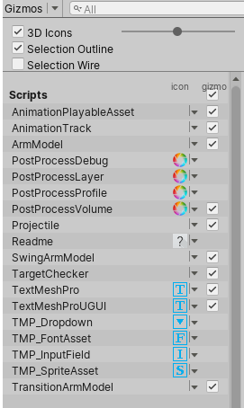
| Свойство: | Функция: |
|---|---|
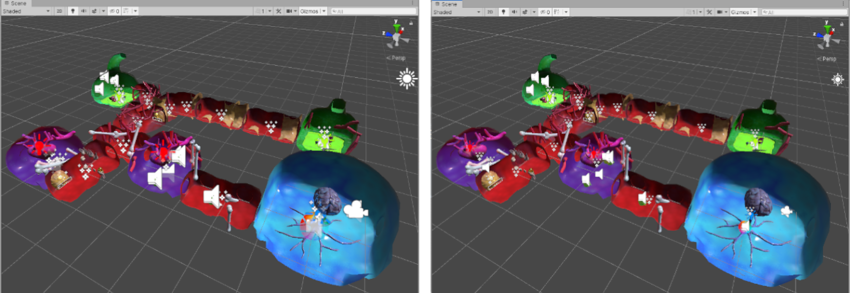
| 3D Icons | The 3D Icons checkbox controls whether component icons (such as those for Lights and Cameras) are drawn by the Editor in 3D in the Scene view. When the 3D Icons checkbox is ticked, component icons are scaled by the Editor according to their distance from the Camera, and obscured by GameObjects in the Scene. Use the slider to control their apparent overall size. When the 3D Icons checkbox is not ticked, component icons are drawn at a fixed size, and are always drawn on top of any GameObjects in the Scene view. See Gizmos and Icons, below, for images and further information. |
| Selection Outline | Check Selection Outline to display selected GameObjects with a colored outline, and their children with a different colored outline. By default, Unity highlights the selected GameObject in orange, and child GameObjects in blue. NOTE: This option is only available in the Scene view Gizmos menu; you cannot enable it in the Game view Gizmos menu. See Selection Outline and Selection Wire, below, for images and further information. |
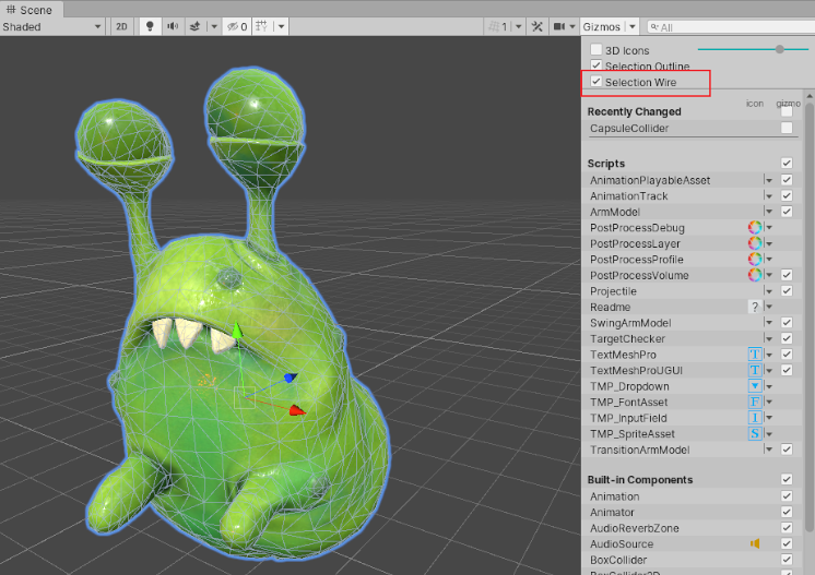
| Selection Wire | Check Selection Wire to show the selected GameObjects with their wireframe Mesh visible. To change the colour of the Selection Wire, go to Unity > Preferences (macOS) or Edit > Preferences__ (Windows), select Colors, and alter the Selected Wireframe setting. This option is only available in the Scene view Gizmos menu; you cannot enable it in the Game view Gizmos menu. See Selection Outline and Selection Wire, below, for images and further information. |
| Recently Changed | Controls the visibility of the icons and gizmos for components and scripts that you modified recently. This section appears the first time you change one or more items, and updates after subsequent changes. For more information, see Built-in components, scripts, and recently changed items, below. |
| Scripts | Controls the visibility of the icons and gizmos for scripts in the Scene. This section appears only when your Scene uses scripts that meet specific criteria. See Built-in components, scripts, and recently changed items, below, for further information. |
| Built-in Components | Controls the visibility of the icons and gizmos for all component types that have an icon or gizmo. See Built-in components, scripts, and recently changed items, below, for further information. |
Gizmos and Icons
Gizmos
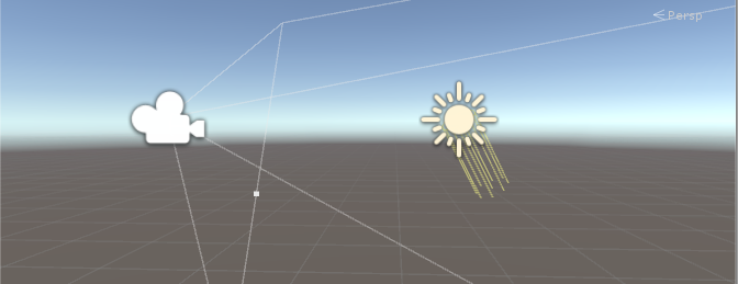
Gizmos are graphics associated with GameObjects in the Scene. Some Gizmos are only drawn when the GameObject is selected, while other Gizmos are drawn by the Editor regardless of which GameObjects are selected. They are usually wireframes, drawn with code rather than bitmap graphics, and can be interactive. The Camera Gizmo and Light direction Gizmo (shown below) are both examples of built-in Gizmos; you can also create your own Gizmos using script. See documentation on Understanding Frustum for more information about the Camera.
Some Gizmos are passive graphical overlays, shown for reference (such as the Light direction Gizmo, which shows the direction of the light). Other Gizmos are interactive, such as the AudioSource spherical range Gizmo, which you can click and drag to adjust the maximum range of the AudioSource.
The Move, Scale, Rotate and Transform tools are also interactive Gizmos. See documentation on Positioning GameObjects to learn more about these tools.
See the Script Reference page for the OnDrawGizmos function for further information about implementing custom Gizmos in your scripts.
Icons
You can display icons in the Game view or Scene view. They are flat, billboard-style overlays which you can use to clearly indicate a GameObject’s position while you work on your game. The Camera icon and Light icon are examples of built-in icons; you can also assign your own to GameObjects or individual scripts (see documentation on Assigning Icons to lean how to do this).

Selection Outline and Selection Wire
Selection Outline
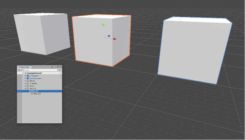
When Selection Outline is enabled, an outline appears around selected GameObjects and their child GameObjects. By default, Unity outlines selected GameObjects in orange, and child GameObjects in blue. You can change these colors in the Unity preferences (see Selection Colors, below).
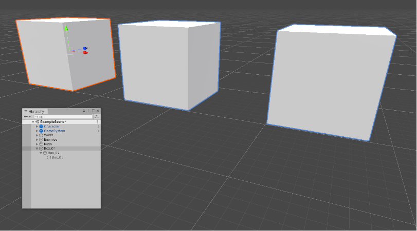
When you select a GameObject, Unity outlines all of its child GameObjects (and their child GameObjects, and so on), but does not outline parent GameObjects (or their parent GameObjects, and so on).
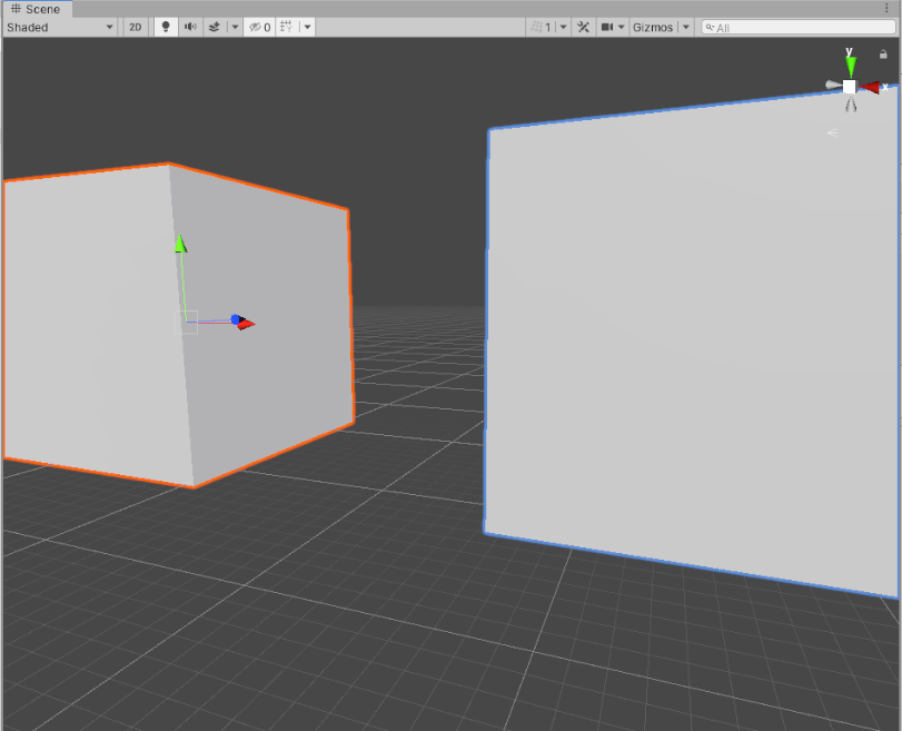
If selected GameObjects extend beyond the edges of the Scene view, the selection outline runs along the edge of the window:
Selection Wire
When Selection Wire is enabled, then when you select a GameObject in the Scene view or Hierarchy window, the wireframe Mesh for that GameObject is made visible in the Scene view:
Selection colors
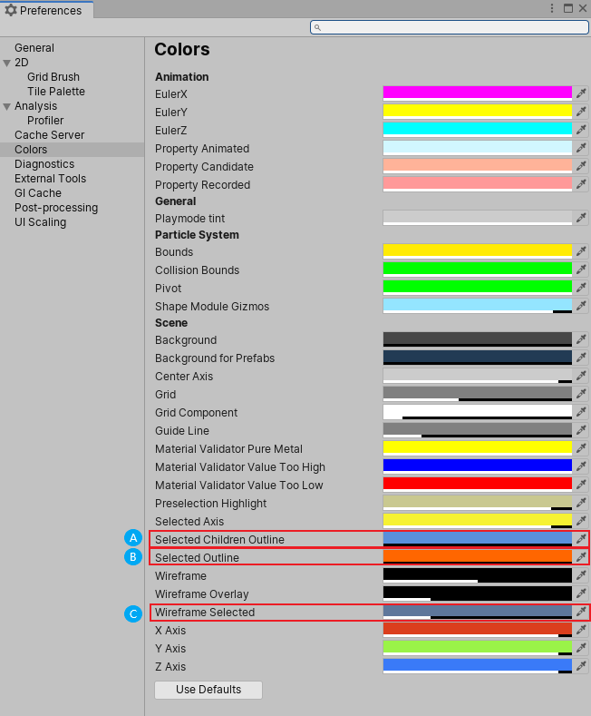
You can set custom colors for selection wireframes.
- Go to Unity > Preferences (macOS) or Edit > Preferences__ (Windows) to open the Preferences editor.
- On the colors tab, change one or more of the following colors:
- (A) Selected Children Outline: outline color for selected GameObjects’ children.
- (B) Selected Outline: outline color for selected GameObjects.
- (C) Wireframe Selected: outline color for selected GameObjects’ wireframes.
Built-in components, scripts, and recently changed items
Use the list in the Gizmos menu to control the visibility of icons and gizmos for various components. The list is divided into sections:
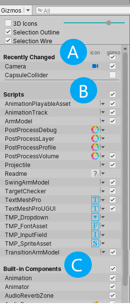
A. The Recently Changed section controls the visibility of the icons and gizmos for items that you’ve modified recently. It appears the first time you change one or more items. Unity updates the list after subsequent changes.
B. The Scripts section controls the visibility of the icons and gizmos for scripts that:
Have an icon assigned to them (see documentation on Assigning icons).
Implement the OnDrawGizmos function.
Implement the OnDrawGizmosSelected function.
This section appears when your Scene contains one or more scripts that meet the above criteria.
C. The Built-in Components section controls the visibility of the icons and gizmos for all component types that have an icon or gizmo.
Built-in component types that do not have an icon or gizmo shown in the Scene view (for example, Rigidbody) are not listed here.
Toggling icon visibility
The icon column shows or hides the icons for each component type. Full-color icons are displayed in the main Scene view window, faded icons are not.
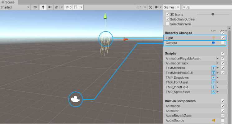
To toggle an icon’s visibility in the Scene view, click any icon in the icon column.
Note: If an item in the list has a gizmo but no icon, the icon column for that item is empty.
Changing script icons
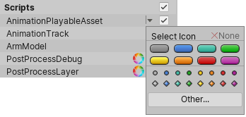
Scripts with custom icons show a small drop-down menu arrow in the icon column. To change a custom icon, click the arrow to open the Select Icon menu.
Toggling gizmo visibility
To control whether the Editor draws gizmo graphics for a particular component type (for example, a Collider’s wireframe gizmo or a Camera’s view frustum gizmo) or script, use the checkboxes in the Gizmo column.
When a checkbox is checked, the Editor draws gizmos for that component type.
When a checkbox is cleared, the Editor does not draw gizmos for that component type.
Note: If an item in the list has an icon but no gizmo, the Gizmo column for that item is empty.
To toggle gizmo visibility for an entire section (all Built-in Components, all Scripts, and so on), use the checkboxes next to the section names.
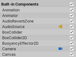
When the checkbox is toggled on, gizmo visibility is toggled on for one or more item types in the section.
