コントロール
IMGUI コントロールのタイプ
様々な種類の IMGUI コントロール を作成することができます。ここでは、すべての表示と相互作用に関するコントロールを紹介します。その他にもレイアウトのコントロールに影響する IMGUI 機能があり、詳細はドキュメントの IMGUI レイアウトモード で説明しています。
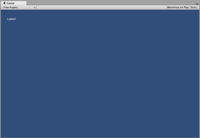
Label
Label は非インタラクティブです。表示専用です。クリックや移動することはできません。情報の表示のみに使用すると良いでしょう。
/* GUI.Label の例 */

using UnityEngine;
using System.Collections;

public class GUITest : MonoBehaviour
{

    void OnGUI ()
    {
        GUI.Label (new Rect (25, 25, 100, 30), "Label");
    }

}
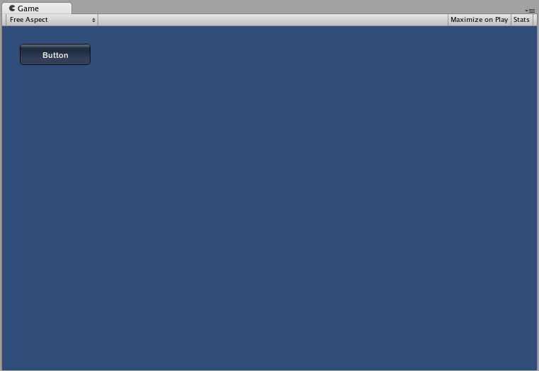
Button
Button は相互作用の目的でよく使用されます。マウスを押し続ける時間に関係なく、クリックすると 1 回だけ反応します。この反応は (押した) ボタンを離した途端に発生します。
基本的な使用例
UnityGUI でボタンをクリックすると、true を返します。ボタンをクリックした際にコードを実行するには、if 構文で GUI.Button 関数をラップします。if 構文内には、ボタンをクリックした際に実行するコードを置きます。
/*GUI.Button の例*/

using UnityEngine;
using System.Collections;

public class GUITest : MonoBehaviour
{

    void OnGUI ()
    {
        if (GUI.Button (new Rect (25, 25, 100, 30), "Button"))
        {
            // このコードは Button がクリックされたときに実行されます
        }
    }

}
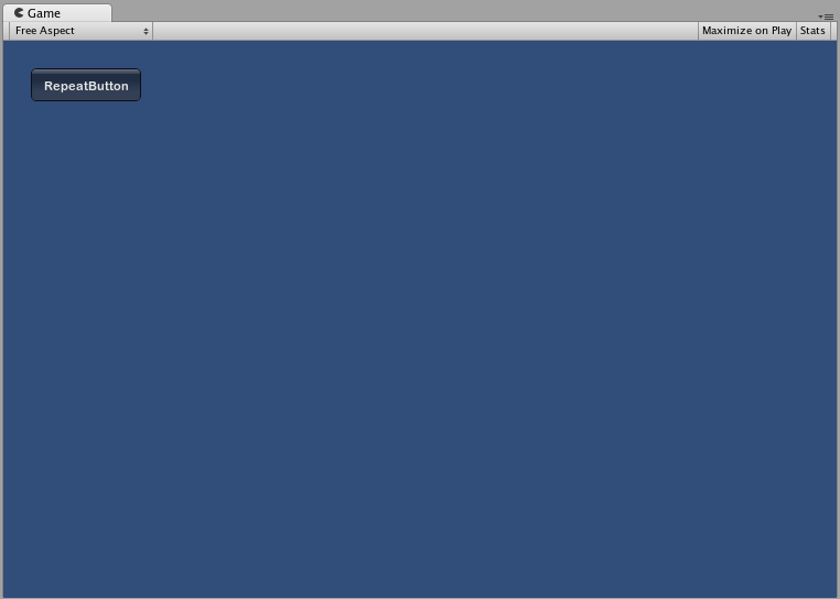
RepeatButton
RepeatButton は、通常の Button の一種です。違いは、RepeatButton の場合は、マウスボタンが押され続けている間のすべてのフレームで反応するということです。これにより、クリックアンドホールド機能を作成できます。
基本的な使用例
UnityGUI で、RepeatButton をクリックすると、毎フレームごとに true を返します。ボタンをクリックした際にコードを実行するには、if 構文で GUI.RepeatButton 関数をラップします。if 構文内には、RepeatButton が押され続けている間に実行されるコードが置かれています。
/*GUI.RepeatButton の例*/

using UnityEngine;
using System.Collections;

public class GUITest : MonoBehaviour
{

    void OnGUI ()
    {
        if (GUI.RepeatButton (new Rect (25, 25, 100, 30), "RepeatButton"))
        {
            // このコードは RepeatButton が押され続けている間に実行されるすべてのフレームで実行されます
        }
    }

}
TextField
TextField コントロールは、テキスト文字列を含む、インタラクティブで、編集可能な 1 行のフィールドです。
基本的な使用例
TextField は、常に文字列を表示します。TextField に表示する文字列を用意する必要があります。文字列を編集すると、TextField 関数は編集した文字列を返します。
/* GUI.TextField の例 */

using UnityEngine;
using System.Collections;

public class GUITest : MonoBehaviour
{

    private string textFieldString = "text field";

    void OnGUI ()
    {
        textFieldString = GUI.TextField (new Rect (25, 25, 100, 30), textFieldString);
    }

}

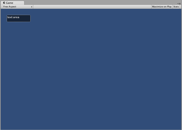
TextArea
TextArea コントロールは、テキスト文字列を含む、インタラクティブで、編集可能な複数行の領域です。
基本的な使用例
TextArea は、常に文字列を表示します。TextArea に表示する文字列を用意する必要があります。文字列に編集を行うと、TextArea 関数は編集した文字列を返します。
/* GUI.TextArea の例 */

using UnityEngine;
using System.Collections;

public class GUITest : MonoBehaviour
{

    private string textAreaString = "text area";

    void OnGUI ()
    {
        textAreaString = GUI.TextArea (new Rect (25, 25, 100, 30), textAreaString);
    }

}
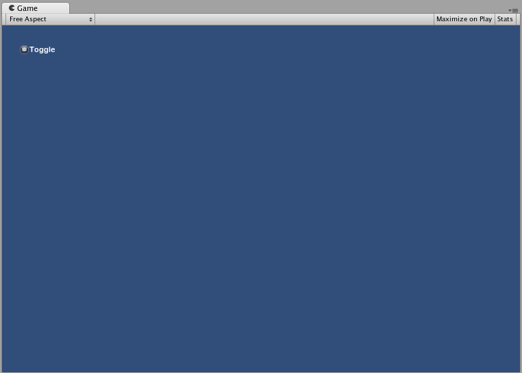
Toggle
Toggle コントロールは、持続するオン/オフ状態を持つチェックボックスを作成します。ユーザーは、チェックボックスをクリックすることで、状態を切り替えられます。
基本的な使用例
Toggle のオン/オフ状態は、true/false のブール値で示されます。Toggle に実際の状態を表示させるために、パラメーターとして、ブール値を設定する必要があります。クリックすると、Toggle 関数は新しいブール値を返します。この相互作用を取得するには、ブール値を割り当て、Toggle 関数の戻り値を受け取る必要があります。
/*GUI.Toggle の例 */

using UnityEngine;
using System.Collections;

public class GUITest : MonoBehaviour
{
    private bool toggleBool = true;

    void OnGUI ()
    {
        toggleBool = GUI.Toggle (new Rect (25, 25, 100, 30), toggleBool, "Toggle");
    }
}
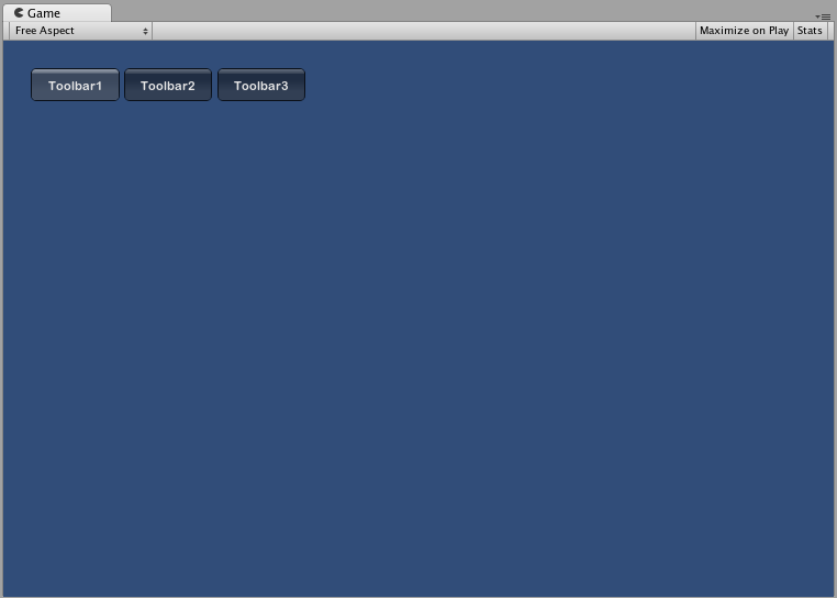
Toolbar
Toolbar コントロールは基本的に Button でできた行です。一度に有効にできるのはツールバー上の Button 1 つだけで、別の Button がクリックされるまで有効になります。この動作は、通常のツールバーの動作と同じです。ツールバーでは任意の数の Button を定義できます。
基本的な使用例
ツールバーのアクティブな状態の Button は、整数で追跡できます。関数の引数として整数を設定します。ツールバーをインタラクティブにするには、関数の戻り値に整数を割り当てる必要があります。作成する配列の要素数によって、ツールバー内に表示できる Button の数が決まります。
/*GUI.Toolbar の例*/

using UnityEngine;
using System.Collections;

public class GUITest : MonoBehaviour
{

    private int toolbarInt = 0;
    private string[] toolbarStrings = {"Toolbar1", "Toolbar2", "Toolbar3"};

    void OnGUI ()
    {
        toolbarInt = GUI.Toolbar (new Rect (25, 25, 250, 30), toolbarInt, toolbarStrings);
    }

}
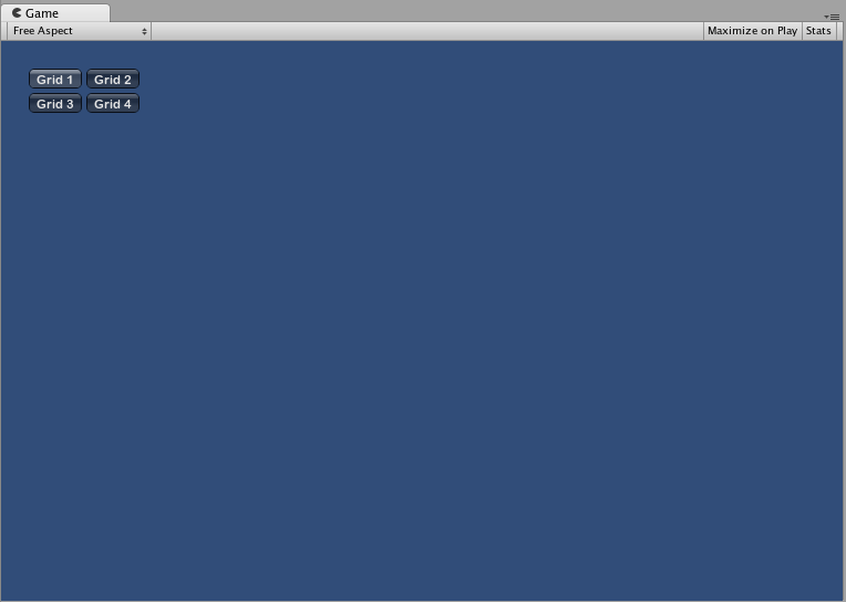
SelectionGrid
SelectionGrid コントロールは複数行の ツールバー です。グリッドの行と列の数を決定できます。一度にアクティブにできる Button の数は 1 つだけです。
基本的な使用例
SelectionGrid でアクティブな Button は、整数で追跡できます。関数の引数として整数を設定します。SelectionGrid をインタラクティブにするには、関数の戻り値に整数を割り当てる必要があります。作成する配列の要素数によって、SelectionGrid 内に表示される Button の数が決まります。関数の引数を通じて、コラムの数も制御できます。
/*GUI.SelectionGrid の例 */

using UnityEngine;
using System.Collections;

public class GUITest : MonoBehaviour
{

    private int selectionGridInt = 0;
    private string[] selectionStrings = {"Grid 1", "Grid 2", "Grid 3", "Grid 4"};

    void OnGUI ()
    {
        selectionGridInt = GUI.SelectionGrid (new Rect (25, 25, 300, 60), selectionGridInt, selectionStrings, 2);

    }

}
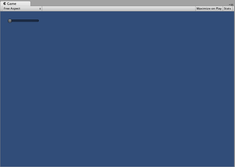
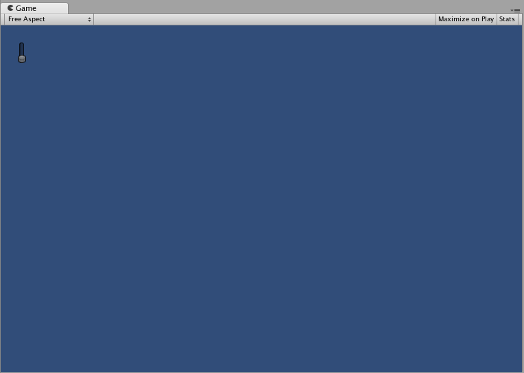
HorizontalSlider
HorizontalSlider コントロールは通常の水平スライダーで、ドラッグして事前に設定された最小と最大値間の値を変更します。
基本的な使用例
スライダーのつまみ位置は float で保存されます。ノブの位置を表示するには、関数内の引数の 1 つとして、その float 値を設定します。さらに、最小値と最大値を決定する 2 つの値を設定します。スライダーを調整可能にするため、スライダー値の float を Slider 関数の戻り値になるように割り当てます。
/*Horizontal Slider の例*/

using UnityEngine;
using System.Collections;

public class GUITest : MonoBehaviour
{

    private float hSliderValue = 0.0f;

    void OnGUI ()
    {
        hSliderValue = GUI.HorizontalSlider (new Rect (25, 25, 100, 30), hSliderValue, 0.0f, 10.0f);
    }

}
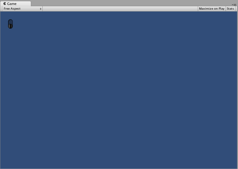
VerticalSlider
VerticalSlider コントロールは通常の垂直スライダーで、ドラッグして事前に設定された最小と最大値間の値を変更します。
基本的な使用例
スライダーのつまみ位置は float で保存されます。ノブの位置を表示するには、関数内の引数の 1 つとして、その float 値を設定します。さらに、最小値と最大値を決定する 2 つの値を設定します。スライダーを調整可能にするため、スライダー値の float を Slider 関数の戻り値になるように割り当てます。
/*Vertical Slider の例 */

using UnityEngine;
using System.Collections;

public class GUITest : MonoBehaviour
{

    private float vSliderValue = 0.0f;

    void OnGUI ()
    {
        vSliderValue = GUI.VerticalSlider (new Rect (25, 25, 100, 30), vSliderValue, 10.0f, 0.0f);
    }

}
HorizontalScrollbar
HorizontalScrollbar コントロールは Slider コントロールと同じですが、Web ブラウザーやワードプロセッサーに対するスクロールの要素に見た目が似ています。このコントロールは、ScrollView コントロールを操作するのに使用されます。
基本的な使用例
Horizontal Scrollbar は、1 つの例外を除いて Horizontal Slider と全く同じに実装されます。その例外は、Scrollbar のノブの幅を制御する引数が 1 つ余分にあることです。
/*Horizontal Scrollbar の例*/

using UnityEngine;
using System.Collections;

public class GUITest : MonoBehaviour
{
    private float hScrollbarValue;

    void OnGUI ()
    {
        hScrollbarValue = GUI.HorizontalScrollbar (new Rect (25, 25, 100, 30), hScrollbarValue, 1.0f, 0.0f, 10.0f);
    }

}
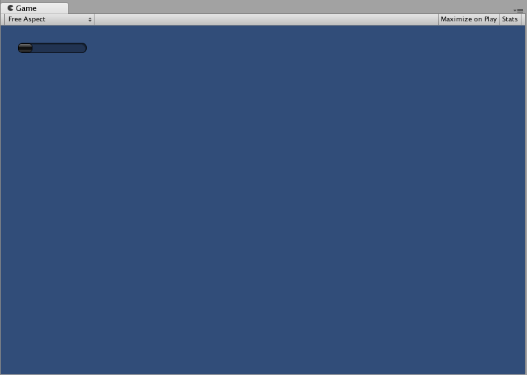
VerticalScrollbar
VerticalScrollbar コントロールは Slider コントロールと同じですが、Web ブラウザーやワードプロセッサーに対するスクロールの要素に見た目が似ています。このコントロールは、ScrollView コントロールを操作するのに使用されます。
基本的な使用例
Vertical Scrollbar は、1 つの例外を除いて Horizontal Slider と全く同じに実装されます。その例外は、Scrollbar のノブの高さを制御する引数が 1 つ余分にあることです。
/* Vertical Scrollbar の例 */

using UnityEngine;
using System.Collections;

public class GUITest : MonoBehaviour
{

    private float vScrollbarValue;

    void OnGUI ()
    {
        vScrollbarValue = GUI. VerticalScrollbar (new Rect (25, 25, 100, 30), vScrollbarValue, 1.0f, 10.0f, 0.0f);
    }
}
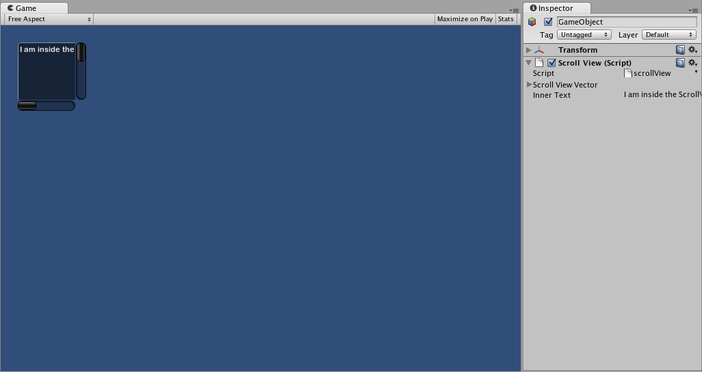
ScrollView
ScrollView は、はるかに大きいひとまとまりのコントロールから成る表示エリアを表示するコントロールです。
基本的な使用例
ScrollView は、引数として、2 つの Rect を必要とします。1 つ目の Rect は、画面上の表示できる ScrollView エリアの位置とサイズを定義します。2 つ目の Rect は、表示エリア内に含まれるスペースのサイズを定義します。エリア内の表示スペースが、エリアよりも大きい場合、スクロールバーは必要に応じて表示されます。表示される表示エリアの位置を格納する 2D Vector を割り当て設定する必要があります。
/*ScrollView の例*/

using UnityEngine;
using System.Collections;

public class GUITest : MonoBehaviour
{

    private Vector2 scrollViewVector = Vector2.zero;
    private string innerText = "I am inside the ScrollView";

    void OnGUI ()
    {
        // ScrollView を開始
        scrollViewVector = GUI.BeginScrollView (new Rect (25, 25, 100, 100), scrollViewVector, new Rect (0, 0, 400, 400));

        // ScrollView の中に何かを表示
        innerText = GUI.TextArea (new Rect (0, 0, 400, 400), innerText);

        // ScrollView を終了
        GUI.EndScrollView();
    }

}
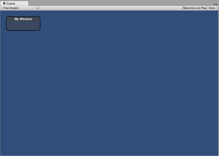
Window
Window は、ドラッグ可能なコンテナのコントロールです。Window はクリックすると、フォーカスを得たり、失ったりします。このため、他のコントロールとは若干異なる形で実装されます。各 Window には ID があり、そのコンテンツは、Window にフォーカスがあるときに呼び出される個々の関数内で宣言されます。
基本的な使用例
Window は、適切に機能するのに別の関数を必要とする唯一のコントロールです。ID 番号と Window で実行される関数名を渡す必要があります。Window 関数内で、実際の動作や含まれるコントロールを作成します。
/*Window の例*/

using UnityEngine;
using System.Collections;

public class GUITest : MonoBehaviour
{

    private Rect windowRect = new Rect (20, 20, 120, 50);

    void OnGUI ()
    {
        windowRect = GUI.Window (0, windowRect, WindowFunction, "My Window");
    }

    void WindowFunction (int windowID)
    {
        // ウィンドウ内のすべてのコントロールをここに記述します
    }

}
GUI.changed
ユーザーが GUI でなんらかのアクション (ボタンのクリック、スライダーのドラッグなど) を行ったかを検出するには、スクリプトから GUI.changed 値を読みます。ユーザーが何かを行なっている場合は true を取得し、ユーザー入力を簡単に検証できます。
よくあるシナリオはツールバーで、ツールバーでクリックされたボタンに基づき、特定の値を変更する場合です。ボタンの 1 つがクリックされている場合にのみ、OnGUI() を呼び出すたびに値を割り当てるのではなく、ボタンの 1 つがクリックされたときにのみ割り当てます。
/*GUI.changed の例*/

using UnityEngine;
using System.Collections;

public class GUITest : MonoBehaviour
{

    private int selectedToolbar = 0;
    private string[] toolbarStrings = {"One", "Two"};

    void OnGUI ()
    {
        // Determine which button is active, whether it was clicked this frame or not
        selectedToolbar = GUI.Toolbar (new Rect (50, 10, Screen.width - 100, 30), selectedToolbar, toolbarStrings);

        // If the user clicked a new Toolbar button this frame, we'll process their input
        if (GUI.changed)
        {
            Debug.Log("The toolbar was clicked");

            if (0 == selectedToolbar)
            {
                Debug.Log("First button was clicked");
            }
            else
            {
                Debug.Log("Second button was clicked");
            }
        }
    }

}
GUI.changed は、ユーザーが操作する前に GUI コントロールを設定した場合に true を返します。
Did you find this page useful? Please give it a rating: