Scripting API
LanguageEnglish
- UnityEngine
- UnityEngine.Accessibility
- UnityEngine.AI
- Classes
- Structs
- Enumerations
- UnityEngine.AMD
- UnityEngine.Android
- Classes
- AndroidApplication
- AndroidAssetPackInfo
- AndroidAssetPacks
- AndroidAssetPackState
- AndroidAssetPackUseMobileDataRequestResult
- AndroidConfiguration
- AndroidDevice
- AndroidGame
- Classes
- AndroidLocale
- ApplicationExitInfoProvider
- DiagnosticsReporting
- DownloadAssetPackAsyncOperation
- GetAssetPackStateAsyncOperation
- PermissionCallbacks
- RequestToUseMobileDataAsyncOperation
- Structs
- Interfaces
- Enumerations
- AndroidAssetPackError
- AndroidAssetPackStatus
- AndroidColorModeHdr
- AndroidColorModeWideColorGamut
- AndroidGameMode
- AndroidGameState
- AndroidHardwareKeyboardHidden
- AndroidHardwareType
- AndroidKeyboard
- AndroidKeyboardHidden
- AndroidNavigation
- AndroidNavigationHidden
- AndroidOrientation
- AndroidScreenLayoutDirection
- AndroidScreenLayoutLong
- AndroidScreenLayoutRound
- AndroidScreenLayoutSize
- AndroidTouchScreen
- AndroidUIModeNight
- AndroidUIModeType
- ExitReason
- ProcessImportance
- Classes
- UnityEngine.Animations
- Classes
- Structs
- AnimationClipPlayable
- AnimationHumanStream
- AnimationLayerMixerPlayable
- AnimationMixerPlayable
- AnimationPlayableOutput
- AnimationScriptPlayable
- AnimationStream
- AnimatorControllerPlayable
- BoundProperty
- ConstraintSource
- GenericBinding
- MuscleHandle
- PropertySceneHandle
- PropertyStreamHandle
- TransformSceneHandle
- TransformStreamHandle
- Interfaces
- Enumerations
- Attributes
- UnityEngine.Apple
- UnityEngine.Apple.ReplayKit
- Classes
- Classes
- Enumerations
- UnityEngine.Apple.ReplayKit
- UnityEngine.Assertions
- UnityEngine.Assertions.Comparers
- Classes
- UnityEngine.Assertions.Must
- Classes
- Classes
- UnityEngine.Assertions.Comparers
- UnityEngine.Audio
- UnityEngine.Categorization
- UnityEngine.CrashReportHandler
- Classes
- UnityEngine.DedicatedServer
- Classes
- Arguments
- Enumerations
- Arguments
- Classes
- UnityEngine.Device
- Classes
- UnityEngine.Diagnostics
- Classes
- Enumerations
- UnityEngine.Events
- UnityEngine.Experimental
- UnityEngine.Experimental.AI
- UnityEngine.Experimental.Animations
- Classes
- Enumerations
- UnityEngine.Experimental.Audio
- Classes
- UnityEngine.Experimental.GlobalIllumination
- UnityEngine.Experimental.Playables
- UnityEngine.Experimental.Rendering
- Classes
- Structs
- Interfaces
- Enumerations
- UnityEngine.Experimental.Video
- Classes
- Structs
- UnityEngine.iOS
- UnityEngine.Jobs
- Classes
- Structs
- Interfaces
- UnityEngine.LightTransport
- UnityEngine.LightTransport.PostProcessing
- Classes
- Structs
- Interfaces
- IDeviceContext
- IProbeIntegrator
- Structs
- Enumerations
- IWorld
- UnityEngine.LowLevel
- Classes
- Structs
- UnityEngine.LowLevelPhysics
- UnityEngine.Lumin
- UnityEngine.Networking
- UnityEngine.Networking.PlayerConnection
- Classes
- Interfaces
- Enumerations
- Classes
- CertificateHandler
- DownloadHandler
- DownloadHandlerAssetBundle
- DownloadHandlerAudioClip
- DownloadHandlerBuffer
- DownloadHandlerFile
- DownloadHandlerMovieTexture
- DownloadHandlerScript
- DownloadHandlerTexture
- MultipartFormDataSection
- MultipartFormFileSection
- UnityWebRequest
- Enumerations
- UnityWebRequestAssetBundle
- UnityWebRequestAsyncOperation
- UnityWebRequestMultimedia
- UnityWebRequestTexture
- UploadHandler
- UploadHandlerFile
- UploadHandlerRaw
- Structs
- Interfaces
- Enumerations
- UnityEngine.Networking.PlayerConnection
- UnityEngine.NVIDIA
- UnityEngine.ParticleSystemJobs
- UnityEngine.Playables
- Classes
- Structs
- Interfaces
- Enumerations
- UnityEngine.PlayerLoop
- Structs
- EarlyUpdate
- Structs
- AnalyticsCoreStatsUpdate
- ARCoreUpdate
- ClearIntermediateRenderers
- ClearLines
- DeliverIosPlatformEvents
- DispatchEventQueueEvents
- ExecuteMainThreadJobs
- GpuTimestamp
- PerformanceAnalyticsUpdate
- Physics2DEarlyUpdate
- PhysicsResetInterpolatedTransformPosition
- PlayerCleanupCachedData
- PollHtcsPlayerConnection
- PollPlayerConnection
- PresentBeforeUpdate
- ProcessMouseInWindow
- ProcessRemoteInput
- RendererNotifyInvisible
- ResetFrameStatsAfterPresent
- ScriptRunDelayedStartupFrame
- SpriteAtlasManagerUpdate
- UnityWebRequestUpdate
- UpdateAsyncInstantiate
- UpdateAsyncReadbackManager
- UpdateCanvasRectTransform
- UpdateContentLoading
- UpdateInputManager
- UpdateKinect
- UpdateMainGameViewRect
- UpdatePreloading
- UpdateStreamingManager
- UpdateTextureStreamingManager
- XRUpdate
- Structs
- FixedUpdate
- Initialization
- PostLateUpdate
- Structs
- BatchModeUpdate
- ClearImmediateRenderers
- DirectorLateUpdate
- DirectorRenderImage
- EndGraphicsJobsAfterScriptLateUpdate
- EnlightenRuntimeUpdate
- ExecuteGameCenterCallbacks
- FinishFrameRendering
- GUIClearEvents
- InputEndFrame
- MemoryFrameMaintenance
- ParticleSystemEndUpdateAll
- PhysicsSkinnedClothBeginUpdate
- PhysicsSkinnedClothFinishUpdate
- PlayerEmitCanvasGeometry
- PlayerSendFrameComplete
- PlayerSendFramePostPresent
- PlayerSendFrameStarted
- PlayerUpdateCanvases
- PresentAfterDraw
- ProcessWebSendMessages
- ProfilerEndFrame
- ProfilerSynchronizeStats
- ResetInputAxis
- ScriptRunDelayedDynamicFrameRate
- ShaderHandleErrors
- SortingGroupsUpdate
- ThreadedLoadingDebug
- TriggerEndOfFrameCallbacks
- UpdateAllRenderers
- UpdateAllSkinnedMeshes
- UpdateAudio
- UpdateCanvasRectTransform
- UpdateCaptureScreenshot
- UpdateCustomRenderTextures
- UpdateLightProbeProxyVolumes
- UpdateRectTransform
- UpdateResolution
- UpdateSubstance
- UpdateVideo
- UpdateVideoTextures
- XRPostLateUpdate
- XRPostPresent
- XRPreEndFrame
- Structs
- PreLateUpdate
- Structs
- AccessibilityUpdate
- AIUpdatePostScript
- ConstraintManagerUpdate
- DirectorDeferredEvaluate
- DirectorUpdateAnimationBegin
- DirectorUpdateAnimationEnd
- EndGraphicsJobsAfterScriptUpdate
- LegacyAnimationUpdate
- ParticleSystemBeginUpdateAll
- Physics2DLateUpdate
- PhysicsLateUpdate
- ScriptRunBehaviourLateUpdate
- UIElementsUpdatePanels
- UpdateMasterServerInterface
- UpdateNetworkManager
- Structs
- PreUpdate
- TimeUpdate
- Update
- EarlyUpdate
- Structs
- UnityEngine.Pool
- UnityEngine.Profiling
- Classes
- Enumerations
- UnityEngine.Rendering
- UnityEngine.Rendering.RendererUtils
- Structs
- UnityEngine.Rendering.VirtualTexturing
- Classes
- Structs
- Enumerations
- Classes
- AsyncGPUReadback
- BatchRendererGroup
- CommandBuffer
- CommandBufferExtensions
- GraphicsSettings
- GraphicsTexture
- InvalidImportException
- LoadStoreActionDebugModeSettings
- MachineLearningContext
- MachineLearningOperatorDispatcher
- MachineLearningOperatorFactory
- ObjectIdRequest
- ObjectIdResult
- OnDemandRendering
- PIX
- RayTracingAccelerationStructure
- Structs
- Enumerations
- RayTracingShader
- RenderPipeline
- Classes
- RenderPipelineAsset
- RenderPipelineAsset<T0>
- RenderPipelineGlobalSettings
- RenderPipelineGraphicsSettingsCollection
- RenderPipelineGraphicsSettingsExtensions
- RenderPipelineManager
- ShadingRateImage
- ShadingRateInfo
- SortingGroup
- SplashScreen
- Enumerations
- SupportedRenderingFeatures
- Enumerations
- Watermark
- Structs
- AsyncGPUReadbackRequest
- AttachmentDescriptor
- AttachmentIndexArray
- BatchCullingContext
- BatchCullingOutput
- BatchCullingOutputDrawCommands
- BatchDrawCommand
- BatchDrawCommandIndirect
- BatchDrawCommandProcedural
- BatchDrawCommandProceduralIndirect
- BatchDrawRange
- BatchFilterSettings
- BatchID
- BatchMaterialID
- BatchMeshID
- BatchPackedCullingViewID
- BatchRendererGroupCreateInfo
- BlendState
- CameraProperties
- CullingResults
- CullingSplit
- DepthState
- DrawingSettings
- FilteringSettings
- GlobalKeyword
- GPUFence
- GraphicsFence
- GraphicsTextureDescriptor
- LightShadowCasterCullingInfo
- LocalKeyword
- LocalKeywordSpace
- LODParameters
- MachineLearningOperator
- MachineLearningTensorDescriptor
- MachineLearningTensorShape
- MetadataValue
- PassIdentifier
- PlatformKeywordSet
- RasterState
- RayTracingAABBsInstanceConfig
- RayTracingGeometryInstanceConfig
- RayTracingInstanceCullingConfig
- RayTracingInstanceCullingMaterialTest
- RayTracingInstanceCullingResults
- RayTracingInstanceCullingShaderTagConfig
- RayTracingInstanceCullingTest
- RayTracingInstanceMaterialConfig
- RayTracingInstanceMaterialCRC
- RayTracingInstanceTriangleCullingConfig
- RayTracingMeshInstanceConfig
- RayTracingSubMeshFlagsConfig
- ReflectionProbeBlendInfo
- RendererList
- RendererListParams
- RenderQueueRange
- RenderStateBlock
- RenderTargetBinding
- RenderTargetBlendState
- RenderTargetIdentifier
- ScopedRenderPass
- ScopedSubPass
- ScriptableCullingParameters
- ScriptableRenderContext
- ShaderKeyword
- ShaderKeywordSet
- ShaderTagId
- ShadowCastersCullingInfos
- ShadowDrawingSettings
- ShadowSplitData
- SortingLayerRange
- SortingSettings
- SphericalHarmonicsL2
- StencilState
- SubMeshDescriptor
- SubPassDescriptor
- ThreadedBatchContext
- VertexAttributeDescriptor
- VisibleLight
- VisibleReflectionProbe
- Interfaces
- Enumerations
- AmbientMode
- BatchBufferTarget
- BatchCullingFlags
- BatchCullingProjectionType
- BatchCullingViewType
- BatchDrawCommandFlags
- BatchDrawCommandType
- BlendMode
- BlendOp
- BlendShapeBufferLayout
- BuiltinRenderTextureType
- BuiltinShaderDefine
- BuiltinShaderMode
- BuiltinShaderType
- CameraEvent
- CameraHDRMode
- CameraLateLatchMatrixType
- ColorWriteMask
- CommandBufferExecutionFlags
- CompareFunction
- ComputeQueueType
- CopyTextureSupport
- CullingOptions
- CullMode
- CustomMarkerCallbackFlags
- DefaultReflectionMode
- DistanceMetric
- FastMemoryFlags
- FormatSwizzle
- FoveatedRenderingCaps
- FoveatedRenderingMode
- GizmoSubset
- GraphicsDeviceType
- GraphicsFenceType
- GraphicsTextureDescriptorFlags
- GraphicsTextureState
- GraphicsTier
- IndexFormat
- LightEvent
- LightProbeOutsideHullStrategy
- LightProbeUsage
- LightShadowResolution
- LightUnit
- MachineLearningDataType
- MachineLearningOperatorType
- MeshUpdateFlags
- OpaqueSortMode
- OpenGLESVersion
- PassType
- PerObjectData
- RayTracingAccelerationStructureBuildFlags
- RayTracingInstanceCullingFlags
- RayTracingSubMeshFlags
- RealtimeGICPUUsage
- ReflectionCubemapCompression
- ReflectionProbeClearFlags
- ReflectionProbeMode
- ReflectionProbeRefreshMode
- ReflectionProbeSortingCriteria
- ReflectionProbeTimeSlicingMode
- ReflectionProbeUsage
- RenderBufferLoadAction
- RenderBufferStoreAction
- RendererListStatus
- RenderingThreadingMode
- RenderQueue
- RenderStateMask
- RenderTargetFlags
- RenderTextureSubElement
- RTClearFlags
- SearchType
- ShaderConstantType
- ShaderKeywordType
- ShaderParamType
- ShaderPropertyFlags
- ShaderPropertyType
- ShadingRateCombiner
- ShadingRateCombinerStage
- ShadingRateFragmentSize
- ShadowCastingMode
- ShadowMapPass
- ShadowSamplingMode
- SinglePassStereoMode
- SortingCriteria
- StencilOp
- SubPassFlags
- SynchronisationStage
- SynchronisationStageFlags
- TextureDimension
- UISubset
- UVChannelFlags
- VertexAttribute
- VertexAttributeFormat
- VideoShadersIncludeMode
- Attributes
- UnityEngine.Rendering.RendererUtils
- UnityEngine.SceneManagement
- UnityEngine.Scripting
- UnityEngine.Search
- Enumerations
- Attributes
- UnityEngine.SearchService
- UnityEngine.Serialization
- Classes
- Attributes
- UnityEngine.SocialPlatforms
- UnityEngine.SocialPlatforms.GameCenter
- Classes
- UnityEngine.SocialPlatforms.Impl
- Structs
- Interfaces
- Enumerations
- UnityEngine.SocialPlatforms.GameCenter
- UnityEngine.Sprites
- Classes
- UnityEngine.SubsystemsImplementation
- UnityEngine.TerrainTools
- Classes
- Structs
- Enumerations
- UnityEngine.TerrainUtils
- Classes
- Structs
- UnityEngine.TestTools
- Classes
- Structs
- Attributes
- UnityEngine.TextCore
- UnityEngine.TextCore.LowLevel
- UnityEngine.TextCore.Text
- Classes
- Enumerations
- Classes
- Structs
- Enumerations
- UnityEngine.Tilemaps
- Classes
- ITilemap
- Tile
- Enumerations
- TileBase
- Tilemap
- Structs
- Enumerations
- TilemapCollider2D
- TilemapRenderer
- Enumerations
- Structs
- Enumerations
- Classes
- UnityEngine.tvOS
- Classes
- Enumerations
- UnityEngine.U2D
- UnityEngine.UIElements
- UnityEngine.UIElements.Experimental
- UnityEngine.UIElements.InputSystem
- Classes
- Classes
- AbstractProgressBar
- AlignmentUtils
- AttachToPanelEvent
- BackgroundPropertyHelper
- BaseBoolField
- BaseCompositeField<T0,T1,T2>
- BaseField<T0>
- Classes
- BaseFieldMouseDragger
- BaseFieldTraits<T0,T1>
- BaseListView
- Classes
- BaseListViewController
- BasePopupField<T0,T1>
- BaseSlider<T0>
- Classes
- BaseTreeView
- Classes
- BaseTreeViewController
- BaseUxmlFactory<T0,T1>
- BaseUxmlTraits
- BaseVerticalCollectionView
- Classes
- BindableElement
- Classes
- Binding
- BlurEvent
- BoundsField
- Classes
- BoundsIntField
- Classes
- Box
- Classes
- Button
- Classes
- CallbackEventHandler
- ChangeEvent<T0>
- Clickable
- ClickEvent
- CollectionViewController
- Column
- Columns
- Enumerations
- CommandEventBase<T0>
- ContextClickEvent
- ContextualMenuManager
- ContextualMenuManipulator
- ContextualMenuPopulateEvent
- ConverterGroup
- ConverterGroups
- CustomBinding
- CustomStyleResolvedEvent
- DataBinding
- DefaultMultiColumnTreeViewController<T0>
- DefaultTreeViewController<T0>
- DetachFromPanelEvent
- DoubleField
- Classes
- DragAndDropData
- DragAndDropEventBase<T0>
- DragEnterEvent
- DragExitedEvent
- DragLeaveEvent
- DragPerformEvent
- DragUpdatedEvent
- DropdownField
- Classes
- DropdownMenu
- DropdownMenuAction
- Enumerations
- DropdownMenuEventInfo
- DropdownMenuItem
- DropdownMenuSeparator
- DynamicAtlasSettings
- EnumField
- Classes
- EventBase
- EventBase<T0>
- EventDispatcher
- ExecuteCommandEvent
- FieldMouseDragger<T0>
- FloatField
- Classes
- Focusable
- FocusChangeDirection
- FocusController
- FocusEvent
- FocusEventBase<T0>
- FocusInEvent
- FocusOutEvent
- Foldout
- Classes
- GenericDropdownMenu
- GeometryChangedEvent
- GroupBox
- Classes
- Hash128Field
- Classes
- HelpBox
- Classes
- IBindingExtensions
- Image
- Classes
- IMGUIContainer
- Classes
- IMGUIEvent
- ImmediateModeElement
- INotifyValueChangedExtensions
- InputEvent
- InputWrapper
- IntegerField
- Classes
- KeyboardEventBase<T0>
- KeyboardNavigationManipulator
- KeyDownEvent
- KeyUpEvent
- Label
- Classes
- ListView
- Classes
- ListViewController
- LongField
- Classes
- Manipulator
- MeshGenerationContext
- MeshWriteData
- MinMaxSlider
- Classes
- MouseCaptureController
- MouseCaptureEvent
- MouseCaptureEventBase<T0>
- MouseCaptureOutEvent
- MouseDownEvent
- MouseEnterEvent
- MouseEnterWindowEvent
- MouseEventBase<T0>
- MouseLeaveEvent
- MouseLeaveWindowEvent
- MouseManipulator
- MouseMoveEvent
- MouseOutEvent
- MouseOverEvent
- MouseUpEvent
- MultiColumnController
- MultiColumnListView
- Classes
- MultiColumnListViewController
- MultiColumnTreeView
- Classes
- MultiColumnTreeViewController
- NavigationCancelEvent
- NavigationEventBase<T0>
- NavigationMoveEvent
- Enumerations
- NavigationSubmitEvent
- Painter2D
- PanelChangedEventBase<T0>
- PanelSettings
- PanelTextSettings
- PointerCancelEvent
- PointerCaptureEvent
- PointerCaptureEventBase<T0>
- PointerCaptureHelper
- PointerCaptureOutEvent
- PointerDownEvent
- PointerEnterEvent
- PointerEventBase<T0>
- PointerId
- PointerLeaveEvent
- PointerManipulator
- PointerMoveEvent
- PointerOutEvent
- PointerOverEvent
- PointerStationaryEvent
- PointerType
- PointerUpEvent
- PopupField<T0>
- PopupWindow
- Classes
- ProgressBar
- RadioButton
- Classes
- RadioButtonGroup
- Classes
- RectField
- Classes
- RectIntField
- Classes
- RepeatButton
- Classes
- RuntimePanelUtils
- Scroller
- Classes
- ScrollView
- Classes
- Enumerations
- Slider
- Classes
- SliderInt
- Classes
- SortColumnDescription
- SortColumnDescriptions
- StyleSheet
- Tab
- Classes
- TabView
- Classes
- TemplateContainer
- Classes
- TextElement
- Classes
- TextField
- Classes
- TextInputBaseField<T0>
- Classes
- TextValueField<T0>
- Classes
- TextValueFieldTraits<T0,T1>
- ThemeStyleSheet
- Toggle
- Classes
- ToggleButtonGroup
- Classes
- TooltipEvent
- TransitionCancelEvent
- TransitionEndEvent
- TransitionEventBase<T0>
- TransitionRunEvent
- TransitionStartEvent
- TreeView
- Classes
- TreeViewController
- TreeViewExpansionChangedArgs
- TwoPaneSplitView
- Classes
- TypedUxmlAttributeDescription<T0>
- UIDocument
- UIRenderer
- UIToolkitInputConfiguration
- UnsignedIntegerField
- Classes
- UnsignedLongField
- Classes
- UQuery
- UQueryExtensions
- UxmlAssetAttributeDescription<T0>
- UxmlAttributeDescription
- Enumerations
- UxmlAttributeOverridesFactory
- UxmlAttributeOverridesTraits
- UxmlBoolAttributeDescription
- UxmlChildElementDescription
- UxmlColorAttributeDescription
- UxmlDescriptionCache
- UxmlDoubleAttributeDescription
- UxmlEnumAttributeDescription<T0>
- UxmlEnumeration
- UxmlFactory<T0>
- UxmlFactory<T0,T1>
- UxmlFloatAttributeDescription
- UxmlHash128AttributeDescription
- UxmlIntAttributeDescription
- UxmlLongAttributeDescription
- UxmlRootElementFactory
- UxmlRootElementTraits
- UxmlSerializedData
- Enumerations
- UxmlSerializedDataUtility
- UxmlStringAttributeDescription
- UxmlStyleFactory
- UxmlStyleTraits
- UxmlTemplateFactory
- UxmlTemplateTraits
- UxmlTraits
- UxmlTypeAttributeDescription<T0>
- UxmlTypeRestriction
- UxmlUnsignedIntAttributeDescription
- UxmlUnsignedLongAttributeDescription
- UxmlValueBounds
- UxmlValueMatches
- ValidateCommandEvent
- Vector2Field
- Classes
- Vector2IntField
- Classes
- Vector3Field
- Classes
- Vector3IntField
- Classes
- Vector4Field
- Classes
- VectorImage
- VisualElement
- Classes
- Structs
- Enumerations
- VisualElementExtensions
- VisualElementFocusChangeDirection
- VisualElementFocusRing
- Enumerations
- VisualTreeAsset
- WheelEvent
- Structs
- Angle
- Background
- BackgroundPosition
- BackgroundRepeat
- BackgroundSize
- BindablePropertyChangedEventArgs
- BindingActivationContext
- BindingContext
- BindingId
- BindingInfo
- BindingResult
- CanStartDragArgs
- CreationContext
- Cursor
- CustomStyleProperty<T0>
- DataSourceContext
- DataSourceContextChanged
- EasingFunction
- EventDispatcherGate
- FontDefinition
- HandleDragAndDropArgs
- Length
- ManipulatorActivationFilter
- MeshGenerationNode
- Rotate
- Scale
- SetupDragAndDropArgs
- StartDragArgs
- StyleBackground
- StyleBackgroundPosition
- StyleBackgroundRepeat
- StyleBackgroundSize
- StyleColor
- StyleCursor
- StyleEnum<T0>
- StyleFloat
- StyleFont
- StyleFontDefinition
- StyleInt
- StyleLength
- StyleList<T0>
- StylePropertyName
- StylePropertyNameCollection
- Structs
- StyleRotate
- StyleScale
- StyleTextShadow
- StyleTransformOrigin
- StyleTranslate
- TempMeshAllocator
- TextShadow
- TimerState
- TimeValue
- ToggleButtonGroupState
- TransformOrigin
- Translate
- TreeViewItemData<T0>
- UQueryBuilder<T0>
- UQueryState<T0>
- UxmlAttributeNames
- Vertex
- VisualElementStyleSheetSet
- Interfaces
- IBaseUxmlFactory
- IBindable
- IBinding
- IChangeEvent
- ICommandEvent
- ICustomStyle
- IDataSourceProvider
- IDataSourceViewHashProvider
- IDebugPanelChangeReceiver
- IDragAndDropEvent
- IEventHandler
- IExperimentalFeatures
- IFocusEvent
- IFocusRing
- IKeyboardEvent
- IManipulator
- IMixedValueSupport
- IMouseCaptureEvent
- IMouseEvent
- INavigationEvent
- INotifyBindablePropertyChanged
- INotifyValueChanged<T0>
- IPanel
- IPanelChangedEvent
- IPointerCaptureEvent
- IPointerEvent
- IResolvedStyle
- IRuntimePanel
- IStyle
- IStyleValue<T0>
- ITextEdition
- ITextElementExperimentalFeatures
- ITextSelection
- ITransform
- ITransitionEvent
- IUxmlAttributes
- IUxmlFactory
- IValueField<T0>
- IVisualElementScheduledItem
- IVisualElementScheduler
- Enumerations
- Align
- AlternatingRowBackground
- AngleUnit
- ArcDirection
- BackgroundPositionKeyword
- BackgroundSizeType
- BindingLogLevel
- BindingMode
- BindingSourceSelectionMode
- BindingStatus
- BindingUpdateTrigger
- CollectionVirtualizationMethod
- ColumnSortingMode
- ContextType
- DeltaSpeed
- DisplayStyle
- DragAndDropPosition
- DragVisualMode
- DynamicAtlasFilters
- EasingMode
- EditorTextRenderingMode
- EventInterestOptions
- FillRule
- FlexDirection
- HelpBoxMessageType
- Justify
- KeyboardNavigationOperation
- LanguageDirection
- LengthUnit
- LineCap
- LineJoin
- ListViewReorderMode
- MouseButton
- Overflow
- OverflowClipBox
- PanelScaleMode
- PanelScreenMatchMode
- PenButton
- PickingMode
- Position
- PropagationPhase
- Repeat
- ScrollerVisibility
- ScrollViewMode
- SelectionType
- SliderDirection
- SortDirection
- StyleKeyword
- TextOverflow
- TextOverflowPosition
- TimeUnit
- TransformOriginOffset
- TrickleDown
- TwoPaneSplitViewOrientation
- UIToolkitInputBackendOption
- UsageHints
- VersionChangeType
- Visibility
- WhiteSpace
- Wrap
- Attributes
- UnityEngine.VFX
- Classes
- Structs
- Enumerations
- Attributes
- UnityEngine.Video
- UnityEngine.Windows
- UnityEngine.Windows.Speech
- UnityEngine.Windows.WebCam
- Classes
- PhotoCapture
- Structs
- Enumerations
- PhotoCaptureFrame
- VideoCapture
- Structs
- Enumerations
- WebCam
- PhotoCapture
- Structs
- Enumerations
- Classes
- Classes
- UnityEngine.WSA
- UnityEngine.XR
- UnityEngine.XR.Provider
- Classes
- Classes
- Structs
- Enumerations
- UnityEngine.XR.Provider
- Classes
- AnchoredJoint2D
- AndroidInput
- AndroidJavaClass
- AndroidJavaObject
- AndroidJavaProxy
- AndroidJNI
- AndroidJNIHelper
- Animation
- AnimationClip
- AnimationClipPair
- AnimationCurve
- AnimationEvent
- AnimationState
- Animator
- AnimatorControllerParameter
- AnimatorOverrideController
- AnimatorUtility
- Application
- AreaEffector2D
- ArticulationBody
- AssetBundle
- AssetBundleCreateRequest
- AssetBundleManifest
- AssetBundleRecompressOperation
- AssetBundleRequest
- AssetBundleUnloadOperation
- AsyncInstantiateOperation
- AsyncInstantiateOperation<T0>
- AsyncOperation
- AudioChorusFilter
- AudioClip
- AudioDistortionFilter
- AudioEchoFilter
- AudioHighPassFilter
- AudioListener
- AudioLowPassFilter
- AudioRenderer
- AudioReverbFilter
- AudioReverbZone
- AudioSettings
- Classes
- AudioSource
- Avatar
- AvatarBuilder
- AvatarMask
- Awaitable
- Awaitable<T0>
- AwaitableCompletionSource
- AwaitableCompletionSource<T0>
- Behaviour
- BillboardAsset
- BillboardRenderer
- BoxCollider
- BoxCollider2D
- BuoyancyEffector2D
- Caching
- Camera
- Canvas
- CanvasGroup
- CanvasRenderer
- CapsuleCollider
- CapsuleCollider2D
- CharacterController
- CharacterJoint
- CircleCollider2D
- Cloth
- ClusterInput
- ClusterNetwork
- Collider
- Collider2D
- Enumerations
- Collision
- Collision2D
- ColorGamutUtility
- ColorUtility
- Compass
- Component
- CompositeCollider2D
- Enumerations
- ComputeBuffer
- ComputeShader
- ConfigurableJoint
- ConstantForce
- ConstantForce2D
- ControllerColliderHit
- Coroutine
- CrashReport
- Cubemap
- CubemapArray
- CullingGroup
- Cursor
- CustomCollider2D
- CustomRenderTexture
- CustomRenderTextureManager
- CustomYieldInstruction
- Debug
- Structs
- DetailPrototype
- Display
- DistanceJoint2D
- DynamicGI
- EdgeCollider2D
- Effector2D
- Event
- ExitGUIException
- ExpressionEvaluator
- FixedJoint
- FixedJoint2D
- Flare
- FlareLayer
- Font
- FrameDebugger
- FrameTimingManager
- FrictionJoint2D
- GameObject
- GeometryUtility
- Gizmos
- GL
- Gradient
- Graphics
- GraphicsBuffer
- Structs
- Enumerations
- Grid
- GridBrushBase
- Enumerations
- GridLayout
- Enumerations
- GUI
- Classes
- Enumerations
- GUIContent
- GUIElement
- GUILayout
- GUILayoutOption
- GUILayoutUtility
- GUISettings
- GUISkin
- GUIStyle
- GUIStyleState
- GUIUtility
- Gyroscope
- Handheld
- HashUnsafeUtilities
- HashUtilities
- HDROutputSettings
- HingeJoint
- HingeJoint2D
- HumanPoseHandler
- HumanTrait
- ImageConversion
- Input
- IntegratedSubsystem
- IntegratedSubsystemDescriptor
- Joint
- Joint2D
- JsonUtility
- LensFlare
- Light
- LightingSettings
- Enumerations
- LightmapData
- LightmapSettings
- LightProbeGroup
- LightProbeProxyVolume
- LightProbes
- LineRenderer
- LineUtility
- LocalizationAsset
- LocationService
- LODGroup
- Logger
- Material
- MaterialPropertyBlock
- Mesh
- Structs
- MeshCollider
- MeshFilter
- MeshRenderer
- Microphone
- MonoBehaviour
- Motion
- MovieTexture
- Object
- OcclusionArea
- OcclusionPortal
- ParticlePhysicsExtensions
- ParticleSystem
- Structs
- Burst
- ColliderData
- CollisionModule
- ColorBySpeedModule
- ColorOverLifetimeModule
- CustomDataModule
- EmissionModule
- EmitParams
- ExternalForcesModule
- ForceOverLifetimeModule
- InheritVelocityModule
- LifetimeByEmitterSpeedModule
- LightsModule
- LimitVelocityOverLifetimeModule
- MainModule
- MinMaxCurve
- MinMaxGradient
- NoiseModule
- Particle
- PlaybackState
- RotationBySpeedModule
- RotationOverLifetimeModule
- ShapeModule
- SizeBySpeedModule
- SizeOverLifetimeModule
- SubEmittersModule
- TextureSheetAnimationModule
- TrailModule
- Trails
- TriggerModule
- VelocityOverLifetimeModule
- Structs
- ParticleSystemForceField
- ParticleSystemRenderer
- Physics
- Physics2D
- PhysicsMaterial
- PhysicsMaterial2D
- PhysicsSceneExtensions
- PhysicsSceneExtensions2D
- PhysicsShapeGroup2D
- PhysicsUpdateBehaviour2D
- Ping
- PlatformEffector2D
- PlayerPrefs
- PlayerPrefsException
- PointEffector2D
- PolygonCollider2D
- ProceduralMaterial
- ProceduralPropertyDescription
- ProceduralTexture
- Projector
- QualitySettings
- Random
- Structs
- RectOffset
- RectTransform
- RectTransformUtility
- ReflectionProbe
- Enumerations
- RelativeJoint2D
- Renderer
- RendererExtensions
- RenderSettings
- RenderTexture
- ResourceRequest
- Resources
- ResourcesAPI
- Rigidbody
- Rigidbody2D
- Structs
- RuntimeAnimatorController
- ScalableBufferManager
- Screen
- ScreenCapture
- Enumerations
- ScriptableObject
- Security
- Shader
- ShaderVariantCollection
- Structs
- SkinnedMeshRenderer
- Skybox
- SleepTimeout
- SliderJoint2D
- Snapping
- Social
- SparseTexture
- SpeedTreeWindAsset
- SphereCollider
- SplatPrototype
- SpringJoint
- SpringJoint2D
- Sprite
- SpriteMask
- Enumerations
- SpriteRenderer
- StateMachineBehaviour
- StaticBatchingUtility
- StreamingController
- Subsystem
- SubsystemDescriptor
- SubsystemManager
- SurfaceEffector2D
- SystemInfo
- TargetJoint2D
- Terrain
- Enumerations
- TerrainCallbacks
- TerrainCollider
- TerrainData
- TerrainExtensions
- TerrainLayer
- TextAsset
- TextGenerator
- TextMesh
- Texture
- Texture2D
- Enumerations
- Texture2DArray
- Texture3D
- TextureMipmapLimitGroups
- Time
- TouchScreenKeyboard
- Classes
- Enumerations
- TrailRenderer
- Transform
- Tree
- TreePrototype
- VulkanDeviceFilterLists
- WaitForEndOfFrame
- WaitForFixedUpdate
- WaitForSeconds
- WaitForSecondsRealtime
- WaitUntil
- WaitWhile
- WebCamTexture
- WebGLInput
- WheelCollider
- WheelJoint2D
- WindZone
- WWW
- WWWForm
- YieldInstruction
- Structs
- AccelerationEvent
- AnimationInfo
- AnimatorClipInfo
- AnimatorStateInfo
- AnimatorTransitionInfo
- ApplicationMemoryUsageChange
- ArticulationDrive
- ArticulationJacobian
- ArticulationReducedSpace
- AudioConfiguration
- BlendShapeBufferRange
- BoneWeight
- BoneWeight1
- BoundingSphere
- Bounds
- BoundsInt
- Structs
- BoxcastCommand
- BuildCompression
- Cache
- CachedAssetBundle
- CapsulecastCommand
- CharacterInfo
- ClosestPointCommand
- ClothSkinningCoefficient
- ClothSphereColliderPair
- ColliderDistance2D
- ColliderHit
- Color
- Color32
- CombineInstance
- ContactFilter2D
- ContactPair
- ContactPairHeader
- ContactPairPoint
- ContactPoint
- ContactPoint2D
- CullingGroupEvent
- CustomRenderTextureUpdateZone
- DetailInstanceTransform
- DisplayInfo
- DrivenRectTransformTracker
- ExposedPropertyResolver
- ExposedReference<T0>
- FrameTiming
- FrustumPlanes
- GradientAlphaKey
- GradientColorKey
- GraphicsBufferHandle
- Hash128
- HumanBone
- HumanDescription
- HumanLimit
- HumanPose
- InstantiateParameters
- JNINativeMethod
- JointAngleLimits2D
- JointDrive
- JointLimits
- JointMotor
- JointMotor2D
- JointSpring
- JointSuspension2D
- JointTranslationLimits2D
- Keyframe
- LayerMask
- LazyLoadReference<T0>
- LightBakingOutput
- LightProbesQuery
- LocationInfo
- LOD
- MatchTargetWeightMask
- Mathf
- Matrix4x4
- MipmapLimitDescriptor
- ModifiableContactPair
- ModifiableMassProperties
- OverlapBoxCommand
- OverlapCapsuleCommand
- OverlapSphereCommand
- ParticleCollisionEvent
- PatchExtents
- PenData
- PhysicsJobOptions2D
- PhysicsScene
- PhysicsScene2D
- PhysicsShape2D
- Plane
- Pose
- PropertyName
- Quaternion
- QueryParameters
- RangeInt
- Ray
- Ray2D
- RaycastCommand
- RaycastHit
- RaycastHit2D
- Rect
- RectInt
- Structs
- RefreshRate
- RenderBuffer
- RenderingLayerMask
- RenderParams
- RenderTargetSetup
- RenderTextureDescriptor
- Resolution
- SecondarySpriteTexture
- SkeletonBone
- SoftJointLimit
- SoftJointLimitSpring
- SortingLayer
- SpherecastCommand
- TagHandle
- TextGenerationSettings
- TextureMipmapLimitSettings
- Touch
- TreeInstance
- UICharInfo
- UILineInfo
- UIVertex
- Vector2
- Vector2Int
- Vector3
- Vector3Int
- Vector4
- VulkanDeviceFilterData
- VulkanGraphicsJobsDeviceFilterData
- WebCamDevice
- WheelFrictionCurve
- WheelHit
- Interfaces
- Enumerations
- AdditionalCanvasShaderChannels
- AndroidActivityIndicatorStyle
- AnimationBlendMode
- AnimationCullingType
- AnimationUpdateMode
- AnimatorControllerParameterType
- AnimatorCullingMode
- AnimatorRecorderMode
- AnimatorUpdateMode
- AnisotropicFiltering
- ApplicationInstallMode
- ApplicationMemoryUsage
- ApplicationSandboxType
- ArmDof
- ArticulationDofLock
- ArticulationDriveAxis
- ArticulationDriveType
- ArticulationJointType
- AssetBundleLoadResult
- AudioClipLoadType
- AudioCompressionFormat
- AudioDataLoadState
- AudioReverbPreset
- AudioRolloffMode
- AudioSourceCurveType
- AudioSpeakerMode
- AudioType
- AudioVelocityUpdateMode
- AvatarIKGoal
- AvatarIKHint
- AvatarMaskBodyPart
- AvatarTarget
- BatteryStatus
- BodyDof
- CameraClearFlags
- CameraType
- CapsuleDirection2D
- ClusterInputType
- ColliderErrorState2D
- CollisionDetectionMode
- CollisionDetectionMode2D
- CollisionFlags
- ColorGamut
- ColorPrimaries
- ColorSpace
- CompressionLevel
- CompressionType
- ComputeBufferMode
- ComputeBufferType
- ConfigurableJointMotion
- CubemapFace
- CursorLockMode
- CursorMode
- CustomRenderTextureInitializationSource
- CustomRenderTextureUpdateMode
- CustomRenderTextureUpdateZoneSpace
- D3DHDRDisplayBitDepth
- DepthTextureMode
- DetailRenderMode
- DetailScatterMode
- DeviceOrientation
- DeviceType
- DrivenTransformProperties
- DurationUnit
- EffectorForceMode2D
- EffectorSelection2D
- EventModifiers
- EventType
- FFTWindow
- FilterMode
- FindObjectsInactive
- FindObjectsSortMode
- FingerDof
- FocusType
- FogMode
- FontStyle
- ForceMode
- ForceMode2D
- FullScreenMode
- FullScreenMovieControlMode
- FullScreenMovieScalingMode
- GamepadSpeakerOutputType
- GradientMode
- GraphicsJobsFilterMode
- HDRDisplayBitDepth
- HDRDisplaySupportFlags
- HeadDof
- HideFlags
- HorizontalWrapMode
- HumanBodyBones
- HumanPartDof
- ImagePosition
- IMECompositionMode
- InspectorSort
- InspectorSortDirection
- IntegrityCheckLevel
- JointBreakAction2D
- JointDriveMode
- JointLimitState2D
- JointProjectionMode
- KeyCode
- LegDof
- LightmapBakeType
- LightmapCompression
- LightmapsMode
- LightmapsModeLegacy
- LightRenderMode
- LightShadowCasterMode
- LightShadows
- LightShape
- LightType
- LineAlignment
- LineTextureMode
- LocationServiceStatus
- LODFadeMode
- LogOption
- LogType
- MaterialGlobalIlluminationFlags
- MaterialPropertyType
- MeshColliderCookingOptions
- MeshTopology
- MixedLightingMode
- MotionVectorGenerationMode
- NetworkReachability
- NPOTSupport
- OperatingSystemFamily
- ParticleSystemAnimationMode
- ParticleSystemAnimationRowMode
- ParticleSystemAnimationTimeMode
- ParticleSystemAnimationType
- ParticleSystemBakeMeshOptions
- ParticleSystemBakeTextureOptions
- ParticleSystemColliderQueryMode
- ParticleSystemCollisionMode
- ParticleSystemCollisionQuality
- ParticleSystemCollisionType
- ParticleSystemCullingMode
- ParticleSystemCurveMode
- ParticleSystemCustomData
- ParticleSystemCustomDataMode
- ParticleSystemEmissionType
- ParticleSystemEmitterVelocityMode
- ParticleSystemForceFieldShape
- ParticleSystemGameObjectFilter
- ParticleSystemGradientMode
- ParticleSystemGravitySource
- ParticleSystemInheritVelocityMode
- ParticleSystemMeshDistribution
- ParticleSystemMeshShapeType
- ParticleSystemNoiseQuality
- ParticleSystemOverlapAction
- ParticleSystemRenderMode
- ParticleSystemRenderSpace
- ParticleSystemRingBufferMode
- ParticleSystemScalingMode
- ParticleSystemShapeMultiModeValue
- ParticleSystemShapeTextureChannel
- ParticleSystemShapeType
- ParticleSystemSimulationSpace
- ParticleSystemSortMode
- ParticleSystemStopAction
- ParticleSystemStopBehavior
- ParticleSystemSubEmitterProperties
- ParticleSystemSubEmitterType
- ParticleSystemTrailMode
- ParticleSystemTrailTextureMode
- ParticleSystemTriggerEventType
- ParticleSystemVertexStream
- ParticleSystemVertexStreams
- PenEventType
- PenStatus
- PhysicsMaterialCombine
- PhysicsMaterialCombine2D
- PhysicsShapeType2D
- PlayMode
- PointerType
- PrimitiveType
- ProceduralCacheSize
- ProceduralLoadingBehavior
- ProceduralOutputType
- ProceduralProcessorUsage
- ProceduralPropertyType
- QueryTriggerInteraction
- QueueMode
- ReceiveGI
- RenderingPath
- RenderMode
- RenderTextureCreationFlags
- RenderTextureFormat
- RenderTextureMemoryless
- RenderTextureReadWrite
- RigidbodyConstraints
- RigidbodyConstraints2D
- RigidbodyInterpolation
- RigidbodyInterpolation2D
- RigidbodySleepMode2D
- RigidbodyType2D
- RotationDriveMode
- RuntimeInitializeLoadType
- RuntimePlatform
- ScaleMode
- ScreenOrientation
- SendMessageOptions
- ShadowmaskMode
- ShadowObjectsFilter
- ShadowProjection
- ShadowQuality
- ShadowResolution
- SimulationMode
- SimulationMode2D
- SimulationOption
- SimulationStage
- SkinQuality
- SkinWeights
- SnapAxis
- Space
- SpriteAlignment
- SpriteDrawMode
- SpriteMaskInteraction
- SpriteMeshType
- SpritePackingMode
- SpritePackingRotation
- SpriteSortPoint
- SpriteTileMode
- StackTraceLogType
- StandaloneRenderResize
- StereoTargetEyeMask
- SystemLanguage
- TerrainChangedFlags
- TerrainHeightmapSyncControl
- TerrainLayerSmoothnessSource
- TerrainQualityOverrides
- TerrainRenderFlags
- TextAlignment
- TextAnchor
- TextClipping
- TextGeneratorType
- TextureFormat
- TextureMipmapLimitBiasMode
- TextureWrapMode
- ThreadPriority
- TouchPhase
- TouchScreenKeyboardType
- TouchType
- TransferFunction
- TransparencySortMode
- TreeMotionVectorModeOverride
- UserAuthorization
- ValidationLevel
- VerticalWrapMode
- VRTextureUsage
- WaitTimeoutMode
- WebCamKind
- WeightedMode
- WhitePoint
- WindZoneMode
- WrapMode
- Attributes
- AddComponentMenu
- AssemblyIsEditorAssembly
- BeforeRenderOrderAttribute
- ColorUsageAttribute
- ContextMenu
- ContextMenuItemAttribute
- CreateAssetMenuAttribute
- CustomGridBrushAttribute
- DefaultExecutionOrder
- DelayedAttribute
- DisallowMultipleComponent
- EnumButtonsAttribute
- ExcludeFromObjectFactoryAttribute
- ExcludeFromPresetAttribute
- ExecuteAlways
- ExecuteInEditMode
- GradientUsageAttribute
- GUITargetAttribute
- HeaderAttribute
- HelpURLAttribute
- HideInCallstackAttribute
- HideInInspector
- IconAttribute
- ImageEffectAfterScale
- ImageEffectAllowedInSceneView
- ImageEffectOpaque
- ImageEffectTransformsToLDR
- ImageEffectUsesCommandBuffer
- InspectorNameAttribute
- InspectorOrderAttribute
- MinAttribute
- MultilineAttribute
- NonReorderableAttribute
- PreferBinarySerialization
- PropertyAttribute
- PropertyCollectionAttribute
- RangeAttribute
- RequireComponent
- RuntimeInitializeOnLoadMethodAttribute
- SelectionBaseAttribute
- SerializeField
- SerializeReference
- SharedBetweenAnimatorsAttribute
- SpaceAttribute
- TextAreaAttribute
- TooltipAttribute
- UnityAPICompatibilityVersionAttribute
- Assemblies
- UnityEngine.AccessibilityModule
- UnityEngine.AIModule
- UnityEngine.AMDModule
- UnityEngine.AndroidJNIModule
- UnityEngine.AnimationModule
- UnityEngine.AssetBundleModule
- UnityEngine.AudioModule
- UnityEngine.ClothModule
- UnityEngine.ContentLoadModule
- UnityEngine.CoreModule
- UnityEngine.DirectorModule
- UnityEngine.GameCenterModule
- UnityEngine.HierarchyCoreModule
- UnityEngine.ImageConversionModule
- UnityEngine.IMGUIModule
- UnityEngine.InputLegacyModule
- UnityEngine.JSONSerializeModule
- UnityEngine.NVIDIAModule
- UnityEngine.ParticleSystemModule
- UnityEngine.Physics2DModule
- UnityEngine.PhysicsModule
- UnityEngine.PropertiesModule
- UnityEngine.ScreenCaptureModule
- UnityEngine.ShaderVariantAnalyticsModule
- UnityEngine.SharedInternalsModule
- UnityEngine.SubsystemsModule
- UnityEngine.TerrainModule
- UnityEngine.TerrainPhysicsModule
- UnityEngine.TextRenderingModule
- UnityEngine.TilemapModule
- UnityEngine.TLSModule
- UnityEngine.UIElementsModule
- UnityEngine.UIModule
- UnityEngine.UmbraModule
- UnityEngine.UnityWebRequestAssetBundleModule
- UnityEngine.UnityWebRequestAudioModule
- UnityEngine.UnityWebRequestModule
- UnityEngine.UnityWebRequestTextureModule
- UnityEngine.UnityWebRequestWWWModule
- UnityEngine.VehiclesModule
- UnityEngine.VideoModule
- UnityEngine.VirtualTexturingModule
- UnityEngine.VRModule
- UnityEngine.WebGLModule
- UnityEngine.WindModule
- UnityEngine.XRModule
- UnityEditor
- UnityEditor.Actions
- Classes
- Enumerations
- UnityEditor.Advertisements
- Classes
- UnityEditor.AI
- UnityEditor.Analytics
- Classes
- UnityEditor.Android
- Classes
- Interfaces
- Enumerations
- UnityEditor.AnimatedValues
- UnityEditor.Animations
- Classes
- Structs
- Enumerations
- UnityEditor.AppleTV
- Classes
- UnityEditor.AssetImporters
- Classes
- Structs
- Enumerations
- Attributes
- UnityEditor.Build
- UnityEditor.Build.Content
- Classes
- Structs
- Enumerations
- UnityEditor.Build.Player
- Classes
- Structs
- Enumerations
- UnityEditor.Build.Profile
- UnityEditor.Build.Reporting
- Classes
- Structs
- Interfaces
- IActiveBuildTargetChanged
- IFilterBuildAssemblies
- IIl2CppProcessor
- ILaunchReport
- IOrderedCallback
- IPostBuildPlayerScriptDLLs
- IPostprocessBuild
- IPostprocessBuildWithReport
- IPostprocessLaunch
- IPreprocessBuild
- IPreprocessBuildWithReport
- IPreprocessComputeShaders
- IPreprocessShaders
- IProcessScene
- IProcessSceneWithReport
- IUnityLinkerProcessor
- Enumerations
- Attributes
- UnityEditor.Build.Content
- UnityEditor.Callbacks
- UnityEditor.Compilation
- Classes
- Structs
- Enumerations
- UnityEditor.Connect
- Classes
- Interfaces
- UnityEditor.CrashReporting
- Classes
- UnityEditor.DeviceSimulation
- Classes
- Structs
- Enumerations
- UnityEditor.EditorTools
- UnityEditor.Embree
- Structs
- Enumerations
- UnityEditor.Events
- Classes
- UnityEditor.Experimental
- UnityEditor.Experimental.GraphView
- Classes
- Attacher
- Blackboard
- BlackboardField
- BlackboardRow
- BlackboardSection
- ClickSelector
- ContentDragger
- ContentZoomer
- Dragger
- Edge
- EdgeConnector
- EdgeConnector<T0>
- EdgeControl
- EdgeDragHelper
- EdgeDragHelper<T0>
- EdgeManipulator
- FreehandSelector
- GraphElement
- GraphElementScopeExtensions
- GraphView
- GraphViewBlackboardWindow
- GraphViewEditorWindow
- GraphViewMinimapWindow
- GraphViewToolWindow
- GridBackground
- Group
- IconBadge
- MiniMap
- Node
- Pill
- Classes
- Placemat
- Enumerations
- PlacematContainer
- Enumerations
- Port
- Enumerations
- PortSource<T0>
- RectangleSelector
- RectUtils
- ResizableElement
- Classes
- Resizer
- Scope
- SearchTreeEntry
- SearchTreeGroupEntry
- SearchWindow
- SelectionDragger
- SelectionDropper
- ShortcutHandler
- StackNode
- StickyNote
- StickyNoteChangeEvent
- TokenNode
- Structs
- Interfaces
- Enumerations
- Classes
- UnityEditor.Experimental.Licensing
- UnityEditor.Experimental.Rendering
- Classes
- Structs
- UnityEditor.Experimental.GraphView
- UnityEditor.IMGUI
- UnityEditor.IMGUI.Controls
- Classes
- Enumerations
- UnityEditor.IMGUI.Controls
- UnityEditor.Inspector
- UnityEditor.Inspector.GraphicsSettingsInspectors
- UnityEditor.iOS
- UnityEditor.iOS.Xcode
- UnityEditor.iOS.Xcode.Extensions
- Classes
- Classes
- Enumerations
- UnityEditor.iOS.Xcode.Extensions
- Classes
- UnityEditor.iOS.Xcode
- UnityEditor.Localization
- UnityEditor.Localization.Editor
- Classes
- UnityEditor.Localization.Editor
- UnityEditor.Media
- UnityEditor.MemoryProfiler
- UnityEditor.MPE
- UnityEditor.Networking
- UnityEditor.Networking.PlayerConnection
- UnityEditor.Overlays
- UnityEditor.PackageManager
- UnityEditor.PackageManager.Requests
- UnityEditor.PackageManager.UI
- Classes
- Structs
- Sample
- Enumerations
- Sample
- Interfaces
- Classes
- Structs
- Interfaces
- Enumerations
- UnityEditor.Playables
- UnityEditor.Presets
- UnityEditor.Profiling
- UnityEditor.Profiling.Memory
- UnityEditor.Profiling.Memory.Experimental
- Classes
- ArrayEntries<T0>
- ConnectionEntries
- FieldDescriptionEntries
- GCHandleEntries
- ManagedMemorySectionEntries
- NativeAllocationEntries
- NativeAllocationSiteEntries
- NativeCallstackSymbolEntries
- NativeMemoryLabelEntries
- NativeMemoryRegionEntries
- NativeObjectEntries
- NativeRootReferenceEntries
- NativeTypeEntries
- ObjectFlagsExtensions
- PackedMemorySnapshot
- TypeDescriptionEntries
- TypeFlagsExtensions
- Structs
- Enumerations
- Classes
- UnityEditor.Profiling.Memory.Experimental
- Classes
- Structs
- Interfaces
- UnityEditor.Profiling.Memory
- UnityEditor.ProjectWindowCallback
- Classes
- UnityEditor.Purchasing
- Classes
- UnityEditor.Rendering
- Classes
- Structs
- Interfaces
- Enumerations
- Attributes
- UnityEditor.SceneManagement
- UnityEditor.SceneTemplate
- UnityEditor.Scripting
- Classes
- UnityEditor.Search
- UnityEditor.Search.Providers
- Classes
- Dispatcher
- FuzzySearch
- ItemSelectors
- ObjectField
- ObjectIndexer
- ParsedQuery<T0>
- ParsedQuery<T0,T1>
- PropertyDatabase
- PropertyTable
- QueryBlock
- QueryEngine
- QueryEngine<T0>
- QueryError
- QueryGraph
- QueryListBlock
- SearchAction
- SearchColumn
- SearchContext
- SearchExpression
- SearchIndexer
- SearchItem
- SearchMonitor
- SearchPropositionFlagsExtensions
- SearchPropositionOptions
- SearchProvider
- SearchQueryError
- SearchSelection
- SearchService
- SearchSettings
- SearchTable
- SearchUtils
- SearchViewState
- Structs
- AssetIndexChangeSet
- CustomObjectIndexerTarget
- ParseResult<T0>
- PropertyDatabaseRecordKey
- QueryFilterOperator
- QueryGraphOptimizationOptions
- QueryToken
- QueryValidationOptions
- SearchColumnCompareArgs
- SearchColumnEventArgs
- SearchDocument
- SearchExpressionContext
- SearchExpressionRuntime
- SearchField
- SearchMonitorView
- SearchProposition
- SearchResult
- SearchSelectorArgs
- SearchValue
- Enumerations
- StringView
- Interfaces
- Enumerations
- DisplayMode
- FetchPreviewOptions
- IndexingOptions
- PropertyDatabaseType
- QueryNodeType
- RefreshFlags
- SearchColumnFlags
- SearchDocumentFlags
- SearchExpressionEvaluationHints
- SearchExpressionKeyword
- SearchExpressionType
- SearchFlags
- SearchItemOptions
- SearchPropositionFlags
- SearchQueryErrorType
- ShowDetailsOptions
- TextCursorPlacement
- Attributes
- CustomObjectIndexerAttribute
- QueryEngineFilterAttribute
- QueryEngineParameterTransformerAttribute
- QueryListBlockAttribute
- SearchActionsProviderAttribute
- SearchColumnProviderAttribute
- SearchExpressionEvaluatorAttribute
- SearchExpressionEvaluatorSignatureOverloadAttribute
- SearchItemProviderAttribute
- SearchSelectorAttribute
- UnityEditor.SearchService
- Classes
- Structs
- Interfaces
- Enumerations
- Attributes
- UnityEditor.ShaderKeywordFilter
- Enumerations
- Attributes
- ApplyRulesIfGraphicsAPIAttribute
- ApplyRulesIfNotGraphicsAPIAttribute
- ApplyRulesIfTagsEqualAttribute
- ApplyRulesIfTagsNotEqualAttribute
- FilterAttribute
- Enumerations
- GraphicsAPIConstraintAttribute
- RemoveIfAttribute
- RemoveIfNotAttribute
- RemoveOrSelectAttribute
- SelectIfAttribute
- SelectIfNotAttribute
- SelectOrRemoveAttribute
- TagConstraintAttribute
- UnityEditor.ShortcutManagement
- Classes
- Structs
- Interfaces
- Enumerations
- Attributes
- UnityEditor.SpeedTree
- UnityEditor.SpeedTree.Importer
- UnityEditor.Sprites
- Classes
- Structs
- UnityEditor.TerrainTools
- Classes
- Structs
- Interfaces
- Enumerations
- UnityEditor.Toolbars
- UnityEditor.U2D
- UnityEditor.UIElements
- Classes
- AssetMonitoringUtilities
- BaseMask64Field
- BaseMaskField<T0>
- BindingExtensions
- ColorField
- Classes
- CurveField
- Classes
- Enumerations
- EnumFlagsField
- Classes
- GradientField
- Classes
- InspectorElement
- Classes
- LayerField
- Classes
- LayerMaskField
- Classes
- Mask64Field
- MaskField
- Classes
- ObjectField
- Classes
- PropertyField
- Classes
- RenderingLayerMaskField
- SearchFieldBase<T0,T1>
- Classes
- SerializedObjectChangeEvent
- SerializedPropertyChangeEvent
- TagField
- Classes
- Toolbar
- Classes
- ToolbarBreadcrumbs
- Classes
- ToolbarButton
- Classes
- ToolbarMenu
- Classes
- Enumerations
- ToolbarMenuElementExtensions
- ToolbarPopupSearchField
- Classes
- ToolbarSearchField
- Classes
- ToolbarSpacer
- Classes
- ToolbarToggle
- Classes
- UxmlAttributeConverter<T0>
- UxmlSerializedDataCreator
- Interfaces
- Attributes
- Classes
- UnityEditor.UnityLinker
- Classes
- UnityEditor.UWP
- Classes
- UnityEditor.VersionControl
- Classes
- Interfaces
- Enumerations
- Attributes
- Classes
- AndroidAssetPackImporter
- AnimationClipCurveData
- AnimationMode
- AnimationModeDriver
- AnimationUtility
- Enumerations
- AnimationWindow
- ApplicationTitleDescriptor
- ArrayUtility
- AssemblyReloadEvents
- AssetDatabase
- Classes
- Enumerations
- AssetDatabaseLoadOperation
- AssetImporter
- Structs
- AssetModificationProcessor
- AssetPostprocessor
- AssetPreview
- AssetSettingsProvider
- AudioCurveRendering
- AudioImporter
- BrokenPrefabAsset
- BuildPipeline
- BuildPlayerWindow
- CacheServer
- CameraEditor
- Classes
- CameraEditorUtils
- ClipboardUtility
- CloudProjectSettings
- CloudProjectSettingsEventManager
- ColorPickerHDRConfig
- ComputeShaderImporter
- ConsoleWindowUtility
- ConvertToPrefabInstanceSettings
- DDSImporter
- DecoratorDrawer
- DefaultAsset
- DefaultLightingExplorerExtension
- DragAndDrop
- Editor
- EditorAnalytics
- EditorAnalyticsSessionInfo
- EditorApplication
- EditorBuildSettings
- EditorBuildSettingsScene
- EditorGUI
- EditorGUILayout
- EditorGUIUtility
- EditorJsonUtility
- EditorPrefs
- EditorSettings
- Enumerations
- EditorSnapSettings
- EditorStyles
- EditorUserBuildSettings
- EditorUtility
- EditorWindow
- FileUtil
- GameObjectUtility
- GenericMenu
- GizmoInfo
- GizmoUtility
- GridPalette
- Enumerations
- GUIDrawer
- Handles
- HandleUtility
- Help
- Highlighter
- HyperLinkClickedEventArgs
- IHVImageFormatImporter
- InSceneAssetUtility
- iOSDeviceRequirement
- L10n
- LightEditor
- Classes
- LightingDataAsset
- LightingExplorerTab
- LightingExplorerTableColumn
- Enumerations
- LightingWindowEnvironmentSection
- LightingWindowTab
- LightmapEditorSettings
- LightmapParameters
- Enumerations
- Lightmapping
- Enumerations
- LocalizationGroup
- LODUtility
- MaterialEditor
- MaterialEditorExtensions
- MaterialProperty
- MaterialPropertyDrawer
- Menu
- MenuCommand
- MeshPreview
- MeshUtility
- ModelImporter
- ModelImporterClipAnimation
- MonoImporter
- MonoScript
- ObjectChangeEvents
- ObjectFactory
- ObjectNames
- ObjectPreview
- PhysicsDebugWindow
- PhysicsVisualizationSettings
- Enumerations
- PlatformIcon
- PlatformIconKind
- PlayerSettings
- Classes
- Structs
- Enumerations
- PlayModeWindow
- Enumerations
- PluginImporter
- PopupWindow
- PopupWindowContent
- PrefabReplacingSettings
- PrefabUtility
- Structs
- ProfilerWindow
- Progress
- Classes
- Enumerations
- PropertyDrawer
- PropertyModification
- SceneAsset
- SceneView
- Classes
- Structs
- SceneViewCameraWindow
- SceneVisibilityManager
- ScriptableSingleton<T0>
- ScriptableWizard
- Selection
- SerializationUtility
- SerializedObject
- SerializedProperty
- SessionState
- SettingsProvider
- SettingsService
- ShaderData
- ShaderGUI
- ShaderImporter
- ShaderInclude
- ShaderUtil
- Enumerations
- SketchUpImporter
- SpeedTreeImporter
- Enumerations
- StaticOcclusionCulling
- StaticOcclusionCullingVisualization
- Sysroot
- TerrainDetailMeshWizard
- TerrainDetailTextureWizard
- TerrainLayerInspector
- TerrainLayerUtility
- TerrainWizard
- TextureImporter
- TextureImporterPlatformSettings
- TextureImporterSettings
- TileBaseEditor
- TileEditor
- Tools
- TransformUtils
- TrueTypeFontImporter
- TypeCache
- Structs
- FieldInfoCollection
- Structs
- MethodCollection
- Structs
- TypeCollection
- Structs
- FieldInfoCollection
- Structs
- Undo
- Unwrapping
- VideoClipImporter
- VideoImporterTargetSettings
- Viewpoint<T0>
- Structs
- AndroidDeviceFilterData
- AssetBundleBuild
- AudioImporterSampleSettings
- BuildAssetBundlesParameters
- BuildPlayerOptions
- BuildPlayerWithProfileOptions
- CacheServerConnectionChangedParameters
- CameraProjectionCache
- ChangeAssetObjectPropertiesEventArgs
- ChangeChildrenOrderEventArgs
- ChangeGameObjectOrComponentPropertiesEventArgs
- ChangeGameObjectParentEventArgs
- ChangeGameObjectStructureEventArgs
- ChangeGameObjectStructureHierarchyEventArgs
- ChangeRootOrderEventArgs
- ChangeSceneEventArgs
- ClipAnimationInfoCurve
- CreateAssetObjectEventArgs
- CreateGameObjectHierarchyEventArgs
- DataModeChangeEventArgs
- DestroyAssetObjectEventArgs
- DestroyGameObjectHierarchyEventArgs
- DragAndDropWindowTarget
- EditorCurveBinding
- GlobalObjectId
- InSceneAssetInformation
- ManagedReferenceMissingType
- ObjectChangeEventStream
- Structs
- PickingIncludeExcludeList
- RenderPickingArgs
- RenderPickingResult
- ShaderInfo
- ShaderMessage
- SketchUpImportCamera
- SketchUpImportScene
- SpriteMetaData
- TakeInfo
- UndoPropertyModification
- UndoRedoInfo
- UnwrapParam
- UpdatePrefabInstancesEventArgs
- Interfaces
- Enumerations
- ActionOnDotNetUnhandledException
- AndroidApplicationEntry
- AndroidArchitecture
- AndroidAutoRotationBehavior
- AndroidBlitType
- AndroidBuildSystem
- AndroidBuildType
- AndroidCreateSymbols
- AndroidETC2Fallback
- AndroidETC2FallbackOverride
- AndroidGamepadSupportLevel
- AndroidMinification
- AndroidPreferredInstallLocation
- AndroidSdkVersions
- AndroidShowActivityIndicatorOnLoading
- AndroidSplashScreenScale
- AndroidTargetDevice
- ApiCompatibilityLevel
- AppleMobileArchitecture
- AppleMobileArchitectureSimulator
- AscentCalculationMode
- AssetDeleteResult
- AssetMoveResult
- AssetPathToGUIDOptions
- AssetPipelineMode
- AudioSampleRateSetting
- BuildAssetBundleOptions
- BuildOptions
- BuildTarget
- BuildTargetGroup
- CacheServerMode
- CacheServerValidationMode
- CanAppendBuild
- ClipAnimationMaskType
- CoppaCompliance
- D3D11FullscreenMode
- D3D9FullscreenMode
- DataMode
- DialogOptOutDecisionType
- DragAndDropVisualMode
- DrawCameraMode
- EditorAssembliesCompatibilityLevel
- EditorSelectedRenderState
- EditorSkin
- EnterPlayModeOptions
- ExportPackageOptions
- FontRenderingMode
- FontTextureCase
- ForceReserializeAssetsOptions
- GfxThreadingMode
- GizmoType
- GraphicsJobMode
- HierarchyDropFlags
- HighlightSearchMode
- IconKind
- Il2CppCompilerConfiguration
- Il2CppStacktraceInformation
- ImportAssetOptions
- InsecureHttpOption
- InteractionMode
- iOSAppInBackgroundBehavior
- iOSBackgroundMode
- iOSBuildType
- iOSLaunchScreenImageType
- iOSLaunchScreenType
- iOSSdkVersion
- iOSShowActivityIndicatorOnLoading
- iOSStatusBarStyle
- iOSTargetDevice
- iOSTargetOSVersion
- LightmapBakeQuality
- LineEndingsMode
- MacFullscreenMode
- ManagedStrippingLevel
- MeshDeformation
- MeshOptimizationFlags
- MessageType
- MobileTextureSubtarget
- ModelImporterAnimationCompression
- ModelImporterAnimationType
- ModelImporterAvatarSetup
- ModelImporterGenerateAnimations
- ModelImporterGenerateMaterials
- ModelImporterHumanoidOversampling
- ModelImporterIndexFormat
- ModelImporterMaterialImportMode
- ModelImporterMaterialLocation
- ModelImporterMaterialName
- ModelImporterMaterialSearch
- ModelImporterMeshCompression
- ModelImporterNormalCalculationMode
- ModelImporterNormals
- ModelImporterNormalSmoothingSource
- ModelImporterSecondaryUVMarginMethod
- ModelImporterSkinWeights
- ModelImporterTangents
- ModelImporterTangentSpaceMode
- MouseCursor
- NormalMapEncoding
- ObjectChangeKind
- ObjectMatchMode
- PauseState
- PivotMode
- PivotRotation
- PlayerConnectionInitiateMode
- PlayModeStateChange
- PrefabAssetType
- PrefabInstanceStatus
- PrefabOverridesOptions
- PrefabType
- PrefabUnpackMode
- PreprocessorOverride
- ProvisioningProfileType
- RemoveAssetOptions
- RenderPickingType
- ReplacePrefabOptions
- ResolutionDialogSetting
- ScriptCallOptimizationLevel
- ScriptCompiler
- ScriptingImplementation
- ScriptingRuntimeVersion
- SelectionMode
- SemanticMergeMode
- SerializedPropertyNumericType
- SerializedPropertyType
- SettingsScope
- ShaderPrecisionModel
- SplashScreenStyle
- SpriteImportMode
- SpritePackerMode
- StandaloneBuildSubtarget
- StaticEditorFlags
- StatusQueryOptions
- StereoRenderingPath
- StrippingLevel
- TerrainDetailMeshRenderMode
- TextureCompressionFormat
- TextureCompressionQuality
- TextureImporterAlphaSource
- TextureImporterCompression
- TextureImporterCubemapConvolution
- TextureImporterFormat
- TextureImporterGenerateCubemap
- TextureImporterMipFilter
- TextureImporterNormalFilter
- TextureImporterNPOTScale
- TextureImporterRGBMMode
- TextureImporterShape
- TextureImporterSingleChannelComponent
- TextureImporterSwizzle
- TextureImporterType
- TextureResizeAlgorithm
- Tool
- tvOSSdkVersion
- tvOSTargetOSVersion
- UIOrientation
- VertexChannelCompressionFlags
- VideoBitrateMode
- VideoCodec
- VideoDeinterlaceMode
- VideoEncodeAspectRatio
- VideoEncodingProfile
- VideoResizeMode
- VideoSpatialQuality
- ViewTool
- VisionOSSdkVersion
- WebGLClientBrowserType
- WebGLCompressionFormat
- WebGLDebugSymbolMode
- WebGLExceptionSupport
- WebGLLinkerTarget
- WebGLMemoryGrowthMode
- WebGLPowerPreference
- WebGLTextureSubtarget
- WebGLWasmArithmeticExceptions
- WindowsBuildAndRunDeployTarget
- WindowsGamepadBackendHint
- WSABuildAndRunDeployTarget
- WSABuildType
- WSASubtarget
- WSAUWPBuildType
- XboxBuildSubtarget
- XcodeBuildConfig
- Attributes
- AssetPostprocessorStaticVariableIgnoreAttribute
- CallbackOrderAttribute
- CanEditMultipleObjects
- CustomEditor
- CustomEditorForRenderPipelineAttribute
- CustomPreviewAttribute
- CustomPropertyDrawer
- DrawGizmo
- EditorWindowTitleAttribute
- FilePathAttribute
- Enumerations
- InitializeOnEnterPlayModeAttribute
- InitializeOnLoadAttribute
- InitializeOnLoadMethodAttribute
- LightingExplorerExtensionAttribute
- LocalizationAttribute
- MenuItem
- PreferenceItem
- SettingsProviderAttribute
- SettingsProviderGroupAttribute
- ShaderIncludePathAttribute
- Assemblies
- UnityEditor.Actions
- Unity
- Unity.Android
- Unity.Android.Gradle
- Unity.Android.Gradle.Manifest
- Classes
- Action
- Classes
- Activity
- Classes
- ActivityAlias
- Classes
- AndroidManifestFile
- Application
- Classes
- AttributeBoolean
- AttributeEnumArray<T0>
- AttributeEnumString<T0>
- AttributeFloat
- AttributeInteger
- AttributeString
- AttributeStringArray
- AttributeUnit
- Structs
- BaseAttributesContainer
- BaseElement
- Category
- Classes
- CompatibleScreens
- Classes
- Data
- Classes
- ElementsList<T0>
- GrantUriPermission
- Classes
- Instrumentation
- Classes
- Intent
- Classes
- IntentFilter
- Classes
- Layout
- Classes
- Manifest
- Classes
- MetaData
- Classes
- Package
- Classes
- PathPermission
- Classes
- Permission
- Classes
- PermissionGroup
- Classes
- PermissionTree
- Classes
- Profileable
- Classes
- Provider
- Classes
- Queries
- Classes
- Receiver
- Classes
- Screen
- Classes
- Service
- Classes
- SupportsGlTexture
- Classes
- SupportsScreens
- Classes
- UsesConfiguration
- Classes
- UsesFeature
- Classes
- UsesLibrary
- Classes
- UsesNativeLibrary
- Classes
- UsesPermission
- Classes
- UsesPermissionSdk23
- Classes
- UsesSdk
- Classes
- XmlProlog
- Classes
- Action
- Enumerations
- Attributes
- Classes
- Classes
- AaptOptions
- AfterEvaluate
- AllProjects
- Android
- AndroidComponents
- AndroidResources
- ApplyPluginList
- BaseBlock
- BaseElement
- BaseGradleFile
- BaseProperty
- Block
- Buildscript
- BuildType
- BuildTypes
- Bundle
- BundleElement
- CompileOptions
- Dependencies
- DependencyResolutionManagement
- Element
- ExternalNativeBuild
- Flavor
- GradlePlugin
- GradlePropertiesFile
- GradleSettingsFile
- IncludeList
- JniLibs
- Lint
- LintOptions
- LocalPropertiesFile
- ModuleBuildGradleFile
- NativeBuildOption
- Ndk
- Packaging
- PackagingOptions
- PluginManagement
- Plugins
- ProductFlavors
- ProjectLevelBuildGradleFile
- Property<T0>
- PropertyBoolean
- PropertyEnum<T0>
- PropertyString
- PropertyStringArray
- PropertyUnsignedInteger
- Repositories
- SigningConfig
- SigningConfigs
- Enumerations
- Unity.Android.Gradle.Manifest
- Unity.Android.Types
- Enumerations
- Unity.Android.Gradle
- Unity.Burst
- Unity.CodeEditor
- Classes
- CodeEditor
- Structs
- CodeEditor
- Interfaces
- Classes
- Unity.Collections
- Unity.Collections.LowLevel
- Unity.Collections.LowLevel.Unsafe
- Classes
- Structs
- Enumerations
- Attributes
- NativeContainerAttribute
- NativeContainerIsAtomicWriteOnlyAttribute
- NativeContainerIsReadOnlyAttribute
- NativeContainerSupportsDeallocateOnJobCompletionAttribute
- NativeContainerSupportsDeferredConvertListToArray
- NativeContainerSupportsMinMaxWriteRestrictionAttribute
- NativeDisableContainerSafetyRestrictionAttribute
- NativeDisableUnsafePtrRestrictionAttribute
- NativeSetClassTypeToNullOnScheduleAttribute
- NativeSetThreadIndexAttribute
- WriteAccessRequiredAttribute
- Unity.Collections.LowLevel.Unsafe
- Classes
- Structs
- Enumerations
- Attributes
- Unity.Collections.LowLevel
- Unity.Content
- Structs
- Unity.Hierarchy
- Classes
- Structs
- HierarchyFlattenedNode
- HierarchyFlattenedNodeChildren
- Structs
- HierarchyNode
- HierarchyNodeChildren
- Structs
- HierarchyNodeMapUnmanaged<T0>
- HierarchyNodeType
- HierarchyNodeTypeHandlerBaseEnumerable
- Structs
- HierarchyPropertyDescriptor
- HierarchyPropertyString
- HierarchyPropertyUnmanaged<T0>
- HierarchySearchFilter
- HierarchyViewNodesEnumerable
- Structs
- Interfaces
- Enumerations
- Unity.IntegerTime
- Unity.IO
- Unity.IO.Archive
- Classes
- Structs
- Enumerations
- Unity.IO.LowLevel
- Unity.IO.LowLevel.Unsafe
- Classes
- Structs
- Enumerations
- Unity.IO.LowLevel.Unsafe
- Unity.IO.Archive
- Unity.Jobs
- Unity.Jobs.LowLevel
- Unity.Jobs.LowLevel.Unsafe
- Classes
- Structs
- Enumerations
- Attributes
- Unity.Jobs.LowLevel.Unsafe
- Classes
- Structs
- Interfaces
- Unity.Jobs.LowLevel
- Unity.Loading
- Unity.Profiling
- Unity.Profiling.Editor
- Classes
- Structs
- Enumerations
- Attributes
- Unity.Profiling.LowLevel
- Unity.Profiling.LowLevel.Unsafe
- Enumerations
- Unity.Profiling.Memory
- Classes
- Enumerations
- Structs
- Enumerations
- Attributes
- Unity.Profiling.Editor
- Unity.Properties
- Classes
- ArrayPropertyBag<T0>
- ConcreteTypeVisitor
- ContainerPropertyBag<T0>
- DelegateProperty<T0,T1>
- DictionaryPropertyBag<T0,T1>
- HashSetPropertyBag<T0>
- IndexedCollectionPropertyBag<T0,T1>
- InvalidContainerTypeException
- InvalidPathException
- KeyValueCollectionPropertyBag<T0,T1,T2>
- KeyValuePairPropertyBag<T0,T1>
- ListPropertyBag<T0>
- MissingPropertyBagException
- PathVisitor
- Property<T0,T1>
- PropertyBag
- PropertyBag<T0>
- PropertyContainer
- PropertyVisitor
- ReflectedMemberProperty<T0,T1>
- SetPropertyBagBase<T0,T1>
- TypeConversion
- TypeTraits
- TypeTraits<T0>
- TypeUtility
- Structs
- Interfaces
- ICollectionElementProperty
- ICollectionPropertyAccept<T0>
- ICollectionPropertyBag<T0,T1>
- ICollectionPropertyBagAccept<T0>
- ICollectionPropertyBagVisitor
- ICollectionPropertyVisitor
- IDictionaryElementProperty
- IDictionaryElementProperty<T0>
- IDictionaryPropertyAccept<T0>
- IDictionaryPropertyBag<T0,T1,T2>
- IDictionaryPropertyBagAccept<T0>
- IDictionaryPropertyBagVisitor
- IDictionaryPropertyVisitor
- IExcludeContravariantPropertyAdapter<T0>
- IExcludeContravariantPropertyAdapter<T0,T1>
- IExcludePropertyAdapter
- IExcludePropertyAdapter<T0>
- IExcludePropertyAdapter<T0,T1>
- IIndexedProperties<T0>
- IKeyedProperties<T0,T1>
- IListElementProperty
- IListPropertyAccept<T0>
- IListPropertyBag<T0,T1>
- IListPropertyBagAccept<T0>
- IListPropertyBagVisitor
- IListPropertyVisitor
- INamedProperties<T0>
- IProperty
- IProperty<T0>
- IPropertyAccept<T0>
- IPropertyBag
- IPropertyBag<T0>
- IPropertyBagVisitor
- IPropertyVisitor
- IPropertyVisitorAdapter
- ISetElementProperty
- ISetElementProperty<T0>
- ISetPropertyAccept<T0>
- ISetPropertyBag<T0,T1>
- ISetPropertyBagAccept<T0>
- ISetPropertyBagVisitor
- ISetPropertyVisitor
- ITypeVisitor
- IVisitContravariantPropertyAdapter<T0>
- IVisitContravariantPropertyAdapter<T0,T1>
- IVisitPrimitivesPropertyAdapter
- IVisitPropertyAdapter
- IVisitPropertyAdapter<T0>
- IVisitPropertyAdapter<T0,T1>
- Enumerations
- Attributes
- Classes
- Assemblies
- Unity.Android
EditorStyles
class in UnityEditor
Suggest a change
Success!
Thank you for helping us improve the quality of Unity Documentation. Although we cannot accept all submissions, we do read each suggested change from our users and will make updates where applicable.
CloseSubmission failed
For some reason your suggested change could not be submitted. Please <a>try again</a> in a few minutes. And thank you for taking the time to help us improve the quality of Unity Documentation.
CloseDescription
Common GUIStyles used for EditorGUI controls.
The screenshots below illustrate each style in both light and dark modes:
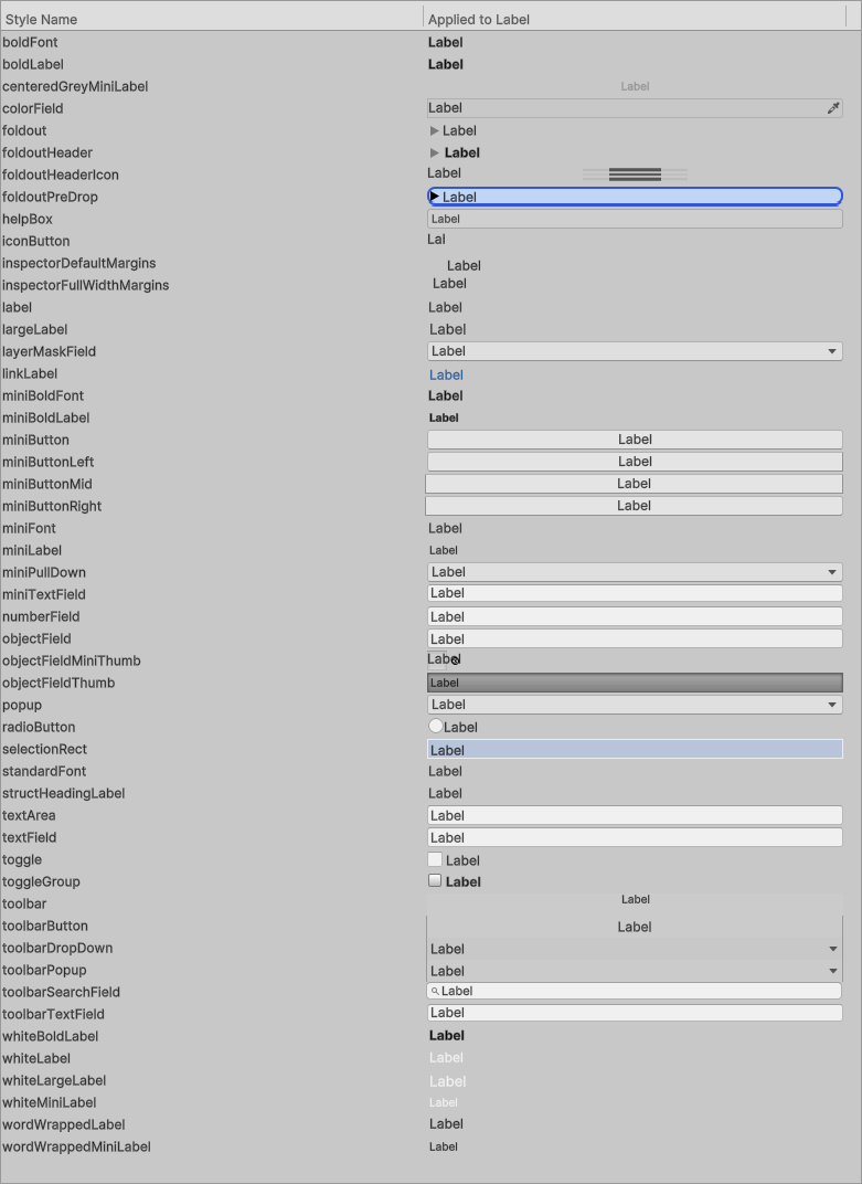
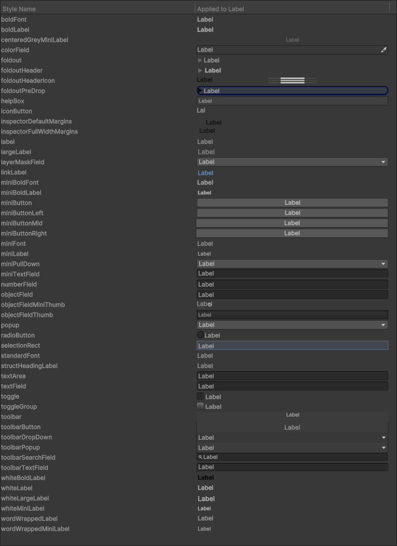
Static Properties
| boldFont | Bold font. |
| boldLabel | Style for bold label. |
| centeredGreyMiniLabel | Style for label with small font which is centered and grey. |
| colorField | Style used for headings for Color fields. |
| foldout | Style used for headings for EditorGUI.Foldout. |
| foldoutHeader | Style used for headings for EditorGUILayout.BeginFoldoutHeaderGroup. |
| foldoutHeaderIcon | Style used for icon for EditorGUILayout.BeginFoldoutHeaderGroup. |
| foldoutPreDrop | Style used for headings for EditorGUI.Foldout. |
| helpBox | Style used for background box for EditorGUI.HelpBox. |
| iconButton | Style used for a standalone icon button. |
| inspectorDefaultMargins | Wrap content in a vertical group with this style to get the default margins used in the Inspector. |
| inspectorFullWidthMargins | Wrap content in a vertical group with this style to get full width margins in the Inspector. |
| label | Style used for the labelled on all EditorGUI overloads that take a prefix label. |
| largeLabel | Style for label with large font. |
| layerMaskField | Style used for headings for Layer masks. |
| linkLabel | Style used for links. |
| miniBoldFont | Mini Bold font. |
| miniBoldLabel | Style for mini bold label. |
| miniButton | Style used for a standalone small button. |
| miniButtonLeft | Style used for the leftmost button in a horizontal button group. |
| miniButtonMid | Style used for the middle buttons in a horizontal group. |
| miniButtonRight | Style used for the rightmost button in a horizontal group. |
| miniFont | Mini font. |
| miniLabel | Style for label with small font. |
| miniPullDown | Style used for the drop-down controls. |
| miniTextField | Smaller text field. |
| numberField | Style used for field editors for numbers. |
| objectField | Style used for headings for object fields. |
| objectFieldMiniThumb | Style used for object fields that have a thumbnail (e.g Textures). |
| objectFieldThumb | Style used for headings for the Select button in object fields. |
| popup | Style used for EditorGUI.Popup, EditorGUI.EnumPopup,. |
| radioButton | Style used for a radio button. |
| selectionRect | Style used to draw a marquee selection rect in the SceneView. |
| standardFont | Standard font. |
| textArea | Style used for EditorGUI.TextArea. |
| textField | Style used for EditorGUI.TextField. |
| toggle | Style used for headings for EditorGUI.Toggle. |
| toggleGroup | Style used for headings for EditorGUILayout.BeginToggleGroup. |
| toolbar | Toolbar background from top of windows. |
| toolbarButton | Style for Button and Toggles in toolbars. |
| toolbarDropDown | Toolbar Dropdown. |
| toolbarPopup | Toolbar Popup. |
| toolbarSearchField | Toolbar search field. |
| toolbarTextField | Toolbar text field. |
| whiteBoldLabel | Style for white bold label. |
| whiteLabel | Style for white label. |
| whiteLargeLabel | Style for white large label. |
| whiteMiniLabel | Style for white mini label. |
| wordWrappedLabel | Style for word wrapped label. |
| wordWrappedMiniLabel | Style for word wrapped mini label. |
Did you find this page useful? Please give it a rating:
Thanks for rating this page!
What kind of problem would you like to report?
Thanks for letting us know! This page has been marked for review based on your feedback.
If you have time, you can provide more information to help us fix the problem faster.
Provide more information
You've told us this page needs code samples. If you'd like to help us further, you could provide a code sample, or tell us about what kind of code sample you'd like to see:
You've told us there are code samples on this page which don't work. If you know how to fix it, or have something better we could use instead, please let us know:
You've told us there is information missing from this page. Please tell us more about what's missing:
You've told us there is incorrect information on this page. If you know what we should change to make it correct, please tell us:
You've told us this page has unclear or confusing information. Please tell us more about what you found unclear or confusing, or let us know how we could make it clearer:
You've told us there is a spelling or grammar error on this page. Please tell us what's wrong:
You've told us this page has a problem. Please tell us more about what's wrong:
Thank you for helping to make the Unity documentation better!
Your feedback has been submitted as a ticket for our documentation team to review.
We are not able to reply to every ticket submitted.